| Image |
Comment |
| 05/12/2007 07:06:03 AM |
Peacefulby sudhiComment: Greetings from the Critique Club -
You caught a pleasnat image here. Nice color and texture in the background, your subject is placed well in the frame and the head of your flower has an interesting pattern and texture.
Areas that may have hurt your score would be maybe a bit blown on the whiters of the flower. Some more detail on the larger petals could have been nice. But prbbaly the biggest thing is the lack of WOW power in the image. It has a nice simplicity to it, but that will also keep it from scoring higher IMO. Flower shots really need to be strong to score well in FS's. You have a nice and pleasing shot here and most voters felt the same way.
Tim |
 Photographer found comment helpful. Photographer found comment helpful. |
| 05/11/2007 03:20:12 PM |
White Bengal Tigerby KaizerComment: Greetings from the Critique Club -
Congrats on a 6+ score in the FS. Always good to be above that benchmark.
I love good pics of big cats. But personally you lost me with the selective desat. You caught good focus, a decent pose, and pretty nice detail. But the desat really took away from the impact this image could have had. Either full black and white with a bit of dodging and burning to bring out the contrast of the fur or full color with saturation tweaked up a bit and then burned for contrast could have made this image pop more and easily score higher. You have a great strong animal here yet with the soft pink and baby blue being the colors showing it just leaves the wrong feel. I tend to hyper process alot of my big cat pics and I could see me going to town on this one so please take my comment with that into consideration.
Again - nice general pic, good score (and a new image in your top rated pics is always a good thing). I would love to be shooting where you are. Good luck in future challenges!
Tim |
| Photographer found comment helpful. |
| 05/11/2007 03:07:06 PM |
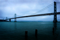
"The coldest winter I ever spent was summer in San Francisco." - Mark Twainby tryals15Comment: Greetings fro the Critique Club -
I will begin with saying that you rimage looks pretty cool in thumbnail. Good line and intersting blues. But upon seeing it as the larger image it does seem a bit flat. The colors are good but I would like to see it more dynamic.
I also think the vignetting is a little heavy on the bottom. I would have liked to have seen the posts in the water a bit more.
Not really a whole lot else I can comment on. Its a straightforward image, nothing too exciting but nothing really bad about it. High 5 in a Free Study isnt really anything major to complain about with an image like this.
You have some really nice work in yoru portfolio. Keep that up and I look forward to seeing your future entries.
Tim |
| Photographer found comment helpful. |
| 05/11/2007 02:48:34 PM |
Relaxing at Whitsunday Islandby AtlantisComment: Greetings from the Critique Club -
Dont ya just hate it when you get so close to a 6 and can't quite make it over. Bummer.
You have a nice image here. The colors might be a little oversaturated for some tastes but they arent heavily so. The perspective and action caught is very cool. Especially with the distant landscape as your backdrop. Good focus and detail and just an interesting shot.
Theborder is a bit much IMO. I woul dhave preferred a much thinner border and had more of your image filling the screen. The border just takes up too much room.
Not much else to comment on. You have a good shot and you got a decent score considering its a Free Study. People really want WOW to give out the higher votes. You did well.
And perusing through your portfolio I must just add that you do some great work in the digital art realm. Very creative and well done. Keep up the good work.
Tim |
| Photographer found comment helpful. |
| 05/10/2007 10:34:07 PM |
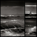
Stormfront at Sunriseby hotpastaComment: Greetings from the Critique Club -
Go figure I pull you again. You would think I would be getting sick of seeing your images and then commenting on them. But alas, it is not so.
Obviously from the same trip as your triptych entry this one wasn't as strong. I loved the people in all of your triptych images where this one felt lacking that focus. The waves are cool and the one surfer is great, but following up your triptych with this one may have prevented this from scoring even higher - not that 6.7 is low by any means, but having a direct comparison so close together can be tough.
And this one I think the color version may have done you better. The colors in these three images seem to be a better balance than in your triptych series. I would have been very interested to see how the color version would fair.
And like your trip entry - great detail, especially on the water spray of the largest image, excellent conversion, and a very nice layout. Keep up the great work Enzo. It's always a pleasure viewing your images.
Tim |
| Photographer found comment helpful. |
| 05/10/2007 10:16:05 PM |
Lower Yosemite Fallsby cools98Comment: Greetings from the Critique Club -
Looks like you had some great places to shoot for your FS thats for sure.
My first impression with this shot is that it is nice. Not WOW amazing but not horrible either. You have a cool location but I think overall it might be just a bit too busy. THere is just alot of detail that when reduced down to the size necessary for entry gets lost I think. I am not quite sure what the focus should be either. Is it the falls or is it the rocks. And are the dark objects on the right trees or is it some sort of clmbing vine on the rocks.
The duotone is nice and the lighting is captured well. Maybe a little blown on the water but not really a major issue.
Now looking through your portfolio I think you had stronger images. You do some really great work with landscapes and they score real well for you. I believe that some of your other images from Yosemite would have scored better for you. El Capitan and Cathedral Rocks being two of them, but even the closer up shot of this same falls here. I find that to be a cleaner and more compelling image.
Anyways - keep up the good work and I look forward to seeing more of it.
Tim
|
| Photographer found comment helpful. |
| 05/10/2007 07:36:28 AM |
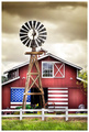
An American Barnby xtianComment: Greetings from the Critique Club -
First off congrats on a great score and placement in the Free Study.
You have a great image here. A great feeling of Americana. And your editing style enhances all the cool features of the image. The barn looks great, the windmill stands out strong, the white fence is balanced in well and the John Deere is just vibrant enough to be seen without the saturation being too much to ake it silly. And on top of all that the flag looks great. I don't hink you could have asked for anything better had you requested each piece to be placed. The only shame is that you can't see the weathervane. That would have been a nice touch.
Not much to say about how to improve. Had the sky been blue it could have been nice, but you deal with what you get. Some may not like the processing, but I think it works well. You just have a very nice picture here. It would probably go over great as a print.
Looking at your portfolio I see you need to enter more challenges. You do very good work and I (as I am sure others) would like to see more. Good luck!
Tim |
| Photographer found comment helpful. |
| 05/09/2007 02:41:51 PM |
Late Night Readingby pipsqueakComment: Greetings from the Critique Club -
First congrats on your first 6+ score and a new personal best! Thats always exciting. And a 6+ score in a FS to boot is really good. The FS's tend to be a bit tougher to get the higher scores as voters tend to be a bit more finicky.
You have a very nice image here. The lighting is excellent. The color tones are warm and appealing and your overall composition is really laid out well. This is just an in general pleasing image - and now looking at your comments (and so many in challenge - well done) you hit a good chord with all of them. I placed a a bit higher in the challenge and didnt come close to that many comments during voting. Really well done. Congrats.
And I can also say that I dont really have alot to offer to make this better. You have a complete image here. Colors, detail, lighting, model and pose. Your editing is clean and well executed. Not much else to add here. While maybe not an image with serious WOW power to get you a higher score, you certainly have an image that is strong and is appealing to a large group here at DPC. 22 comments and 4 faves is excellent. Keep up the good work. I look forward to seeing more images from you!
Tim |
| Photographer found comment helpful. |
| 05/09/2007 02:31:46 PM |
Tag!by andrea22_alsComment: Greetings from the Critique Club -
Free Studies are such tough challenges. To get the higher scores you really need to have a dead on shot. This image has some issues that are easily overlooked for a yearbook image, but in the world of DPC will garner you a low score.
From a positive point of view you had great timing in capturing this moment. Just a split second before the tag itself (which I am assuming she did - lokos like a clean catch in plenty of time). And the poses you caught all three particpants in is nice. The umpire is actually my favorite of the three. Great position.
Issues with the image that prevent it from scoring higher. I would love to see this tack sharp. It just has an overall soft feel to it. Not sure if its from to otight a crop or what, but I can see the shutetr speed you used and the lens you used and it should be a bit sharper I would think (not sure for sure though). Maybe a final USM on your resized for web image could have made it sharper.
Also - I know you have prettymuch no control over your background here, but it is a bit distracting. Alot of lines and various colors draw away from the focus of the action. You could do a ton of postprocess work to minimize that, but probably not worth the work. I wonder what black and white converted version of this would look like. That might take away some of the background distraction. But then the uniform colors would be lost and they are nice.
Just did a quick peek at your image size. I see that you used the full 720 pixels but that your size of file in KB is almsot half of what it could be. That there could be a cause of your image feeling soft. Make sure you max that out as high as possible. It will affect your image quailty and how viewers see your image.
Keep working at it and dont let the low scores discourage you. Give me a Pm if there is anything I can help with.
Tim |
| Photographer found comment helpful. |
| 05/09/2007 02:16:26 PM |
Sometimes weeds aren't so badby LonzComment: Greetings from the Critique Club -
Congrats on the 6+ score and a new image in your top rated pics row. Its always nice to see shots fall off the other end.
First off let me say that you have great colors. The yellows and green are vibrant yet still real and not over the top. I also really like the textures on the tips of the grass. Offers a nice little bit of extra somethign to the shot. I think you did real well with the vignetting effect - offers good focus on the weed. And you rcomposition is well done too. Nicely off centered - uses the rule of thirds concept well.
A couple of minor issues from me. Maybe a bit heavy on the noise reduction on the weed head. You seemed to have lost some detail from it. Also a little more fine burning on the head to really separate more of the petals, especially on the top part could have allowed it more visible detail.
A nice overall image and your vote curve really reflects that. No real low votes but not many too high either. You have an in general well executed and pleasing image. Had your compostion packed a bit more WOW power you would have scored higher, but without totally reshooting your image I dont think there is anything major that you could have done in post process to achieve that. In the end - nice work, good score and a really good placement in the FS. Keep up the good work!
Tim |
| Photographer found comment helpful. |
Home -
Challenges -
Community -
League -
Photos -
Cameras -
Lenses -
Learn -
Help -
Terms of Use -
Privacy -
Top ^
DPChallenge, and website content and design, Copyright © 2001-2025 Challenging Technologies, LLC.
All digital photo copyrights belong to the photographers and may not be used without permission.
Current Server Time: 08/26/2025 11:30:18 PM EDT.