| Image |
Comment |
| 01/14/2008 05:32:25 AM |
Childs Play by JudiComment: Congrats Judi! Nice work all around with your outatkes as well. |
 Photographer found comment helpful. Photographer found comment helpful. |
| 01/13/2008 06:17:37 PM |
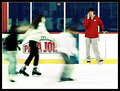
Matt - Week 2by magenmarieComment: Nice clean shot. Good feel of natural lighting. The only thing that kind of bigs me is the border around his pupils. A bit heavy on the burning/pimping. Seems a bit unnatural. Other than that very nice work. |
| Photographer found comment helpful. |
| 01/11/2008 10:41:12 AM |
|
| Photographer found comment helpful. |
| 01/10/2008 05:19:39 PM |
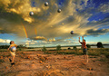
Disconnectby levyj413Comment: Greetings from the Critique Club -
I didn't vote in this challenge so this is the first time i am seeing this one. Let me say that this is a very creative take on the challenge. Great idea.
I probably would have scored this an 8 (sorry I didn't vote). I like the processing and I really like the composition. Has a fun feel to it - and I am digging the blur.
Not sure what I can say to improve it any. I don't see this image as being an attempt to appease the general DPC voter. I see this as being a complete image and if the voters didn't like it then their loss. So who am I to say what to change (and I wouldnt change a thing).
Tim |
| Photographer found comment helpful. |
| 01/10/2008 05:14:32 PM |
Crystal bowlby snafflesComment: Greetings from the Critique Club -
I think you met the challenge here. The glass bowl is easily isolated by the orange. But overall the image leaves me a bit flat. Not really any wow power to bring in the higher votes.
I think the image could have been improved with some work on the orange. Cleaning up the background line and doing some work to minimize the spots could have made this a cleaner image. But going from your details it looks like you edited within the basic ruleset.
Not really much else I can add to this one. Hope something here helps.
Tim |
| Photographer found comment helpful. |
| 01/10/2008 05:06:50 PM |
The Penthouse [Fisheye View]by treyvusComment: Greetings from the Critique Club -
My first reaction to this image is "Cool colors". Nice job of catching complimentary colors between the sky and building. The general comp is somewhat pleasing though I think I would prefer to see an even wilder angle on the building.
What I think this image suffers from most is oversharpening. Where the building should be sharp its a bit much. And way overdone on the sky. I think if you had left the sky alone when it came time to sharpen and maybe even gone heavy on Neat Image or something you woudl have had an even better contrast - smooth and sharp. As it is though its just too grainy.
I think 5.3 may be a little low overall as it meets the challenge, but I wouldnt have expected it to score a whole lot higher than say a 5.6.
Hope some of this may help.
Tim |
| Photographer found comment helpful. |
| 01/10/2008 05:58:30 AM |
Captain H.Mby lowonenergyComment: Very cool shot. Love the ring light effect. Need to get me some of them goggles. 9 |
| Photographer found comment helpful. |
| 01/10/2008 05:57:48 AM |
|
| Photographer found comment helpful. |
| 01/10/2008 05:57:23 AM |
|
| Photographer found comment helpful. |
| 01/10/2008 05:56:41 AM |
|
| Photographer found comment helpful. |
Home -
Challenges -
Community -
League -
Photos -
Cameras -
Lenses -
Learn -
Help -
Terms of Use -
Privacy -
Top ^
DPChallenge, and website content and design, Copyright © 2001-2025 Challenging Technologies, LLC.
All digital photo copyrights belong to the photographers and may not be used without permission.
Current Server Time: 08/18/2025 03:42:09 PM EDT.


![The Penthouse [Fisheye View]](https://images.dpchallenge.com/images_challenge/0-999/792/120/Copyrighted_Image_Reuse_Prohibited_626992.jpg)