| Image |
Comment |
| 04/24/2005 10:49:37 PM |
Alone with my thoughts...by samtrundleComment: The image quality is great, and so is the lighting. About the composition, I think more negative space to the left will helped the impact quite a bit. |
 Photographer found comment helpful. Photographer found comment helpful. |
| 04/24/2005 10:47:35 PM |
I Am People, I Am Myselfby ArtysteComment: Very nicely done and processed. I might have liked to see some more of the (curving) frame on the top, just a tad more (not to the point of symmetry at all with the bottom). Good work.
|
| Photographer found comment helpful. |
| 04/24/2005 12:59:20 PM |
Blushing Lady Close Upby srbrubakerComment: I saw your call for comments in the Invitational challenge thread, and dropped in, though the comment is not for the purpose of getting into the challenge (that's not going to happen :D).
The colors in this picture caught my eye, and the lighting you have used has enhanced these colors. There's a lot of potential here, but it could do with some modification. First, the central part of the flower is lacking in sharpness; that might be simply because you didn't use enough USM on it (need to reuse USM everytime you resize a photo almost). Second, the crop, I think if you crop some off the bottom, and some off the left you will get a tighter composition. That combined with a sharper centre will make this quite a stunning image, I think :) Message edited by author 2005-04-24 12:59:57. |
| Photographer found comment helpful. |
| 04/24/2005 12:12:28 PM |
Street Angelby beamsclanComment: Beautiful shot, the colors really work and you have captured a beautiful expression!!
I think a tighter crop from the left would bring the viewer's attention to the face better.
All n all, a wonderful picture. |
| Photographer found comment helpful. |
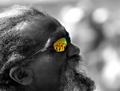
| 04/24/2005 12:09:21 PM |
Reflecting...by LevTComment: great image, and very effective use of selective desat. however since the title is reflecting, and the subject is clearlylooking _out_, it might have been more effective with more negative space to the top and right. |
| Photographer found comment helpful. |
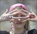
| 04/23/2005 12:11:48 PM |
gypsy windby SeanachaiComment: Great subject, and very nice colors.But the position of the hands has left the eyes in complete shadow, and the only light is on the tip of the nose. If the hands are placed farther away from the face in the same position, the shadowing wouldn'thappen... Also, I'd try a tighter crops, maybe around the top of the scarf from top, and a little below the chin from the bottom, I think it might help the impact. |
| Photographer found comment helpful. |
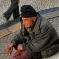
| 04/23/2005 11:51:13 AM |
What to do with this life?by carlosmfernandesComment: Very poignant; it conveys so much that I wonder if it is even right to comment on technical aspects. But I will :P, I wish the man's body were not cropped off from the right and bottom. A little more space on the bottom would also add some context...About the passerby I'm not so sure. I started out thinking that he would be better off missing, but on second thoughts, I think he adds to the neglected, passed-by
feel of the subject. Wonder what this looks like in B/W. 7. |
| Photographer found comment helpful. |
| 04/23/2005 11:45:38 AM |
On the lookoutby BrinComment: I'm a little torn about this image. The colors are excellently chosen. I think I would like to see more detail in the subject, which does not (particularly the head and cap) look sharp enough to me. Compositionally, I think placing him a tad more to the left, or better still cropping tighter from the left would add tension to the image. I really like the title you've chosen, it fits the atmosphere created by the dark colors! |
| Photographer found comment helpful. |
| 04/23/2005 11:40:00 AM |
At the railway stationby RUEDISCHMUTZComment: Nice candid, well composed. Lacks pop somehow for me.. partial selective desaturation might help bring out the subject better. 7. |
| Photographer found comment helpful. |
| 04/22/2005 06:30:47 PM |
Carlby dunamisComment: A very good classic portrait, the catchlights in the eyes and the color coordination of shirt with background are very well done. |
| Photographer found comment helpful. |
Home -
Challenges -
Community -
League -
Photos -
Cameras -
Lenses -
Learn -
Help -
Terms of Use -
Privacy -
Top ^
DPChallenge, and website content and design, Copyright © 2001-2025 Challenging Technologies, LLC.
All digital photo copyrights belong to the photographers and may not be used without permission.
Current Server Time: 08/04/2025 06:12:43 PM EDT.