| Image |
Comment |
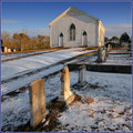
| 03/07/2006 01:14:40 PM |
Gravestones & Church, Daybreakby Bear_MusicComment: just a little bit further to the right and this image would be perfect, the composition is off just enough to make me cringe, i would have liked to see it composed with the furthest gravestone almost touching the right border |
 Photographer found comment helpful. Photographer found comment helpful. |
| 03/07/2006 01:13:31 PM |
Simple Lifeby whiteroomComment: i like the photojournalistic feel of this image, but it was probably taken out of a moving vehicle and the forfront subject looks blurred, along with the rest of the image, at least having the kid on the bike sharp would have made this image a success |
| Photographer found comment helpful. |
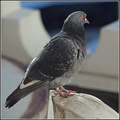
| 03/07/2006 01:12:25 PM |
Curiousby MadMan2kComment: snap shot, tight crop on the cat, or even the cat's face would have made this image work, as is, it sucks |
| Photographer found comment helpful. |
| 03/07/2006 01:11:49 PM |
Smoke Breakby mandyturnerComment: very flat image, adjusting the levels to add contrast would have really made this image stand out, as is the texture of the hand doesn't add necessary mood to the photograph |
| Photographer found comment helpful. |
| 03/07/2006 01:11:08 PM |
Proofby macrothingComment: i love this image, but i would have liked to see a tighter crop |
| Photographer found comment helpful. |
| 03/07/2006 01:10:46 PM |
|
| Photographer found comment helpful. |
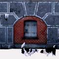
| 03/07/2006 01:10:11 PM |
Let's play!by AnnaPComment: too contrasty, i just can't look at this picture for very long, i don't like it at all |
| Photographer found comment helpful. |
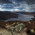
| 03/07/2006 01:09:28 PM |
Loch Katrine from Ben A'anby TallblokeComment: love it love it love it, but i hate how it looks like it slopes off to the right, and the rock formation in the front is slightly distracting, but i kind of like it, it adds mood to the image, straightening the horizon would have done wonders to this image |
| Photographer found comment helpful. |
| 03/07/2006 01:08:13 PM |
|
| Photographer found comment helpful. |
| 03/07/2006 01:07:30 PM |
|
| Photographer found comment helpful. |
Home -
Challenges -
Community -
League -
Photos -
Cameras -
Lenses -
Learn -
Help -
Terms of Use -
Privacy -
Top ^
DPChallenge, and website content and design, Copyright © 2001-2025 Challenging Technologies, LLC.
All digital photo copyrights belong to the photographers and may not be used without permission.
Current Server Time: 08/04/2025 10:54:43 PM EDT.