| Image |
Comment |
| 04/20/2003 11:45:39 PM |
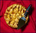
Area (circle) = PI (3.1415926...) X r (radius of circle)2 (squared)by ArtifactsComment: Critique Club critique by Tim Jensen
My last critique was a pie photo as well but this one is executed much better. As I told the last person I personally do not like these types of plays on words.
This pie looks very tasty and I like the addition of the server (whatever you call it). The red colors also makes it stand out and look even more inviting.
The composition is fine but safe. It is pretty easy to just take an overhead shot of a pie and have it look pretty good compositionally but it is also somewhat boring and overdone. There must be other cmaera angles that would look very interesting and fresh. Shooting from the side, from an angle, up close with a shallow depth of field, or any number of other ways could be effective.
Everything else is pretty good. Nice colors, well executed with good clarity and focus, effective cropping, and even a simple and tasteful border. So even though I think it is a bit of a cop out to use pie instead of Pi I still think you did a pretty good job with this photo.
Tim |
 Photographer found comment helpful. Photographer found comment helpful. |
| 04/20/2003 10:43:21 PM |
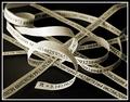
Endless Ribbonby JackoComment: Critique Club critique by Tim Jensen
Jacko, This is a great concept and you pulled it off very well. It also clearly meets the challenge.
The one thing that stands out for me is the blank backside of your strips. Did you consider printing on both sides? As if you didn't already give yourself enough work. Keeping it pretty much black and white works well making it very clean and easy to understand.
I like your composition quite a bit. There is a nice combination of straight lines and curves. It has a nice balanced feel to it.
The depth of field is very appropriate for this image. The slight blurring as it recedes helps to convey a bigger sense of depth which supports your idea well.
The lighting is pretty good overall allthough slightly contrasty as evidenced by the very bright area on the backside of the curved loops in the middle. You may have intended this so it stood out more but I would have preferred some more diffused light.
It is executed very well with clean sharp lines.
I feel like I am basically nitpicking a very good image with a tough topic. Nice job.
Tim |
| Photographer found comment helpful. |
| 04/13/2003 08:50:45 PM |
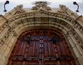
Front Doorby Pep VentosaComment: Critique Club critique by Tim Jensen
Wow! was my first impression when I first saw this image. So it is pretty obvious that I like this photo.
First of all, it is very symmetrical so you have easily met the challenge. I really like the two torches or sconces that raise up at the top as well as the flow of the arch into a point at top center. You chose a very good perspective to show the symmetry here. I'm having a hard time deciding if I would like to see more of the door or if it just right the way it is. It is hard to know without seeing other views. I just purchased a wide angle conversion lens and I am really loving the wider angle shots. Of course it is very dependent on the subject.
Clearly the other element in this photo is the beautiful textures and features of this old building. While it is good as it is I think it could have been improved by more contrast with more direct lighting. This would make an excellent subject for studying the effects of various lighting situations.
The color and values appear very natural except I don't like the bluish sky reflecting in the door. A little hard to avoid, I know. Maybe you could have desaturated some of the blue and cyan channels since blue is not a prominant color in this image.
Technically everything looks pretty good and your depth of field is appropriate for showing all of the details clearly.
Very nice work.
Tim
|
| Photographer found comment helpful. |
| 04/02/2003 04:56:29 PM |
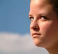
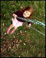
Contemptby crabappl3Comment: Critique Club critique by Tim Jensen
This is an interesting photo and I like it quite a bit. My one slight problem I have with it, though, is the fact that I don't see a lot of contempt in the girl's expression. Maybe it would if I knew her expressions. To me it simply looks like she is looking off intently at something. As a photo, in general, this is actually one of the elements that I enjoy about this photo. The other elements that I think are well done are the tight cropping, the simple blurred background, and the natural complimentary colors. These elements create an engaging photo by eliminating everything that isn't necessary. I enjoy portraits the most where the subject is looking away at something. This puts the emphasis squarely on the person and doesn't imply that there is someone with a camera nearby.
The overall lighting is very effective and I like the shadows cast by the girl's eyelashes. However, I find the shadow from her nose a little distracting and maybe some very subtle fill flash would have helped in that area.
Technically everything appears perfect with nice colors and appropriate sharpness. I see no evidence of jpeg artifacts and there is a pleasant smoothness to the girls skin and features. I am normally not in favor of a square format but I find it effective in this case.
Very nice job.
Tim |
| Photographer found comment helpful. |
| 04/01/2003 04:41:16 PM |
Almost Holy by KonadorComment: Ben, you are really starting to develop a nice style with the use of black and white along with dramatic lighting and interesting compositions. I knew it was yours and a winner even from the thumbnail. Congratulations.
T |
| Photographer found comment helpful. |
| 03/23/2003 05:24:04 PM |
"Looking Down Hoover"by tfarrell23Comment: This is one of those images that could have really benefitted from a wide angle lens. As it is it is still very good with strong composition and great detail. Angling the image was a good idea.
T |
| Photographer found comment helpful. |
| 03/23/2003 05:20:57 PM |
Lottie by dsidwellComment: Absolutely beautiful. My top pick. The composition, colors, and perspective are perfect. The great texture and details throughout realy help tie it all together.
T |
| Photographer found comment helpful. |
| 03/23/2003 05:18:07 PM |
Into The Mystic by sherComment: An average of 6.7 from the non camera users? A full point lower then the others. Unbelievable. End of tiny rant.
This photo is awesome. This deserves to be displayed large. I think you should definitely try to promote this image because everybody will love this and you could make some good money off of it.
The choice of colors is perfect as well as the composition and detail.
I guess you can tell how much I love this photo. Great job!
T |
| Photographer found comment helpful. |
| 03/23/2003 05:07:54 PM |
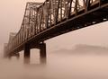
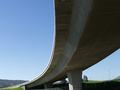
No Turning On Bridgeby autoolComment: Critique Club critique by Tim Jensen.
The first thing that caught my attention was the strong visual impact of this photo due to its dynamic composition. Compositionally it is very effective in communicating the sense of beauty, size, and strength of this structure. I would have preferred to not see the trees just to the right of the closest column. Instead, by moving to the right you could have blocked those trees with the column and displayed a solid blue shape that would better reflect the blue area on the left side of the bridge. I understand why the image is tilted slightly so that the apparent horizon line is level but by doing that the columns are tilted and the bridges looses some of its structural balance. it's a bit of a trade off and I am simply wondering what it would look and feel like with the columns more vertical.
Your intent was to shoot this scene at mid day and while that works just fine I am wondering what this would look like taken at dusk or nighttime with a much darker background. A timed exposure could give a real interesting deep blue color that could compliment the color of the concrete very well. It could simplify much of the background and empahasize the composition even more. Of course I would have to see that to know for sure. Just an idea.
The colors and values are very natural looking and the contrast is appropriately bold. It is very sharp but I think I would have preferred a much shallower depth of field where the focus was on the foreground 1/3 of the bridge and to go slightly soft as it receded. I feel that this would support the already strong sense of depth and 3dimensionality (is that a word?).
I love how you took a pretty common structure and created a very artistic image out of it. Good job.
Tim |
| Photographer found comment helpful. |
| 03/21/2003 06:06:49 PM |
|
| Photographer found comment helpful. |
Home -
Challenges -
Community -
League -
Photos -
Cameras -
Lenses -
Learn -
Help -
Terms of Use -
Privacy -
Top ^
DPChallenge, and website content and design, Copyright © 2001-2025 Challenging Technologies, LLC.
All digital photo copyrights belong to the photographers and may not be used without permission.
Current Server Time: 07/31/2025 12:03:08 PM EDT.