| Image |
Comment |
| 02/09/2003 10:37:39 PM |
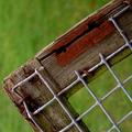
Absent Squares by paynekjComment: Critique Club critique
I'm a little late getting to this, sorry.
I just love images like this. They are fun to look at. You can let your eyes wander around from detail to detail. I wouldn't change too much about this photo except for maybe showing a little more of the links on the fence, but I would have to experiment with it to know for sure. The colors and textures are just wonderful and not overly sharpened or saturated, I'm glad to say. The composition is very nice with a good use of angles. You handled the depth of field very well by keeping the background blurry so that it contrasts very nicely with the fence. even the subtlety of reds in the grass matches nicely with the red color in the fence. This is a very clean image, it meets the challenge nicely, and I think it is appropriately cropped. Good job.
T |
 Photographer found comment helpful. Photographer found comment helpful. |
| 01/31/2003 06:20:45 PM |
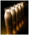
Who`s Got Bottle by redfigComment: Critique Club critique
The main thing that I don't like about this photo is the title. I don't know why, I just don't. And since that is such a trivial thing I think you can tell how much I like this photo. It is just so simple and clean with very interesting visual elements to hold your attention. What I think I like best is the way that you didn't overdo anything in the composition. There seems to be just the right amount of milk bottles, the right amount of water drops on the bottles, and the right amount of visual balance between the positive and negative spaces. I bet you really studied your photos and cropping options before you settled on this because it appears like you put a lot of thought into it and made the right decisions. I enjoy the photo for it's visual imapct as well as it's abstract qualities. You presented the photo very well with an appropriate border and a clean, sharp image. Very well done.
Tim Jensen |
| Photographer found comment helpful. |
| 01/31/2003 05:58:57 PM |
Tag! You're it.by DezComment: Critique Club critique
While the perpective certainly makes this photo an interesting one I feel a little uncomfortable with how much the left edge is being crowded. I would like to see the angle of the pole exaggerated even more so that the round sign is positioned on the right side with the top of the post in its same location to create an even more dynamic look and feel to the image. This positioning would also create triangular shapes in the negative space that would compliment the triangular sign. The reflection of the light bothers me a little as well and maybe the use of a polarizer filter could have reduced the reflection. You chose a good background that adds to the dramatic effect. The colors are good and overall the photo is very sharp and clean. The border does a nice job of presenting your photo without overpowering it. All and all you did a nice job with this photo.
Tim Jensen |
| Photographer found comment helpful. |
| 01/31/2003 05:23:43 PM |
Strawberry Fareby PtmanComment: Critique Club critique
The colors here emmediately jumped out at me and made a good impression. They look natural without being over saturated. The composition is good but a little safe. In that I mean the overhead view with a pleasing arrangement is pretty common but that also means that it works well. The composition would be just fine to me if the lighting was more dramatic in some way. It appears flatter than it should be with too much ambient light. The ice cream and strawberries have very interesting forms that should be emphasized as much as possible. I would think one dominate light slight diffused on one side to produce a strong but soft shadows with a lesser light on the opposite side to reveal some detail in the shadows may work well. The amount of sharpness is right on and the image looks very clean. It is a very nice photo but some more emphasis on the forms would really make this a winner.
Tim Jensen |
| Photographer found comment helpful. |
| 01/31/2003 04:53:10 PM |
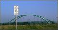
No Cars Allowedby GeneralEComment: Critique Club critique
Well well, I get to critique one of your photos. Ok, where to start? : )
One of the first things that jumped out at me was how well you presented this photo. The cropping is very appropriate, the subtle border presents the image very well, and it is very clean and natural looking. As far as the photo content goes I find it fairly ordinary and without much punch. I feel it needs more visual appeal like dramatic lighting or a very unique perspective. Something that grabs the viewers attention. I would like to see what it looks like from a lower perspective so that it looks like the sign towers authoritatively over the bridge and didn't compete visually with the other vertical street lamps or in size and weight to the bridge. As it is now both the sign and bridge seem to compete for the primary focus point. As I said it very good technically and in it's presentation but it is lacking in visual appeal. I think this would have been a great opportunity for some greater visual risk taking.
Tim Jensen
|
| Photographer found comment helpful. |
| 01/27/2003 09:16:18 PM |
Gold Blend by NatashaComment: Congratulations Natasha. This is very well done. The composition, lighting, texture, forms, and execution are all handled beautifully. It is definitely deserving of first place.
T |
| Photographer found comment helpful. |
| 01/24/2003 07:04:42 PM |
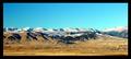
Big Horn Mountainsby SonifoComment: Critique Club critique.
Two things jumped out at me initially. The slightly over saturated colors and the black distracting border. The colors, particularily the blue channel, appear over saturated which takes away from the naturalness of it. This may have been intentional or a calibration problem on your monitor. The black border really commands attention which draws my attention away from the photo where it should be. The border should support the photo not compete with it. Maybe a thin dark inner border of green, blue or even black with a wider outer border in a lighter color of ocre, cream, or white would be appropriate. I like the wider cropping, it helps to convey the sense of a wide open space. I'm not sure about the perfectly centered horizon line, I think I would prefer to see it raised so as to show more of the foreground with the beautiful colors and features. If there were some really interesting cloud formations Than you could have focussed on that but as it is, with only a solid blue color, it isn't really necessary to show that much of it when you can, instead, show off more of the land which has the interesting details. The photo appears properly exposed with the right amount of sharpness and clarity. It looks like a beautiful area to photograph. Nice job.
Tim
|
| Photographer found comment helpful. |
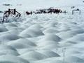
| 01/24/2003 06:39:13 PM |
SNOWFIELDby howzaComment: I selected this photo for the Critique Club although I already commented on it. I will try to expound on it further. As you can see from my comments I really like this photo but there were a few things that I would have changed. The bit of grass under the fence is distracting in part because it is so dark and doesn't show a lot of detail. However I do like the taller, thinner grass and maybe would like to see more of that. I would have really tried to keep this scene as simple as possible by showing only the fence and the beautiful snow mounds. I do like the gate and would maybe like to see that emphasised a little more. A slightly different composition may have been even more interesting such as getting even lower to to the ground so that the closest mound looked even bigger and helped to exaggerate the perspective. I wish I were there to study this location it looks really interesting. I would have taken every possible angle and composition I could think of. But as it is it is still very good. You did a nice job with the exposure and colors and it is as sharp as it needs to be. Good job.
Tim
Critique Club |
| Photographer found comment helpful. |
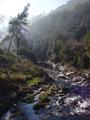
| 01/24/2003 06:21:33 PM |
Riu Ripollby bcncrazyComment: I really wanted to like this photo because it seems to have a lot of the right elements like sunny weather, a river, rocks and greenery but instead it feels too cluttered. It doesn't have a focal point, my eyes just keep wandering around without really enjoy any one thing in particular. I think there probably was something good to photograph at this location but this particular composition just isn't working for me. Of course without knowing the location I can't really recommend a better composition. Was there a cleaner looking part of the river? Was there an angle that showed more of the beautiful trees? It's often a little tricky to shoot into the sun so as to avoid a washed out sky or lens flare. Maybe you could have pursued that element and showed the sun even more for a real striking shot by positioning the sun directly behind a tree or other object or something like that. Technically it is pretty good, fairly clean and sharp. For this particular shot the photo may have benefitted by underexposing it about a 1/2 to 1 full stop to maintain more of the color in the trees and grass. Like I said many of the right elements are there it just needed a better composition and some elements of emphasis. It looks like a fun area to explorer.
Tim
Critique Club |
| Photographer found comment helpful. |
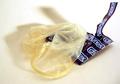
| 01/19/2003 07:25:23 PM |
tired of sexby andresComment: This is nicely focused and well lit but it has very little impact on me aside form it containing sexual content. I don't know how showing a condom out of it's package conveys the idea of being tired of sex. If anything, it suggests that you are about to enjoy sex. It just doesn't seem to match the theme to me. It is too well lit and is absent of any kind of mood. Your choice of colors and the softness and length of the shadows are good. Compositionally it is pretty ordinary with the content placed squarely in the center of the frame. The lighting and the composition are probably just the way you wanted it and for that you did a fine job in execution, however I just find this photo to be lacking in visual and emotional impact. Score 5
Tim
Critique Club |
| Photographer found comment helpful. |
Home -
Challenges -
Community -
League -
Photos -
Cameras -
Lenses -
Learn -
Help -
Terms of Use -
Privacy -
Top ^
DPChallenge, and website content and design, Copyright © 2001-2025 Challenging Technologies, LLC.
All digital photo copyrights belong to the photographers and may not be used without permission.
Current Server Time: 08/01/2025 09:15:16 AM EDT.