| Image |
Comment |
| 08/20/2009 11:38:22 AM |
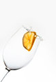
Gravity splash!by Snorri94Comment: It's not an appliance in my understanding, but considering that pictures of glasses are far more difficult it is very well done. |
 Photographer found comment helpful. Photographer found comment helpful. |
| 08/20/2009 06:22:38 AM |
The Black Kettleby sfaliceComment: The silhouette would not be recognizable without the title. Therefore it's quite abstract, but not enough abstract for an abstract. I don't know if you see what mean, sorry fot not being clearer. But I would probably have gone for the full silhouette and increased the blacks (edge). |
| Photographer found comment helpful. |
| 08/20/2009 06:15:35 AM |
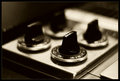
OFFby glad2badadComment: A beautiful composition of an "uninteresting" object shows the talented photographer. I like the yellow tone. |
| Photographer found comment helpful. |
| 08/19/2009 10:38:21 AM |
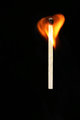
A match to the heart by Gretel Ehrlichby Ecce_SignumComment: Greetings from the Critique Club :)
My first impression: I do really like minimalistic pictures, therefore I was an instant fan of your photo (voted 9). It exhibits a pure and flawless aesthetic.
The subject has its elemental interest. The heart shape is instantly recognizable, looks great and is consistent with the title/challenge.
The composition deviates subtly from a classical rule of thirds approach. This introduces some dynamism and tension into the picture. The match could be moving upwards, but the horizontal placement does not sustain this suggestion. Out of curiosity, I tried some 'filling the frame on the heart' approaches or rotating in order to straighten the heart. But your version works best for me. Of course, perfection would be to place the flame in the position where the heart of a human body would be ;-)
Technically it looks quite perfect. Maybe the lighting is a bit strong or too frontal, as the wood textures are a bit washed out, but that's definitively nitpicking.
Overall, my first impression stays: it is a great picture and I am quite astonished that it was not more successful. My personal conclusion: loads of negative space can be very spectacular in some pictures, but without an instant WOW reaction people do not overly like it. You might also have received some nasty shoehorn votes.
If you have questions about this critique, please contact me.
Mike |
| Photographer found comment helpful. |
| 08/18/2009 03:48:22 PM |
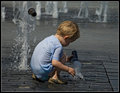
"Fountain Boy" by Neil Brantby ConnorComment: Reminiscent of "Taking Cover" (one of the site favorites). It's a picture which just comes to life as soon as you see it. Brilliant! |
| Photographer found comment helpful. |
| 08/13/2009 04:51:11 PM |
At workby Rino63Comment: Greetings from the Critique Club :)
The first impression coming from this picture is about round shapes, so it definitively meets the challenge! There is an interesting contrast with the triangular shapes of the tire pattern which are adding some dynamism, along with the angle of view.
The choice of a tire is actually a good idea, as there are several concentric circles in them. From this point of view, the almost central composition on this subject is a good choice and there are some nice framing elements.
Technically it is quite perfect: good focus & exposure. There is a great contrast in the mid-tones which accentuates the dirt on the tires, a look that works well for a building machine.
So why did it score so low? As there are no obvious faults, it must be the lack of interest. Your title is 'At work'. Yet the wheels and the whole machine looks terribly static! I think it would have done much better if there would be some dust flying around those wheels: this would trigger the imagination, you would begin to hear the engine,... You know what I mean?
In summary, it is a perfectly executed photo, which just lacks some inspiration in order to produce the DPC-sacred WOW effect.
If you have questions or remarks about this critique, please contact me.
Mike |
| Photographer found comment helpful. |
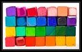
| 08/10/2009 06:19:50 AM |
Coloring Cubesby JeniYComment: The shapes of the individual squares are very interesting to look at. You found the right mix between new and used ones. It would be a great picture without the broad black frame which weakens the lovely colors. The subject is well delimited as it is and does not need framing (at least not with a dark border). |
| Photographer found comment helpful. |
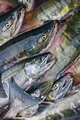
| 08/05/2009 01:13:16 PM |
A Brutal Endby volcom36Comment: Greetings from the Critique Club :)
First of all, congratulations! I was looking for another great picture I do remember from this site, in order to compare it with yours. I went through the 25 pages you get after searching for 'fish' and did not find it. But I found that yours was the best from the photos with lots of fish!
So what's a picture of fishes about?
First of all it is about great shapes. The shape of an open mouth is striking and you did well to place it in the center of your composition in order to draw the attention. The tail is another prominent shape and it works well in a corner, but the bottom right part gets a bit lost in the chaotic background.
Secondly, it's about patterns. Again, the diagonal alignment works very well and the one fish lying in the other direction (tail) disturbs the pattern nicely. The pattern would be more effective if it was a bit more regular, but I suppose you could not rearrange them before shooting.
And lastly it's about great shiny colors. Here you missed a bit an opportunity to trigger the WOW-reaction which is so important on this site. I would have played a bit more with curves and saturation or even better tried the LAB technique described here: //ronbigelow.com/videos/videos.htm
From the technical side, your photo is very good. I'm just not sure about the narrow depth of field, it does weaken the pattern and is perceived as a fault when it is not obviously intentional. I would have used f/5.6.
With a subject which is not necessarily the favorite pet of most of the voters, you did really well. I'm sure you have a great future on DPC! If you have any questions about this critique, please contact me. |
| Photographer found comment helpful. |
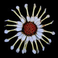
| 08/03/2009 04:51:08 PM |
crazydaisyby korpenComment: Greetings from the Critique Club :)
My first impression was of strong weirdness. It comes mainly from the irregular radial angles and is reinforced by the rolled-up petal and the faded colors. The square composition delimiting the round flower makes the irregularity of the petal even more obvious than any other composition would be. All this conveys perfectly well the trait of craziness you needed from your chosen username.
The technical execution of this photo is perfect, as far as I can tell. However, I am not sure if HDR was useful here. Unlike your entry in Flowers II, where you visibly increased the range of color tones, the effect is more subtle here. The first time I saw your image was on a cheap LCD monitor and the colors looked terribly flat. The second time was on a high-end screen and it looks fine. HDR seems dangerous to me for web publishing, if not used in order to achieve tones with higher contrast.
I think you took the challenge seriously and created a meaningful picture. In other words, you produced a very fine piece of art, where every element fits neatly together and creates an original mood. I guess you knew before entering that it is not necessarily the most DPC-friendly of subjects, therefore your nonetheless respectable score shows that it is very well done!
If you have any questions about this critique, please PM me.
Mike
|
| Photographer found comment helpful. |
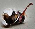
| 07/31/2009 04:13:00 PM |
Coffee_Breakby ambakerComment: Hello teammate! Great post-processing, the subject pops out nicely now. I guess voters are more used to aesthetic water drop pictures and do not appreciate a real splash anymore... |
| Photographer found comment helpful. |
Home -
Challenges -
Community -
League -
Photos -
Cameras -
Lenses -
Learn -
Help -
Terms of Use -
Privacy -
Top ^
DPChallenge, and website content and design, Copyright © 2001-2025 Challenging Technologies, LLC.
All digital photo copyrights belong to the photographers and may not be used without permission.
Current Server Time: 07/30/2025 04:23:42 PM EDT.