| Image |
Comment |
| 09/21/2006 08:01:17 PM |
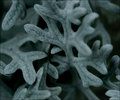
Dusty Miller macroby ShutterPugComment: Thank you for your donation to the Leukemia & Lymphoma Society
This is one more of those photos that makes me really want to go buy a Macro lens! I love how you captured the intricate detail of the fibers on the plant. Filling the entire frame as you did gives a real sense of this being larger than life.
I might have wanted to increase the DoF a little so that the leaves coming toward the viewer are also in focus, but I wouldn't have done that at the expense of bringing the background into focus. |
 Photographer found comment helpful. Photographer found comment helpful. |
| 09/03/2006 11:59:40 PM |
|
| Photographer found comment helpful. |
| 08/31/2006 08:24:30 PM |
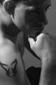
edit1.jpgby mecfcostaComment: Thank you for your donation to the Leukemia & Lymphoma Society
Great shot! The lighting in this photo is very dramatic! I really like how his face is in shadow, it adds a little suspense to the shot. This works quite well in B&W. I like the expression of his pose. It makes you wonder what he may be thinking about. You did a great job conveying "deep thoughts". The one thing I might have done differently is not crop it so tight. His tattoo and the top of he ear are right on the photo's edge. Adding just a little bit more room around those elements would allow the lines in this photo to be more natural.
Thanks again for your donation!!
|
| Photographer found comment helpful. |
| 08/30/2006 11:04:09 PM |
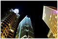
Peachtree at 14thby ericwooComment: Thank you for your donation to the Leukemia & Lymphoma Society!
Great wide angle shot! I really like the three different styles of building together. This perspective makes them look as if they are almost all the same height. I imagine that this must have been a fairly long exposure since the buildings are so well lit. One thing I would try to adjust is the purple flare on the right side. Well done! (I really need to get a wide angle lens) |
| Photographer found comment helpful. |
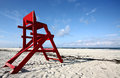
| 08/30/2006 09:26:16 PM |
The Chairby Jaded_HousewifeComment: Thank you for your donation to the Leukemia & Lymphoma Society!
The first thing that strikes me is the great color contrasts between the chair and the sky. I really like the low perspective of this, it feels like you are just lying on the beach enjoying the morning sun. Only thing I might have done differently would be to add a little more saturation to the sky. A little bit stronger blue would really make the clouds in the distance pop out.
Thanks again for your donation! |
| Photographer found comment helpful. |
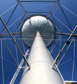
| 08/21/2006 10:01:24 PM |
A Day's Worth of Waterby NoellaSueComment: Hello from the Critique Club!
First off, let me say congratulations on your highest scoring photo so far!
The perspective of this shot is wonderful and meets the challenge perfectly. You achieved great symmetry in this shot and all the support cables provide a lot of interesting visual lines.
There is very little here that I can be critical about. However, I do find that the lighting is a bit harsh for my taste. Bumping down the brightness a bit would help with this as well as make the sky a slightly deeper shade of blue. In fact, adding a little more blue to the entire picture may make it just that much more dramatic.
So, did you have to break through a fence or something to get this close? ;-)
|
| Photographer found comment helpful. |
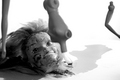
| 08/15/2006 11:10:01 PM |
Disassembledby moviemanComment: Hello from the Critique Club!
This strikes me with the feeling of a Alfred Hitchcock movie. It gives the feeling of horror, but not by blatantly showing it. Being in black and white is what really pulls this off. The position of the doll's head makes this even more creepy. She is staring at nothing, with a slight grin- she never knew what was coming. >-)
The high key and noise work well for this shot. It adds to the tension you have created. The lighting is another well used element. It is like someone opened a door letting the light in, and this carnage is what they found.
Well done! |
| Photographer found comment helpful. |
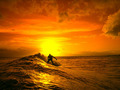
| 08/13/2006 02:53:55 PM |
Calm In The Stormby MPRPROComment: Hello from the Critique Club!
My first impression was that this shot is too busy, but this is solely because of the person on the left that is looking at you. Everyone else is doing their own thing and not paying any attention to you or the reader. This fits well with the Zen theme in so far as they are "tuned out" of the picture. A second shot, taken from a step or two to your right would have been perfect.
The DoF works well in this shot. The people in the far background MAY be looking at you, but since they are out of focus, you can't tell, and therefor they don't matter.
I like the motion blur of the people that are moving. This give a feeling that the reader is in her own time, and everyone else around can do whatever they want and it won't disturb her.
I think what really hurt your score is the person on the left, and the fact that this photo takes more time to understand the "Zen" of it than most voters will give it. |
| Photographer found comment helpful. |
| 08/13/2006 02:35:00 PM |
|
| Photographer found comment helpful. |
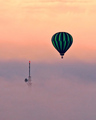
| 08/13/2006 02:32:40 PM |
UP by cloudsmeComment: Amazing! This one is going in my favorites! |
| Photographer found comment helpful. |
Home -
Challenges -
Community -
League -
Photos -
Cameras -
Lenses -
Learn -
Help -
Terms of Use -
Privacy -
Top ^
DPChallenge, and website content and design, Copyright © 2001-2025 Challenging Technologies, LLC.
All digital photo copyrights belong to the photographers and may not be used without permission.
Current Server Time: 08/12/2025 09:29:58 AM EDT.