| Image |
Comment |
| 05/09/2007 10:39:08 PM |
Solemn Dignityby MarjoComment: Cute, Right now she is thinking "I'm going to be queen one day", Good job. |
 Photographer found comment helpful. Photographer found comment helpful. |
| 05/09/2007 10:38:29 PM |
Viva! Cinco de Mayoby boyd2000Comment: I think that this is more of a memory shot than a submission picture. There are spectators at the bottom of the image that take away from the actual potential that this image has. There are people in the background that makes the view look there. IMO there are to many distracting objects in this image.
Looks like you had a good time though.
Good Luck |
| Photographer found comment helpful. |
| 05/09/2007 10:35:21 PM |
Cinco de Mayo Paradeby geahsklzComment: Way too much going on here in this image. My eyes are going all over the place to see everything that is going on. Not real sharp but I can understand that they were probably moving when you took this shot right? |
| Photographer found comment helpful. |
| 05/09/2007 10:34:11 PM |
The front dancerby birkinComment: IMO it looks just like a snapshot and could use a touch up with processing. Looks like a neat showing though. Just doesn't have that DPC pop that everyone likes to see so much.
Good Luck with the challenge. |
| Photographer found comment helpful. |
| 05/09/2007 10:32:09 PM |
any comments?by cutoutComment: I really don't care for things like this. It's creative yes but it's just not intresting. Sorry but I don't like it. |
| Photographer found comment helpful. |
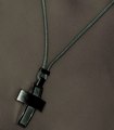
| 05/09/2007 10:22:27 PM |
Orthodox Weekendby dstrahinovComment: I find this image a bit grainy for the subject at hand. IMPO I would only use a grain for an image that I want it to look rough, dirty, or something in that nature. I understand that some camera's just produce a ton of image grain (mine being one) but lighting really helps with that. Speaking of lighting, I see that you didn't have much light here. When you want some of your subject to look faded you should fade an entire side of the image so everything flows nicely.
I like the cross and the idea but there are just a few things that do not fit the image,
1 - The lighting
2 - The amount of room that is on the lower corner just below the cross. It looks like it is just too close to the image to look staged.
3 - The image Grain.
4 - The slight shadows at the top and the right of the image. Not really distracting like many say but it does stand out like a sore thumb.
Try using the color balance and levels adjustments when processing your images, It really helps and brings out a lot.
Good luck mate. |
| Photographer found comment helpful. |
| 05/09/2007 10:14:28 PM |
low tideby whiterookComment: I think that just because the challenge is something like "bubbles" you shouldn't just take a picture of some standard bubbles. The whole idea behind DPC is so one and get better and learn from their mistakes and other uses. If you notice the difference between your's and 1st it's the creativity, color, pop, the actual shot taken and the wow factor. Many of your critiques said that this image was boring and uninteresting, well I agree with them. It looks like you were just walking along a beach, looked down and was like Oh bubbles. ::snap:: Take your time and think about what you would like to use as a picture. Think about "what can I do that is really creative (or looks creative) that really stands out from everyone else"?
The reason your picture was given 183 F's or D's was because that is what you put out there. If you didn't study for the test you will fail. Don't take anything I said personally as I do not know you or any of your situations. I am only posting a comment to try and help you improve. Good luck
|
| Photographer found comment helpful. |
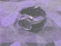
| 05/09/2007 07:43:32 AM |
Sports Watchby Fairfield20Comment: ouch, looks very blown up and hard to see the subject. Looks like you need a better phone camera. lighting needs to be stonger and try useing a macro if you have the ability. |
| Photographer found comment helpful. |
| 05/08/2007 08:24:19 PM |
|
| Photographer found comment helpful. |
| 05/08/2007 08:23:00 PM |
You would not... WOULD NOT ! by robaComment: This is a really awesome idea but it looks blurred at the top of the fish bowl and the light is reflecting off it too. |
| Photographer found comment helpful. |
Home -
Challenges -
Community -
League -
Photos -
Cameras -
Lenses -
Learn -
Help -
Terms of Use -
Privacy -
Top ^
DPChallenge, and website content and design, Copyright © 2001-2025 Challenging Technologies, LLC.
All digital photo copyrights belong to the photographers and may not be used without permission.
Current Server Time: 06/23/2025 07:19:34 AM EDT.