DPChallenge: A Digital Photography Contest You are not logged in. (log in or register
 
Browse Settings
Currently viewing:
Registered UserHarz_Joerg

Show comments:

Per page:

Order:

Comments:


Comments Made by Harz_Joerg
Pages:   ...
Showing 41 - 50 of ~256
Image Comment
Overview to the Underworld
01/27/2004 03:29:46 PM
Overview to the Underworld
by banmorn

Comment:
Greetings from the Critique Club

Initial thoughts/My opinion
Great point of view, right on the topic. Took me quiet some time to get what it is though.

Content/Composition
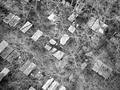
This is of course a very special point of view you have form your apartment! The view to the trees from far above is already very special by itself, but the grave stones just top it. Very good choice.
However, the image is a little confusing: it takes some time to get what one is looking at: first there is the network of the tree branches and then one sees some rectangular bright "thinks". Only at the very top one can see that there are actually grave stones. Then, after reading the title the image becomes of course clear.
A more clear, easier to get portion (maybe just the top) and a tighter crop or more zoomed in would have been better.
As mentioned by others, the image appears to be a little bright/low contrasted. Darkening it would probably improved it a bit.

You mentioned that the trees should resemble their roots under the grave yard. While I do see the intention, it didn't work well for me: even if I try to imagine this, my brain switches back to the inverse, real scene. Doesn't matter much though.

Camera work - Technically
Focus seems fine although the image is a little fuzzy due to the many branches, but this is not important. Exposure see above.

Digital Processing - Technical
You did a good job on sharpening: not too much, just right.
A border might have been nice.

Fits the challenge
Of course, very good!

Good luck for your upcoming submissions
Photographer found comment helpful.
Electric Laces
01/27/2004 02:11:24 PM
Electric Laces
by Geo_Griffin

Comment:
Great job on the image itself and the final result. It's of course very much Photo-Shopped, but who doesn't like shopping :)
What I like most are the thin, pale lines of the tip and in the very back as contrast to the bright laces. Good luck.
Photographer found comment helpful.
Home on the Range
01/24/2004 05:14:01 AM
Home on the Range
by Shannon

Comment:
Great earthy colours and nice background too.
I would have placed the Bisson more on the right, so that it is directed into the image rather then outside of it.
Photographer found comment helpful.
The Highland Cow (Scotland`s hardy breed)
01/24/2004 05:11:16 AM
The Highland Cow (Scotland`s hardy breed)
by geewhy

Comment:
While I like this hairy cow (reminds me a little on our dog :)) to me it is a little too tightly cropped at the top.
Nice colours and well focused though.
Photographer found comment helpful.
Shy
01/24/2004 05:08:54 AM
Shy
by dr rick

Comment:
I do like the great smile of the girls eye, I can almost hear her giggle. I don't see to much "shy" in the image though, more "hide and seek". Also the foreground rose disturbs a lot.
Photographer found comment helpful.
Heartland Morning
01/24/2004 05:02:27 AM
Heartland Morning
by cshep

Comment:
Nice warm colours and well composed. I think that it is a little to dark and the bright upper left does not look too natural to me.
Photographer found comment helpful.
Bush Living  'tradition without technology'
01/24/2004 05:00:23 AM
Bush Living 'tradition without technology'
by camelotnorth

Comment:
I really think that this could be a image in NG: well chosen topic and shows real life. I would have preferred if it had a warmer colour cast. Right now the white are to bright, a little bit into yellow would give the image a more natural look.
Good luck.
Photographer found comment helpful.
Restrained Movement
01/23/2004 06:07:51 PM
Restrained Movement
by Konador

Comment:
Greetings from the Critique Club
Hi Ben,
got you again. Seems we are linked somehow.

Initial thoughts/My opinion
Great close-up, like the texture of the rusty iron. POV not the first thing that comes to my mind. Would make a great image to hang on the wall, maybe as triptych.

Content/Composition
The composition is just great: could be a textbook presentation for rule of third and also leading line. I also like that the back part of the axle adds due to its brightness a further element to the image and it is not only background. The shapes (gear wheel, chain and axle bearing) are simple and thus easy to understand and look at, although one does not know to what it belongs. But this is not important.
I like the texture of the metal very much.
Also I like the light: very gentle but still due to some soft shadows enough depth.
I would have composed the DOF a little different though: a little wider with everything sharp starting from the lower left up to the whole gear wheel leaving only the back part of the axle blurred. But this is really the only part where I see improvement.

Camera work -technically
Nothing to mention here: exposure, focus etc. just right.

Digital Processing - Technical
Very good selection of duo-tone, sharpening set right and the border works great to me: for such an image I feel a border is a must.

Fits the challenge
Actually I don't see a special POV in this image, to me it is more a close-up. However, that is really my personal view and I had this problem in one or another way with most submissions to this challenge.

Good luck for your upcoming submissions
Photographer found comment helpful.
Protest in Mexicali
01/23/2004 03:01:39 AM
Protest in Mexicali
by cimarron98

Comment:
To me this would fit better to photojournalism and for that topic it's well made: the protesters have interesting faces and look strong.
However, I don't know thing such political iamges would be shown in NG.
Photographer found comment helpful.
The Mask - Unveiling Man's Disguise
01/23/2004 02:57:32 AM
The Mask - Unveiling Man's Disguise
by Spanish_Grease

Comment:
I do like the strong contrast between the mask and the white background. Would have loved it to see some more details on the mask. Also the crop is too tight for my taste.
Like the strong colours. Good luck!
Photographer found comment helpful.
Pages:   ...
Showing 41 - 50 of ~256


Home - Challenges - Community - League - Photos - Cameras - Lenses - Learn - Help - Terms of Use - Privacy - Top ^
DPChallenge, and website content and design, Copyright © 2001-2025 Challenging Technologies, LLC.
All digital photo copyrights belong to the photographers and may not be used without permission.
Current Server Time: 06/18/2025 04:15:40 PM EDT.