| Image |
Comment |
| 02/03/2004 06:21:19 AM |
Spirit of Hamleinby KoriyamaComment: Like it very much, also the texture of the background.
It should read Hamelin though (I acctually lived 20 kilometers apart from Hameln, as the town is called in German).
Good luck! |
 Photographer found comment helpful. Photographer found comment helpful. |
| 02/01/2004 04:31:45 PM |
Thistle and beeby trainComment: Greetings from the Critique Club
Initial thoughts/My opinion
Fine image, fitting the challenge very well. It has some technical issues though.
Content/Composition
Insects and flowers work always well, especially for this challenge. In contrast to many other "simple" flowers the thistle is something special: due to it's thorns it's a "stronger", less lovely flower. However, you composed it showing how beautiful it is.
Unfortunately the bee is turning its back on the viewer, but there was probably not much to do against this "camera"-unfriendly behaviour.
I thing you cropped the image a bit too tight at the top while the lower border is too low: the bee and colourful part of the thistle are somewhat squeezed in the upper left edge.
Camera work -technically
Focus seems fine, at least when judging it by looking at the thistle. DOF is set well too. Same for light and white balance. That the bee is fuzzier is probably due to its fast movement.
Digital Processing - Technical
Maybe I'm wrong, but the image looks like being a small section out of the original picture. It looks over sharpened, at least at the thistle and the grainy structure of the background might be caused by the sharpening too. Increasing the colour saturation a bit might have been nice too.
Fits the challenge
Yes it does very well fit to NG.
Good luck for your upcoming submissions
|
| Photographer found comment helpful. |
| 02/01/2004 04:12:44 PM |
Close-up Featherby vtruanComment: Greetings from the Critique Club
Initial thoughts/My opinion
Great play of colour and texture/lines. Too artistic and not scientific enough to fit for NG IMO.
Content/Composition
What a colourful image! I like the bended lines and also how you arranged them along the diagonal. Having the upper right more blurred is nice too. The compositional problem I do have with the image is the fact that it is not clear at all what I am looking at. Even with the title I don't know what part of a feather and what bird's feathers I see. Thus having more in focus would have worked better IMO.
Camera work -technically
Focus is way too narrow, even the sharpest parts are not very clear. Light and exposure are fine.
Digital Processing - Technical
No issue here. Seems that not much digital work has been applied and it is also not necessary too.
Fits the challenge
Here I see the problem I and the voters had: it's more an artistic image and not one of the very clear and crisp NG-images one has in mind. Showing microscopic features do fit for NG but it should be more like "Aha, that's how things look in detail!" and not "What is it?".
Good luck for your upcoming submissions
|
| Photographer found comment helpful. |
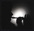
| 01/31/2004 11:38:06 AM |
Sparkling personality by timmiComment: Wonderfully creative and right on the schallange. Do like how the boy is lit by the light. One of my favorits. Good luck |
| Photographer found comment helpful. |
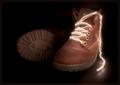
| 01/31/2004 08:48:30 AM |
Old Bootsby agwrightComment: Not sure how this was done, but it is one of my favorits for sure. I especially like how you set the light on the boots. A 9 from me. |
| Photographer found comment helpful. |
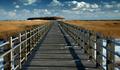
| 01/30/2004 05:46:31 PM |
Crystal Clearby dg02Comment: Greetings from the Critique Club
Initial thoughts/My opinion
Great clear image, speaking of lines, texture and a wonderful sky. To me it does not work for National Geographic too well.
Content/Composition
You captured at the right moment a wonderful place: as your title says the image speaks by its clear and crisp appearance. The leading line of the bridge, the texture of its wood and of the surrounding field work very well together. That the walk leads to the small forest makes the horizon more interesting and the great clouds make the image complete.
I really can't see any flaw here.
Camera work -technically
You did a great job technically: focus, exposure and white balance all set very well.
Digital Processing - Technical
Also regarding the post processing no issue to be mentioned. Especially the sharpening is well done: not too much, just right.
Fits the challenge
To my personal taste the image comes short here: I cannot envision a story that comes with the image. The title would have been a possibility to give the viewer an idea in what context to place the beautiful image.
|
| Photographer found comment helpful. |
| 01/30/2004 05:18:19 PM |
Ancient Artifactsby SamaraComment: Greetings from the Critique Club
Initial thoughts/My opinion
Nice looking antique ceramics, a bit soft/unsharp and the selection of background and light is not too well.
Content/Composition
The two bottles are really nice and fit well to the challenge topic. Also how you placed them and cropped the image is OK.
The main issue of improvement is regarding the background and the light. I would have chosen a darker one to better contrast the not too dark ceramics. Maybe also with some shadows on the ground and the background.
Speaking of shadow I want to address the light: it is set rather flat. The light is set very homogeneous and the objects are well exposed everywhere. However, this style would be more appropriate for an archaeological journal or catalogue: it's rather clinical without too much atmosphere. For instance some soft light from the right would have produced some shadows and thus more depth.
Camera work -technically
Focus is OK, but the DOF seems a bit narrow: the ceramic in the back is less sharp. White balance and exposure are fine.
Digital Processing - Technical
A bit more sharpening would be fine, also border.
Fits the challenge
Yes, it fits well, could envision it in an archaeological article.
Good luck for your upcoming submissions
|
| Photographer found comment helpful. |
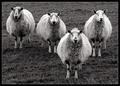
| 01/30/2004 02:59:08 AM |
Four of a Kind by KonadorComment: Congrats Ben!
When I saw it during the voting, I thought: that's Ben's because he's right now pretty much in B&W and the sheeps look very British too.
Keep up the good work! |
| Photographer found comment helpful. |
| 01/28/2004 06:33:00 AM |
Year of the "Three Little Pigs"by bjallenComment: This is just wonderfull: you captured a great moment of all three of them jumping. Of course would be nicer if you would have panned the camera and thus get them sharper. However, such a shot is so difficult to take and a on-time chance that panning was probably not possible. Good luck to you and from me a 9 |
| Photographer found comment helpful. |
| 01/28/2004 06:29:02 AM |
Four of a Kindby KonadorComment: That's a great one: B&W works wonderfully and the cropping/framing too. What did you tell or do to the sheeps to make them look this way?
Good luck! |
| Photographer found comment helpful. |
Home -
Challenges -
Community -
League -
Photos -
Cameras -
Lenses -
Learn -
Help -
Terms of Use -
Privacy -
Top ^
DPChallenge, and website content and design, Copyright © 2001-2025 Challenging Technologies, LLC.
All digital photo copyrights belong to the photographers and may not be used without permission.
Current Server Time: 06/18/2025 04:16:10 PM EDT.