| Image |
Comment |
| 04/08/2003 10:23:04 AM |
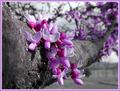
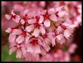
Virginia Redbudby AaronComment: I like the composition of this photograph. The use of color and depth of field are very well done. The background is far enough out of focus as to not be distracting, and the blossoms in the foreground appear to be well in focus. The exposure is very good here, I can’t find any blown-out areas and the lighting is not too harsh. The only suggestion I would make on this photograph would be to try it at different times of the day. From looking at the shadows underneath the flowers it appears that you shot this one around noon. I would try it in the early morning around sunrise or in the late evening as the sun is going down depending on which direction the tree is facing. I think that lighting might eliminate the dark shadows underneath the flowers and could bring out the color more. Good job here, I gave this picture a 7.
Greg
|
 Photographer found comment helpful. Photographer found comment helpful. |
| 04/08/2003 10:15:36 AM |
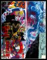
Graffiti in the Sunby greenem2Comment: This is not one of my favorite subjects but I think you have done a good job with it. I think it meets the color challenge very well and overall I think the picture is well done. The shadows add a lot to the photo. I don’t know if you planned it this way or not but they really help the composition and make the picture more interesting for me. There certainly is a lot to look at here that would be missed by the frantic reviewer trying to get through the whopping 300 submissions from this week, but I am glad I took the time to look at it. The more I look at this picture the more I like it. I really can’t think of anything I would change about it. I gave this one a 7.
Greg
|
| Photographer found comment helpful. |
| 04/08/2003 10:09:23 AM |
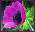
Natures Beautiful Colorby DianaComment: First, I think that this photo meets the color challenge very well. You have made good use of depth of field here and the exposure looks dead on. I like the angle at which you photographed the flower and that you picked a good specimen. The only real qualm I have with this photograph is the cropping. I think it might be more effective if the bottom of the flower was much closer to the lower right hand corner of the frame. The tight cropping at the top and the left-hand side of the picture are uncomfortable for me and I don’t think the OOF areas to the right and bottom add much to the photograph. Because the DOF is so narrow here (and I think it should be for this picture) the stalk for the flower is barely discernable and the flower almost appears to be floating in mid air. You could stop down the lens some to bring it closer to being in focus but I am afraid this might bring out distractions in the background also. Different cropping can hide the stalk and make the composition more comfortable while keeping the DOF the way it is. I gave this one a 6. Good job.
Greg
|
| Photographer found comment helpful. |
| 04/07/2003 11:00:43 PM |
Space Bubble#1by 'PongComment: I like this idea. The colors are very important to this photo and I think it meets the challenge very effectively. I like the simplicity of the picture as well as the use of symmetry. I gave it a 5.
Greg
|
| Photographer found comment helpful. |
| 04/07/2003 10:48:31 PM |
Blue sky over Red hill and Yellow Rosesby lambrosiComment: I am not sure exactly what this is I am looking at but that doesn’t really matter. You have a nice use of color here. It looks like a throw pillow but I can’t figure out what the blue is. I don’t really care for the white spots on the blue. The pillow looks like it might stand to be in a bit sharper focus. There really isn’t a lot here to hold my attention. I gave it a 4.
Greg
|
| Photographer found comment helpful. |
| 04/07/2003 10:37:27 PM |
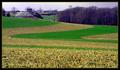
Earth Tonesby alanfreedComment: I like the use of color in this picture and think it is very appropriate for this challenge. The composition is very nice and the only thing I would like to see different is the sky. This is pretty much just a nit pick and a very minor point, but the sky looks a bit overcast and gray in this picture. It would be nice to see some blue skies and white clouds. I know this can’t really be helped and I totally wouldn’t worry about it if I were you. Overall this is a great capture. I gave it a 6.
Greg
|
| Photographer found comment helpful. |
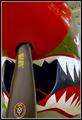
| 04/07/2003 10:31:54 PM |
Flying Tigerby pncowleyComment: Great subject and the color plays a strong role in the picture so it meets the challenge well. The cropping is a bit tight for me, I would love to see more of the airplane. I would also suggest opening the lens up a stop or two to throw the celing out of focus. The way it is now is somewhat distracting. Good shot! I gave it a 5.
Greg
|
| Photographer found comment helpful. |
| 04/07/2003 10:26:14 PM |
Pinkby BAMartinComment: I like the color and DOF in this photo. This looks like the kind of result I get when I use my 50mm f/1.8 lens wide open. The out of focus areas are nice and smooth which is very pleasing to the eye. I am not thrilled, however, by the dark area on the bottom right side of the photo. It might work if you just cropped it out along with the OOF area on the top of the photo. I think the subject is a little too centered for my taste. You might run a light USM over this one to sharpen it up a little more. I think this is a good effort and I gave it a 6.
Greg
|
| Photographer found comment helpful. |
| 04/07/2003 10:20:31 PM |
Limited Edition (Renewed rivalry)by zerocusaComment: This is a cool idea, but I think I have seen something very similar in an earlier challenge. It is definitely a clever idea. You might try some sort of diffuser over your light source(s) in order to reduce the hot-spots on the cans. The most critical one being on the Coke can. I know this probably couldn’t be prevented but I find the red area below the Pepsi can to be a little displeasing. I am not sure if this is the case but it looks like there is some clipping in the highlights on the drop-cloth in the background. For me these highlights detract from the photo. You might have had better luck using a wider aperture to throw the background more out of focus. I gave this one a 5.
Greg
|
| Photographer found comment helpful. |
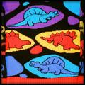
| 04/07/2003 10:14:34 PM |
Colorful Dinosby GeneralEComment: This is a cool photo and I think it meets the color challenge but I wonder if it isn’t pushing the rules some. To me this appears to be a picture of artwork. Aside from that I think you should have cropped it so the edges of the box(?) are not showing. Focus looks good and the colors are nice and strong. Good shot here, I gave it a 4.
Greg
|
| Photographer found comment helpful. |
Home -
Challenges -
Community -
League -
Photos -
Cameras -
Lenses -
Learn -
Help -
Terms of Use -
Privacy -
Top ^
DPChallenge, and website content and design, Copyright © 2001-2025 Challenging Technologies, LLC.
All digital photo copyrights belong to the photographers and may not be used without permission.
Current Server Time: 08/20/2025 10:46:16 AM EDT.