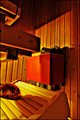
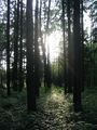
DPChallenge: A Digital Photography Contest You are not logged in. (log in or register
 
Browse Settings
Currently viewing:
Registered Userdiablo2097

Show comments:

Per page:

Order:

Comments:


Comments Made by diablo2097
Pages:   ... ...
Showing 111 - 120 of ~188
Image Comment
...a lump of purest green.
06/09/2006 08:06:36 PM
...a lump of purest green.
by xianart

Comment:
no idea what it is, bbut lol looks cool
Photographer found comment helpful.
Churchill Park
06/09/2006 08:06:14 PM
Churchill Park
by Joost

Comment:
nice angle... needs some more detail however
Photographer found comment helpful.
New Kid On The Grass
06/09/2006 08:05:55 PM
New Kid On The Grass
by pitsaman

Comment:
tighter crop
Photographer found comment helpful.
Avocat Vert
06/09/2006 08:05:11 PM
Avocat Vert
by rubienne

Comment:
nice dof
Photographer found comment helpful.
Violin
06/09/2006 05:21:29 AM
Violin
by leilanicoles

Comment:
Critique Club
Composition
I like the idea, and I like the way you set it up so that you only see one side of the face. Cropping could have been a little tighter, and perhaps more even (looks a bit uneven to me). Also, i think one of his shoulders is higher htan the others... get your bf to stand straight :P. Also, the violin insignia is nice, but could have been slightly sharper. Finally, maybe some sort of an expression wouldn't have hurt.

Technical
image isn't very well in focus. Its a bit blurred. Maybe thats from using the dodgy tripod setup... might be worth investing in at least a cheap one.

Processing
Not a fan of the digital haircut... Contrast is too sharp between background and hair, and so it looks artificial. Also, you could try lightening the eyes a bit to bring them out.

Overall
Nice concept, but the sharpness just isn't there, and the processed looking hair detracts. I see this is your first entry, which is pretty good. Hope the comments are helpful, and hope to see increasing scores :)

Feel free to pm me
Photographer found comment helpful.
Sauna heater
06/07/2006 07:58:28 PM
Sauna heater
by greslizzz

Comment:
Greets from the Critique Club

Composition
First thing that strikes me, and what i really like is the colour... awesome tint to the whole pic, and sets a real atomsphere. Unfortunately however, why i believe it didn't score too high is that the picture is too cluttered, there's too many distractions from the sauna heater. Also, its hard to tell that it is a sauna heater. perhaps focus on something more easily recognisable with less clutter around in the frame would have done nicely. Did i mention i really like the colour? :P

Technical
excellent technically, everything is in focus (though perhaps this is contributing to the distracting elements). picture is beautifully sharp, the grain on the wood shows really nicely. No real qualms with technical side of the picture

Post processing
The colour is really nice, and i'm not sure if a little curves/selective colour could have tweaked it just a little more to make it more appealing, but i do really like the colour here anyway. Not sure if you sharpened, butsome of it looks a little jagged edged. Also, maybe a different crop to hide more of the distracting elements would be nice.

Overall
Great idea, and i like the colour. Could have even labeled it first light from the sun (but then voters might DNMC), as the colour really does seem like first light or so... Declutter, find a target for the eye to be drawn to, and prefferably something more recognisable, and it would have done aweseome

Feel free to pm me if you would like to discuss
Photographer found comment helpful.
Green II
06/07/2006 09:48:51 AM
Green II
by tlalonde

Comment:
noisy on the left of the image
Photographer found comment helpful.
Trees and Leaves
06/07/2006 09:47:36 AM
Trees and Leaves
by bjoern

Comment:
harsh exposure....
Photographer found comment helpful.
Lemons
06/07/2006 09:43:47 AM
Lemons
by TomMMD

Comment:
background is distracting... and pick a slightly healthier lemon :P
Photographer found comment helpful.
Carnival
06/07/2006 09:42:58 AM
Carnival
by mato

Comment:
too bright... needs more focus... too much blur
Photographer found comment helpful.
Pages:   ... ...
Showing 111 - 120 of ~188


Home - Challenges - Community - League - Photos - Cameras - Lenses - Learn - Help - Terms of Use - Privacy - Top ^
DPChallenge, and website content and design, Copyright © 2001-2025 Challenging Technologies, LLC.
All digital photo copyrights belong to the photographers and may not be used without permission.
Current Server Time: 08/01/2025 09:35:15 PM EDT.