| Image |
Comment |
| 01/05/2004 12:23:21 AM |
Main Street Chirstmas Dayby TooCoolComment: All this needs is a vintage automobile parked on the corner. Nice job. The person in the middle of the road looks a bit odd to me. |
 Photographer found comment helpful. Photographer found comment helpful. |
| 01/05/2004 12:20:45 AM |
make a wishby shutterflyComment: I like the mood created by the lighting on this photo, but unfortunately, it leaves me with little to see. Still, it is well done. An angle with the cake in center and the person's face behind it lit slightly by the candles might look good too. Oh, and happy birthday = ) |
| Photographer found comment helpful. |
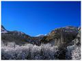
| 01/03/2004 01:26:57 PM |
Mountain Passby mtreitComment: The resolution is excellent here, even with the 640x480 crop. I like the blue tones in the sky, but the time of day also casts more shadow on your scene. I would prefer a bit more light in the valleys, but it is also nice the way it is. Nice work. |
| Photographer found comment helpful. |
| 01/03/2004 01:24:50 PM |
Reflected Dawnby KazComment: This is pretty interesting. Was the reflected light actually in the scene or was it added as part of the extended rules? I like the aged appearance of the doors. |
| Photographer found comment helpful. |
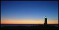
| 01/01/2004 12:32:30 PM |
Star Lightsby BeagleboyComment: The colors and subject in particular are great in this shot. I think the green light in the lighthouse adds an interesting touch. -10- |
| Photographer found comment helpful. |
| 12/19/2003 01:52:53 AM |
Frozen Delightby jrs915Comment: I think less DOF (to make the background rocks blurry) or more to bring it all into focus would work better here. With the limited depth of field used, it gives slightly more of an impression of missed focus. I like that the stone in the middle right is sharp, but the rest of the image doesn't really lead my eye there. |
| Photographer found comment helpful. |
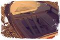
| 12/19/2003 01:49:27 AM |
Sub-marine?by robsmithComment: I would like to see the original colors of this photo. The colors used are not very strong at conveying the old worn out message of the subject. Also, I don't think the framing choice is necessary. You have a good subject, just a little too much editing imho. |
| Photographer found comment helpful. |
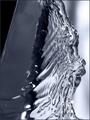
| 12/19/2003 01:47:18 AM |
Aquaeby colorosilenceComment: I like the texture, reflections and overall shape of this a lot. Compositionally, I think the black diagonal on the left is unwanted, and I would consider maybe rotating this to make the water diagonal to the frame. Other forms of cropping might work well too. Nice work. |
| Photographer found comment helpful. |
| 12/19/2003 01:43:52 AM |
|
| Photographer found comment helpful. |
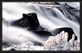
| 12/18/2003 11:22:13 PM |
Water & Ice by oskarComment: Actually, I think I prefer your outtake (the one from the forums), but still, this is a very nice picture, and I'm sure you will do well with it = ) |
| Photographer found comment helpful. |
Home -
Challenges -
Community -
League -
Photos -
Cameras -
Lenses -
Learn -
Help -
Terms of Use -
Privacy -
Top ^
DPChallenge, and website content and design, Copyright © 2001-2025 Challenging Technologies, LLC.
All digital photo copyrights belong to the photographers and may not be used without permission.
Current Server Time: 07/21/2025 07:03:06 PM EDT.