| Image |
Comment |
| 01/18/2003 01:52:16 AM |
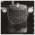
Smile!by greenem2Comment: Hehehe... this is cute! I never would have thought of a tractor like that :-) The black and white makes it look old fashioned which is pretty cool . Only thing I would say is cropping part of the bottom off might have been more effectual -7- |
 Photographer found comment helpful. Photographer found comment helpful. |
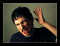
| 01/18/2003 01:32:51 AM |
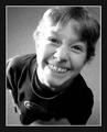
Silly Boyby SonifoComment: This is definitely a humorous photo... the angle you took it at and the look on his face, not to mention the addition of his braces really makes this funny to look at. Like one of those birthday cards that are blank inside or something. Good choice of using black and white as well. There are a few things that to me drop the score a tad. The lighting on the left side of the picture especially on his face and neck is much too harsh. His face seems to blend in with his neck, and its a shame some of the hair is blown out at the top because that would have very nicely framed his face... I like your choice of cropping part of the head, because it makes it look like he's lifting is face to fill the frame. It looks like there is wood or something in the upper right hand corner which is slightly bothersome... I would have had him move a little so you didn't get that in the frame and would be able to keep a purely solid background. -7- Good luck! |
| Photographer found comment helpful. |
| 01/17/2003 12:55:02 PM |
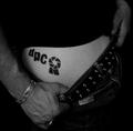
My New Tatooby AnachroniteComment: This is DPChallenge at a new level! I really like your idea here, I think it's very funny... at least I hope it is, and that it isn't real ;-) Great photo... I love your composition... I love the framing of the tattoo by the clothing. I would have liked more contrast, but thats just me. Good choice of black and white though. Good luck! -8- |
| Photographer found comment helpful. |
| 01/17/2003 12:51:01 PM |
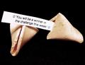
Lucky Cookieby kandyjComment: This is great, I wish I could get a fortune cookie like that and that it would come true! Great composition, I really like the 3-d look to this, given to it by the shadow that falls over the cookie. The only thing I might try to be aware of next time is your background, and the white fuzz or spots on it. Otherwise great photo! -9- Good luck! |
| Photographer found comment helpful. |
| 01/17/2003 12:47:44 PM |
OW! I HATE It When That Happens!!! by albright1Comment: This is absolutely great, and very funny! Nice job... I love theexpression on his face, and I think that the composition is excellent as well. The lighting is pretty good... I like the fact there is more light on the leeft side of the photo which I think adds to the pencil coming out of the guys nose. The one thing I might have tried to watch out for is the little red thing on his shirt... even though it is a tiny thing, it takes my eyes from his face quite a bit. Still a solid 9... good luck! |
| Photographer found comment helpful. |
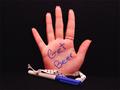
| 01/17/2003 12:44:43 PM |
Redneck Palm Pilotby ShiiizzzamComment: This is my favorite submission for the humor challenge. Nice job... it definitely got your point across while at the same time managing to be a very nice photo. I especially like the fact that you used a woman's hand for the photo, I think it adds to it :-) The lighting on here is excellent, and I like your choice of centering and horizontal photo, I think the black space really helps draw your eyes to the hand. Excellent job! Good luck! -10- |
| Photographer found comment helpful. |
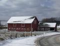
| 01/16/2003 03:46:03 PM |
THE BARN IN GLENWILLOWby STEINRComment: When I saw the thumbnail of this I thought, wow cool, it looks like a painting... then when I made it bigger I still thought it looked pretty neat, but I also saw a few minor problems with it that really bother me. For one, I think the angle you took this at kind of gave it a tilted look. Also I'm not sure the horizon is completely straight... Turning this in photoshop or a similar program might have helped with that. I don't mind the fact that you have the roadsign or the road in there... they add the modern look... but maybe you should have worked to keep from shooting the telephone pole coming out of the right side of the barn or house... that is fairly disturbing to me. Otherwise this is a really cool photo, and I gave it a 7. Good luck! |
| Photographer found comment helpful. |
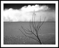
| 01/16/2003 03:39:11 PM |
Desertby JackoComment: This is totally awesome. I love the way you added some depth to it with the plant in the foreground, and this picture makes me think of an Ansel Adams. Awesome! Also this photo would not have been as cool without the texture at the bottom of the page in the (sand?) Very well done! One of my 10's for the week. Congrats and good luck! |
| Photographer found comment helpful. |
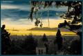
| 01/14/2003 09:29:33 PM |
Golden Gateby GeneralEComment: This looks unnatural and more like a painting then a photograph. I really don't care for whatever you did, I'm guessing in photoshop or a similar program. This would have been a really cool photo just in black and white, not sure why you choose to do such dramatifc stuff with the coloring. Just having the piece of the stteple is kind of bothersome, but I love your framing of this shot. |
| Photographer found comment helpful. |
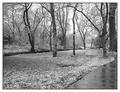
| 01/14/2003 09:06:21 PM |
Winter Serenityby crabappl3Comment: Excellent composition on this photo! I love the way the lines of the sidewalk and the line of the creek cross paths, that is where your eye is drawn to. I think this might have been cooler with just slightly more contrast but it's a really neat photo. I like your perspective of looking down rather then up... it looks like a very peaceful walk! You get a 9 from me! Nice job and good luck! |
| Photographer found comment helpful. |
Home -
Challenges -
Community -
League -
Photos -
Cameras -
Lenses -
Learn -
Help -
Terms of Use -
Privacy -
Top ^
DPChallenge, and website content and design, Copyright © 2001-2025 Challenging Technologies, LLC.
All digital photo copyrights belong to the photographers and may not be used without permission.
Current Server Time: 08/20/2025 05:33:50 PM EDT.