|
|
|
Showing 671 - 680 of ~776 |
| Image |
Comment |
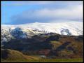
| 01/22/2003 07:52:31 PM | Down the valleyby amnonComment: Critique Club
This is a beautiful, very classical looking landscape photo, that is well composed, and nicely proportioned. The bottom part of the photo has some nice colors to it, and is nice and sharp and bright, however the haze takes away from the entire photo, the way it covers especially the upper left hand corner. I suggest for this trying a haze filter to cut out some of the haze, or if that doesn't work, maybe try a polarizing filter, which might bring out the blues more in the sky. I love the lines in this photo, especially the way that they come out of the corners, They all kind of come together on the bottom left hand corner, which gives you a good start for a focal point for the entire picture. Once again, I think your biggest problem here was the haze, and maybe shooting at a different time of day might have helped if that was possible.
Technically the only thing wrong with the photo seems to be your lighting and exposure. Otherwise the rest of it is very good. I think you fit the challenge well. This would be an awesome photo, if you have the chance to go shoot it again. Good luck in your next challenges! |  Photographer found comment helpful. Photographer found comment helpful. |
| 01/21/2003 10:07:18 PM | Seasonsby auroraComment: Critique Club
This is an awesome photo! I love the contrasts between the green at the bottom and the snowy mountains at the top. Those mountains must go to some pretty high altitudes! :-) My favorite thing about this photo, is the sense that you can stay on the photo, and just circle around looking at it, and the closure that the clouds at the top give it. Your exposure here is excellent, you were able to catch the details both in the dark and the light parts of the photo which can be quite tough. Also the blue sky really adds some color to the overall photo, which is nice. Your focus here is perfect, and I like your use of DOF, allowing for everything to be in focus... which is very important for this particular photo. The fact that it looks like you went just at the right time of day is a big part of what makes this photo so nice, the light at that time was simply perfect for what you wanted. Although I'm not usually a big border fan, I like your use of borders here, the single pixel greenish border really adds to the photo, then encircled by the black border it finishes it off. I like your composition here, the whole photo seems to lead you to the upper right hand corner, and I like your layering as well...The one thing that bothers me is maybe how it looks just slightly tilted, but it's very hard with things that aren't straight. Overall you have one beautiful photo here! I hope you enjoyed that lovely walk in the Lake District as much as I've enjoyed looking at and analyzing your photo. GREAT job! | | Photographer found comment helpful. |
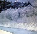
| 01/21/2003 09:53:30 PM | Japanby KimInNBComment: Critique Club
The layered effect you have here, and the choice to not have it in color, but just to have a blue tint to this made for a really neat looking photo! I love how you go from flat, plain white in the left hand corner, to some texture in the stream, to the trees, but they don't cover everything because they have no leaves, to the pine trees because they block out almost everything behind them. Your use of contrast here is very eye catching. The one thing that bothers me is how the top pine trees just slightly get cut off... thats not a very big problem though. Your composition here is beautiful, you can definately follow the lines, and your eyes wander over the whole photo, but know when to stop without running off the page. The lighting is almost perfect, except for in the upper left hand corner, it kind of turns into a dark blob and loses it's details, the rest is beautiful. Your exposure is excellent, especially in not having the bottom left hand corner too bright, it can be hard with snow. You did a wonderful job of meeting the challenge and you have a gorgeous photo here. Nice job of using your photographers eye to catch this lovely, peaceful site! | | Photographer found comment helpful. |
| 01/21/2003 09:44:20 PM | At the Parkby kandyjComment: Critique Club
Hi Kandyj, wow! handheld at 1/8 shutter speed, not bad, not bad at all!
Your sepia here looks slightly pink to me, I think it kind of gives the photo an early morning look which I can't decide whether I like or not. Nice job on using your rule of thirds, and the flower, or plant sticking up in the upper left hand corner adds to the composition. I really think this was nicely composed. The foreground in the photo to me is slightly busy... besides in the upper left hand corner, on the nice calm water, I'm not sure where my eyes are supposed to be looking. The lighting looks pretty even here, and there are no drastic shadows that I can see, though there may have been in the original, hidden by the sepia. Personally I wouldn't really consider this to be a classical landscape, however it does fit the definition of landscape. The contrast in here looks rather dull, the entire picture seems to be almost the same color which is fairly bothersome, it's almost got a greyish pinkish film over the entire thing. Overall the photo leaves me wondering what the rest of the pond/lake/whatever looks like, and thinking that the ground isn't extremely interesting to me. Although I like the rocks, I think this wasn't a very exciting subject. I'd be interested in seeing more photos that you took during this outing. Good luck on your next challenges! | | Photographer found comment helpful. |
| 01/21/2003 05:15:26 PM | "Snow" Outletby DougPazComment: This is beautiful! truly a great photo. I love this picture.. I think it is simple, yet imaginative, and I love the angle you shot it at. Solid 10. Good job! Good luck! | | Photographer found comment helpful. |
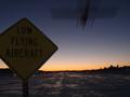
| 01/21/2003 05:06:31 PM | Low Flight at Nightby av8orboyComment: Wow... excellent catch here! I would have liked a little more lighting on thee sign, but it's understandable why you couldn't get that. The horizon also isn't quite level, but that is a minor problem. Even though there are a couple of problems here, I give you a -9- great job! Good luck. | | Photographer found comment helpful. |
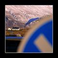
| 01/21/2003 05:02:34 PM | Living behind the Signby arnitComment: I think this picture would have been positively awesome if you had used a different DOF, putting your aperture at highest it would go, would have allowed the sign to be in focus as well as the background. The colors here are great, as are you use of composition. The sign being out of focus is just really bothersome though. Nice creative use of the challenge. -8- good luck! | | Photographer found comment helpful. |
| 01/21/2003 04:58:09 PM | Roadsign?by jonrComment: Nice catch... I maybe would have tried cropping off a little more at the top, and maybe some on the left but that is just personal oppinion. I like the bend in the sign, I think it adds character. Good luck. | | Photographer found comment helpful. |
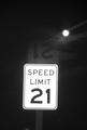
| 01/21/2003 04:56:32 PM | Broken Lawsby DJLubaComment: Are you sure this isn't the drinking limit? hehehe... interesting effect you have here, it would be interesting to see how you did it. I didn't know any place had a speed limit of 21, but thats a little too slow for me :-) Oh well... hopefully I won't come across that road anytime soon... You did a very nice job of having the sign not too bright as well as the moon, nice job of using exposure... also I like your composition, the moon in the upper right hand corner is a nice touch. Good job, and good luck! | | Photographer found comment helpful. |
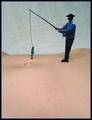
| 01/19/2003 06:23:16 PM | Fishing Holeby DougPazComment: Critique Club...
Yup this is definitely a strange land :-) I love the idea behind this picture... its similar to a sledding picture with sleds on the body, but this is such a cool idea! :-) The first thing I really notice is how much I like the composition here! I really think you did an excellent job with that! I also like the white background, it makes it almost look like snowy hills or maybe a bunch of clouds, I like the extra texture that background puts into the photo. Your dof is pretty good here, I like the way the front of the picture is just slightly blurred, so you can't tell what it is until you get closer to the "fishing hole". I think this is a neat effect. The one thing that really takes my eye away from the photo as a whole is the tape that is holding the fisherman up.... I'm not sure what you could have done there... but it is slightly bothersome... though I understand why you had to put it... The fisherman is kind of weird the way you can clearly see his shirt, but not his face... I think this would have been better if either you could see the details in the fisherman, or you could just see a sillouhette of the entire little guy. I do like the fish though. I wonder how this picture would have looked in black and white? It might have been a neat thing to try. Overall I definitely think your picture got your idea across. Its an adorable photo, that I think should have had a better score! Nice job. Good luck in future challenges!
-Talya | | Photographer found comment helpful. |
|
Showing 671 - 680 of ~776 |
Home -
Challenges -
Community -
League -
Photos -
Cameras -
Lenses -
Learn -
Help -
Terms of Use -
Privacy -
Top ^
DPChallenge, and website content and design, Copyright © 2001-2025 Challenging Technologies, LLC.
All digital photo copyrights belong to the photographers and may not be used without permission.
Current Server Time: 06/21/2025 12:01:34 PM EDT.
|