| Image |
Comment |
| 06/11/2003 04:05:13 PM |
PC-Worldby zeranicoComment: Whatever is in the front and blurry is very bothersome... I guess I don't know enough about computers to know what I'm looking at here. Interesting with the smoke or whatever in the background. This could be the beginning of a cover photo. |
 Photographer found comment helpful. Photographer found comment helpful. |
| 06/11/2003 03:55:44 PM |
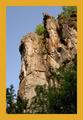
National Geographicby InnaNComment: It's too bad the subject looks slightly out of focus, this really could have been great. I like the subject here, could definitely fit on National Geographic, although I feel shooting down was not the best way to capture this... I think that getting down and shooting up might have been more effectual for this shot. Just my opinion though. Great subject for the challenge. |
| Photographer found comment helpful. |
| 06/11/2003 03:53:58 PM |
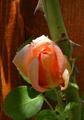
National Geographicby pncowleyComment: The yellow looks very off on this, not at all the color NG uses, this looks more orange less yellow. The photo is nice, not overly fantastic though, I'm not sure it's NG quality. It leaves room for type though which is good. |
| Photographer found comment helpful. |
| 06/11/2003 03:51:08 PM |
Jackson Perkins Rose Catalogby kavamamaComment: Question... is a catalog a magazine? I'm just curious this is not meant to be offensive. I guess I think of magazines as something informational or entertainment, and usually not specifically trying to sell something. thats what I think though. Your photo is nice, not spectacular but nice. I would have liked some different lighting so that you got more vibrant colors and made the flower pop a bit more. wow those thorns look nasty! |
| Photographer found comment helpful. |
| 06/11/2003 03:37:03 PM |
Star Light Expressby donpramComment: Personally I do not consider magazines to be in a horizontal shape... thats just me though. I have no clue what the theme of Star Light Express Magazine is... I can't seem to find it on Yahoo. I'm not doubting that it's a real magazine, it's just I have no way to judge whether your photo would be good for the cover or not. Sorry. |
| Photographer found comment helpful. |
| 06/11/2003 03:27:49 PM |
National Geographicby alexmfinComment: I think I might have gone with another magazine than National Geographic for this photo... I don't often seen just flowers on the front of NG. Just my opinion though. Pretty nicely done photo... a little bright at the bottom, and since the rest is in focus I think I would have liked to have seen it all in focus. This is a nice flower macro but because of the magazine you chose to use, i don't think it fits the theme. Thats just my opinion though. |
| Photographer found comment helpful. |
| 06/11/2003 03:21:38 PM |
Travel & Leisure (Cincinnati)by lecalanComment: Very nicely done night photo. I could definitely see this as the cover of a magazine. I'm wondering if there's not enough room for type though? It's a pretty picture that definitely could have done without the border. Not sure many magazines use borders, just something to think about. I really like how the bridge leads you into the city. |
| Photographer found comment helpful. |
| 06/11/2003 02:33:16 PM |
Garden Designby DennisFComment: This is beautiful... very professional looking. I like the way you have it on a black background. Everything is perfectly in focus, Very well done. I could definitely see this on the front of the magazine you chose after going and looking at the website you posted. However, I think you should have thought more about putting the border as it doesn't look to me like the magazine has a border on it... it goes all the way to the edges except for maybe just at the top. Beautiful photo though! I'm noting the border, but I've decided not to take away from your score because of it. -10- I think you should think about submitting this to that magazine... :-) Good luck. |
| Photographer found comment helpful. |
| 06/11/2003 02:26:31 PM |
Runners worldby kengurinnComment: Great stop action shot... unfortunately the subject doesn't quite look in focus... looks like your focus is on the background and not the guy... You could definitely put wording at the bottom of this, if this was in focus it would have been great. |
| Photographer found comment helpful. |
| 06/11/2003 02:10:02 PM |
Architectural Digestby TarbiniComment: I like this... looks very professional. Nicely done with the area at the top for text. I could definitely see this as the front of a magazine. Good luck. |
| Photographer found comment helpful. |
Home -
Challenges -
Community -
League -
Photos -
Cameras -
Lenses -
Learn -
Help -
Terms of Use -
Privacy -
Top ^
DPChallenge, and website content and design, Copyright © 2001-2025 Challenging Technologies, LLC.
All digital photo copyrights belong to the photographers and may not be used without permission.
Current Server Time: 08/21/2025 08:49:42 PM EDT.