| Image |
Comment |
| 06/20/2003 03:19:14 AM |
The allowed on DPC version :(by dimitriiComment: LOL... oh gees... nice job. very interesting and intriguing. why did you choose to leave out the head? I like what you did with the border inside of the all editing allowed area, because it doesn't really change the photo, just enhances it. This isn't a perfect photo, but I'm going out on a limb and giving it a -10- good luck! |
 Photographer found comment helpful. Photographer found comment helpful. |
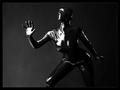
| 06/20/2003 03:16:56 AM |
Plastic Surgeryby DrJOnesComment: A DrJones portrait? This is wonderful, the black (latex?) is so form fitting, you can see the every movement, against the grey background, which technically is a shade of black it's very well done. the lighting, everything is well done here. If that is indeed a real person, which I assume it is, how does she breath? -10- |
| Photographer found comment helpful. |
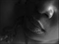
| 06/20/2003 03:09:36 AM |
ojinikaby SatelliteSpeckComment: What a sensual photo. The strands of hair at the side make this picture. I really like it. The soft feel of a not too sharp photo, which I'm guessing was intentional to go with what looks to be a kind and soft person. Simple and nice... a well done photo. Good luck! -9- |
| Photographer found comment helpful. |
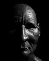
| 06/20/2003 03:05:12 AM |
Dignityby PaulkComment: Interesting... hard to tell if this is an old man, or a mask. I really like it. The eyes kind of bother me, I wish I could see them more, they look so sunken and eerie. I think in this case I would have actually liked to have seen more of the left side of the face, it is almost too black, but I guess thats the challenge. Awesome texture here! -8- |
| Photographer found comment helpful. |
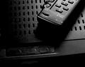
| 06/20/2003 03:03:22 AM |
My entertainment centerby camelotnorthComment: I know that this was an open editing challenge, but what you did to this photo makes it, in my mind, appear to be overprocessed, and look like a drawing/water color or something. I'm not sure I really care for what you did here. I think that emphasis on a photography website should still be put on the original picture more than the editing, even in an free for all editing challenge. Just my opinion though. |
| Photographer found comment helpful. |
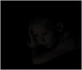
| 06/20/2003 03:01:37 AM |
Timeless Youthby dodobirdComment: The thumb looks pitch black, the photo looks fricking awesome! Very cool usage of both low key photography and black on black. excellent job! I'm guessing quite a bit of this was done in photoshop, but it's just very well done. I like your use of negative space on the left side of the photo, makes you wonder what this kid is looking at. Once again... well done, this is the photo that first caught me eye, it's the first one I'm voting on, so it's definitely my first 10 :-) Good lucK! |
| Photographer found comment helpful. |
| 06/18/2003 12:53:09 AM |
Crazy Bankerby JackoComment: Hehehehe... Jacko... you do look pretty crazy here. This is GREAT! Wonderful use of negative space, excellent lighting... great juob of blending into the background.. this is so cool. I also love the cropping of it, and how skinny and tall it is, gives us an idea of how you think of yourself too ;-) A perfect 10 in my eyes. Love, RiderGal... when we meet you can touch my thingy ;-) |
| Photographer found comment helpful. |
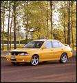
| 06/16/2003 11:47:54 AM |
Sport Compact Carby RefractedComment: NICE JOB making this a vertical, it would have been so easy to make it a horizontal. Nice looking car. I like your lighting and your composition in this photo, it's very well done. The trees add a lot to this... as if to say, sporty in the country. Plenty of room for type. Very well done. |
| Photographer found comment helpful. |
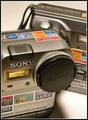
| 06/16/2003 11:46:47 AM |
Digital Photography: DPChallenged... "The Mavica Gang"by ISivicComment: LOL... this is cute. Nice shot of the cameras.. good job making this a vertical. Not sure I would have put the border, most magazines don't have borders, and I'm not big on them, but thats just me. I think I could definitelly see this as the cover of the said magazine, but prolly not with that headline The shadow is kind of bothersome, but not too bad. Good luck! |
| Photographer found comment helpful. |
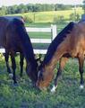
| 06/16/2003 11:45:31 AM |
Thoroughbredby LeahStephenComment: The color on this and the graininess aren't very good... I like the two horses and where you put them in the photo, but I think it could have been improved. Good job leaving space at the top for type. I would have played with Photoshop or similar program on this. |
| Photographer found comment helpful. |
Home -
Challenges -
Community -
League -
Photos -
Cameras -
Lenses -
Learn -
Help -
Terms of Use -
Privacy -
Top ^
DPChallenge, and website content and design, Copyright © 2001-2025 Challenging Technologies, LLC.
All digital photo copyrights belong to the photographers and may not be used without permission.
Current Server Time: 08/21/2025 09:25:11 PM EDT.