| Image |
Comment |
| 02/22/2006 09:26:00 PM |
|
 Photographer found comment helpful. Photographer found comment helpful. |
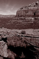
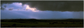
| 02/22/2006 09:25:25 PM |
Devil's Bridgeby LoudDogComment: Not a great lighting condition as the landscape looks 'flat'. No depth from shadows. |
| Photographer found comment helpful. |
| 02/22/2006 09:23:57 PM |
|
| Photographer found comment helpful. |
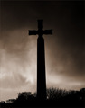
| 02/22/2006 01:18:56 PM |
The Crossby RosskoComment: Really good except for how dark the top right is. It blends in with the top of the cross and makes the power of the shadow less. |
| Photographer found comment helpful. |
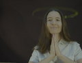
| 02/21/2006 10:48:09 PM |
Spun (self portrait)by RyShuComment: Greetings from the Critique Club!
Hard to say much about this photo. It was an interesting submission for this challenge. The lighting is strange with the bright stripe behind you and there's a large shadow across your face. The long exposure made your face distort which is distracting. I think you probably could've achieved what you were looking for here with a shorter exposure which would have resulted in less 'deformation.' I think this didn't score well because nothing is jumping out of the picture. The idea behind motion panning is to blur the background to give a look of speed to the subject and bring the subject out of the shot. Here, you're blurred too (because it's hard to stay still in the frame) so it's basically just an interesting study in motion panning as opposed to a picture that makes people really interested in the subject. Very clever idea though and definitely very interesting. |
| Photographer found comment helpful. |
| 02/20/2006 12:38:23 PM |
|
| Photographer found comment helpful. |
| 02/20/2006 12:35:02 PM |
|
| Photographer found comment helpful. |
| 02/20/2006 12:31:09 PM |
For These Things.......by missinseattleComment: Great shot. Try and prevent the hotspots from window lighting. Try not to crop off parts of her head (unless you're cropping off a lot to get the face). I actually would've preferred to see a closer crop over her shoulder with her hands and face only. Smaller DOF to remove the distracting bedpost. |
| Photographer found comment helpful. |
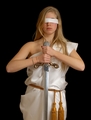
| 02/20/2006 12:28:27 PM |
Justiceby smykComment: Same shot I was trying to do...it's a little hard to see justice without the scales. |
| Photographer found comment helpful. |
| 02/20/2006 12:27:29 PM |
Hope- A New Day Dawnsby deanaComment: Level your horizon...place it at either a 1/3 or 2/3 of the image (depending on if you want to accentuate the sky or the sea). Nice concept. |
| Photographer found comment helpful. |
Home -
Challenges -
Community -
League -
Photos -
Cameras -
Lenses -
Learn -
Help -
Terms of Use -
Privacy -
Top ^
DPChallenge, and website content and design, Copyright © 2001-2025 Challenging Technologies, LLC.
All digital photo copyrights belong to the photographers and may not be used without permission.
Current Server Time: 08/17/2025 02:28:44 AM EDT.