| Image |
Comment |
| 06/06/2006 04:31:16 PM |
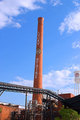
LUCKY STRIKE SMOKESTACKby MelTech1Comment: oooo Greeting from the Critique Club oooo
Challenge
- Relevant to the Challenge? Yes, but aesthetically it leaves me wanting more.
- Is subject unique (vs. unoriginal or rehashed)? Most definitely.
Compostion
- Good or Bad? How can it be fixed? There are two things that draw attention away from the subject (smoke stack) the pipes and mechanicals below the stack and the water tower on the edge of the image. Any time you have a complex pattern (pipes) or an object on an edge it' will draw the attention away from your subject. Simplify your composition here. Rotate your stack to be verticle.
- Good use of Depth of Field? Yes
- Good focus? Yes
Lighting
- Good use of light? Yes. I like the light rounding the edge of the stack.
Aesthetics/Artistic Appeal:
- Colors and ContrastI like the red of the bricks, but the sky looks odd (maybe it's just my monitor.)
- Sharpness. Good.
- What is my reaction or feelings? I think this would have done better in the Industrial Challenge than Architecture. With some work it could be a great image. |
 Photographer found comment helpful. Photographer found comment helpful. |
| 06/06/2006 02:59:48 PM |
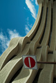
No entry- God's Playgroundby smykComment: oooo Greeting from the Critique Club oooo
Challenge
- Relevant to the Challenge? Hard not to be in this one. ;)
Compostion
- Good or Bad? How can it be fixed? I don't understand why you chose to rotate the image. I might understand if the sign weren't there, but it is and ruins the flow of the building. On or the other needs to change. No Rotate or no Sign.
- Is there anything missing?
- Good use of Depth of Field? Yes. This requires a wide DOF which looks good.
- Good focus? Yes
Lighting
- Good use of light? Yes & No. I like to see more of the shadows, but the design of the building overhang might not allow for thme in that area. I love the shape of the shadows in the bottom portion.
Aesthetics/Artistic Appeal:
- Colors and Contrast. The sky has a funny tealish tint to it and seems oversaturated.
- What is my reaction or feelings? I'd like to see this on re-shot without the sign. If you do go take a ladder with you to get the weight you need toshoot over the sign... |
| Photographer found comment helpful. |
| 06/03/2006 07:22:53 PM |
Memoirsby LalliSigComment: Great image, but I'm having difficulty believing that this is a single artificial light (the catchlights in her eyes are oddly shaped and the quantity of light). |
| Photographer found comment helpful. |
| 05/31/2006 06:07:22 PM |
Clock Tower [high key]by SDWComment: This is NOT high-key. This is high contrast. Open this in your editing software and you'll see a U shaped histogram with spikes on the left and right edges. High-key and low-key are possible do to a lack of contrast.
A high key image has most of it's color dat in the right-most 20% of the graph. You can do this by Using the Hue/Saturation/Lightness dialog to Lighten or push to color data to the right.
Nice image. Good contrast. |
| Photographer found comment helpful. |
| 05/31/2006 12:19:41 AM |
|
| Photographer found comment helpful. |
| 05/26/2006 02:01:18 PM |
|
| Photographer found comment helpful. |
| 05/26/2006 01:50:09 PM |
Got Chalk?by tjbel05Comment: Hmmmm... Okay. So the first issue that stands out is the lighting. Flash=bad. (This rule can be broken, but aren't all rules meant to be?) I like the semi circle shape, but the far right set of hands juts into the center blowing the smooth flow of it. The colors are a bit distracting too. I'd try this as either, desaturated 50% or B&W. |
| Photographer found comment helpful. |
| 05/26/2006 01:09:23 AM |
A Portrait Of A Portraitistby KrisbyComment: I thought when I saw this one that it was a Krisby. ;)
Your lighting is getting better althought the sharp shadow behind the left hand and the high contrast of the right hand with the paper point to a little more work there. Love the work. |
| Photographer found comment helpful. |
| 05/25/2006 10:15:23 PM |
deaddoll.jpgby KelliComment: I hope you didn't get into the poison ivy on the left side of the image... :) |
| Photographer found comment helpful. |
| 05/20/2006 12:28:37 PM |
"i'm just a verb"by RikkiComment: Hey, Rikki, What the hell's up with using the on camera flash? So Unflattering... ;) |
| Photographer found comment helpful. |
Home -
Challenges -
Community -
League -
Photos -
Cameras -
Lenses -
Learn -
Help -
Terms of Use -
Privacy -
Top ^
DPChallenge, and website content and design, Copyright © 2001-2025 Challenging Technologies, LLC.
All digital photo copyrights belong to the photographers and may not be used without permission.
Current Server Time: 08/06/2025 04:57:07 PM EDT.


![Clock Tower [high key]](https://images.dpchallenge.com/images_challenge/0-999/500/120/Copyrighted_Image_Reuse_Prohibited_339821.jpg)