| Image |
Comment |
| 03/02/2008 04:45:30 PM |
Bantuby h2Comment: I wish it had a bit more body under the face as the crop looks to tight to me. Still an excellent job. |
 Photographer found comment helpful. Photographer found comment helpful. |
| 03/02/2008 04:44:20 PM |
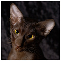
Please Let me outta here! :(by Dirt_DiverComment: You really needed some light in the cat's eyes (although you probably didn't have many chances to do this :D), but it's still worth a 10 for me. Very Cute.
Mike |
| Photographer found comment helpful. |
| 10/28/2007 12:44:17 AM |
?by Art RoflmaoComment: "No Girls Allowed!"
;)
Nice shot.
Mike |
| Photographer found comment helpful. |
| 09/15/2007 03:05:56 PM |
IMG_3529.jpgby BradComment: I think you have cropped it to close on each side and you have her face in too much of a shadow.
Mike |
| Photographer found comment helpful. |
| 09/15/2007 03:04:56 PM |
IMG_3423.jpgby BradComment: I really like this one, although I think it would be better if she wasn't looking the way you have it titled. It makes it seem like she's going to fall forward. But expression, color and exposure are excellent.
Mike |
| Photographer found comment helpful. |
| 09/15/2007 03:03:12 PM |
|
| Photographer found comment helpful. |
| 09/15/2007 03:00:53 PM |
IMG_3474.jpgby BradComment: She's got a great smile in this shot, but I don't care for the angle of the hat and how it cuts across her right eye. Her cloths are too bunched up as well and grabs attention. Good color and focus.
Mike |
| Photographer found comment helpful. |
| 09/05/2007 11:24:58 PM |
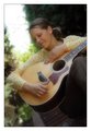
Simply Phoebeby TranquilComment: She's pretty but it's more of a mug shot than a portrait. You have her square to the camera. Get her to sit at an angle (but don't have her point her shoulder at the camera) and then turn her face back towards the camera.
I also agree that the color balance is off a bit. I think your white tent was an off white and was causing a color cast. That should be fixable in Photoshop. If that is a white dress she has on, bring up the Levels palette, click on the right eye dropper and then click on the whitest part of her dress. You can try AutoColor also and see if that fixes it.
Mike |
| Photographer found comment helpful. |
| 07/28/2007 11:12:47 AM |
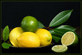
A Slice of Lifeby jrdawsonComment: You have good color, good lighting, good focus, good placement... but I couldn't go above a 7 because your cut lime looks dry and not very appealing. It doesn't have that fresh look to it. Maybe if you had sprizted some water on it to give it a fresh jucy look or used a really fresh lime, it would have helped. I know I would have voted higher. |
| Photographer found comment helpful. |
| 07/28/2007 11:04:38 AM |
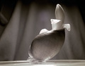
Shell with Flowerby JeffryZComment: I really wanted to give this a 9 instead of the 8, but it took a while to figure out what was off about it. The first thing is it is not level. The straight line of the table shows the slant, which makes the shell look off. A little clockwise rotation would have made the difference. The dark shadow up in the left corner also keeps grabing my eyes. Usually it's the lightest area that attracts the eyes, but in this case, since the contrast of the shell, flower and rest of background are pretty close to the same, it's the dark corner that stands out the most. Nice job over all though. |
| Photographer found comment helpful. |
Home -
Challenges -
Community -
League -
Photos -
Cameras -
Lenses -
Learn -
Help -
Terms of Use -
Privacy -
Top ^
DPChallenge, and website content and design, Copyright © 2001-2025 Challenging Technologies, LLC.
All digital photo copyrights belong to the photographers and may not be used without permission.
Current Server Time: 08/01/2025 12:45:47 PM EDT.