| Image |
Comment |
| 06/08/2006 03:04:22 PM |
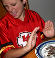
I Don't Care Too Much For Moneyby NoellaSueComment: Greetings from the Critique Club Noella!
At first glance I find the shot to be creatively funny. The look on his face is priceles and I think that this was a great idea.
A couple of things that I think might improve the shot. I sort of understand the tight crop here but you went a bit far with his head and the plate of money. Leaves a sense of incompleteness on the image. Also, the DOF here calls for a smaller aperture (around f8 or so) as it gets a bit of a blur on his left hand and face. Sometimes a shallow DOF is needed but with the hands being a major part of the composition here I think you need both in focus.
Overall a good effort Noella.
Thanks for the opportunity to critique this image!
Cheers - Phil |
 Photographer found comment helpful. Photographer found comment helpful. |
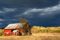
| 06/08/2006 11:43:01 AM |
Stormy-Barnby cryanComment: This is a cool shot. I like the placement of the barn on the left side of the image. We're taught that the subject should usually be on the right side but I think it works well here. Not sure if it's the lay of the land but it seems to be just a bit tilted to the left. I'd try rotating it clockwise a half degree and see what you come up with. Overall a great shot! |
| Photographer found comment helpful. |
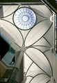
| 06/06/2006 02:36:52 PM |
Palm Treeby whatsthatbeepingComment: Greetings from the Critique Club Tim!
Overall I like the image. The overexposure works well here and crop on the right side with the window barriers is dead on perfect (straight). Great looking piece of architecture indeed.
What got you here is the left side of the shot. The voters want symmetry for ceiling shots, detailing all of the wonderful archtecture. The part on the left is distracting enough for them not to give you many 8's which is needed for a high placement. Technicals are great but the composition just leaves me wanting a bit more.
Thanks for the opportunity to critique this image Tim!
Cheers - Phil |
| Photographer found comment helpful. |
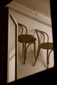
| 06/01/2006 10:27:07 AM |
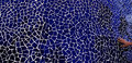
bentwoods.jpgby weiszComment: This is a cool shot. I'd like to see a touch more contrast for my personal preference but it works lovely as a still life. The tone is nice as well.
Cheers - Phil |
| Photographer found comment helpful. |
| 05/31/2006 02:19:16 PM |
Handworkby StructorComment: Oh wow. What a cool shot. The abstractness grabs you then flows to the hand. Colors are beautiful as well. Nice job �orsteinn! |
| Photographer found comment helpful. |
| 05/31/2006 02:14:13 PM |
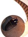
Piano Havenby saintaugustComment: It is a "cool shot". Can't really say anything that hasn't been said already so I'll just say, "Nice work indeed!". |
| Photographer found comment helpful. |
| 05/31/2006 02:07:47 PM |
First Danceby eostylesComment: Emotive - period. Excellent capture of this wonderful moment. I'm sorta fond of the noise but I'd also like to see one without it. I really like it. |
| Photographer found comment helpful. |
| 05/30/2006 04:59:07 PM |
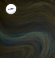
moonlightby daffodilaComment: Greetings from the Critique Club daffodila!
Congrats on your highest score in two challenges entered.
At first glance I see a very creative image. Your choice to shoot on a light background and invert to negative to give the appearance of the moon was a great one. I give the creative thought a 10 here. Technicals, exposure are fine.
As far as the score goes, 5.72 is not bad at all in an open challenge. The choice of background is probably what got you. Many people will give high votes if someone uses a background in the studio for portraits but are not as free with the high scores if an object is placed directly on a background. What is the difference? I just don't have an answer for that. I do think that it night have been better received if you had inverted a night shot, printed it out, placed the lens cap in the same spot as your current image, took the shot then inverted. This would actually make it look like a moon shining down on a landscape rather than a background.
Overall I think it's a great shot that you should be proud of.
Thanks for the opportunity to critique this image.
Cheers - Phil |
| Photographer found comment helpful. |
| 05/29/2006 04:45:02 PM |
|
| Photographer found comment helpful. |
| 05/27/2006 11:36:18 AM |
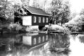
saw millby KronusComment: Beautiful, serene image. I think B&W was a good chioce here. I am also fond of the glow you added. Nice job. |
| Photographer found comment helpful. |
Home -
Challenges -
Community -
League -
Photos -
Cameras -
Lenses -
Learn -
Help -
Terms of Use -
Privacy -
Top ^
DPChallenge, and website content and design, Copyright © 2001-2025 Challenging Technologies, LLC.
All digital photo copyrights belong to the photographers and may not be used without permission.
Current Server Time: 08/05/2025 07:55:37 AM EDT.