| Image |
Comment |
| 05/05/2007 07:29:21 AM |
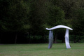
Giant Pi in the Parkby cajayComment: What a perfect spot for the challenge! Were you the one who suggested this one? ;) It looks as though you tried to hide a sign behind the statue, but it's still sticking out a bit. The shot could use just a bit of a clockwise rotation too to level up the horizon. Nice use of the rule of thirds for such a simple shot. |
 Photographer found comment helpful. Photographer found comment helpful. |
| 05/05/2007 07:26:30 AM |
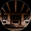
TTby SDWComment: Took me a second to find the pi... it gets lost a bit in the shadows. I like how it repeats though in the next layer back. |
| Photographer found comment helpful. |
| 05/04/2007 11:12:56 PM |
In the Setting Sunby WickedBComment: Greetings from the Critique Club!
My first impression of this photo was that it was difficult to focus in on the focused stalk since it is so small.
I'm a big fan of shallow DOF shots, but this one for me isn't as effective. I like that you've chosen to pull out one particular stem to highlight the textures, but it's so small in relation to the whole shot that it gets lost. Perhaps focusing in even closer from a slightly different angle would have really allowed more detail in the top of the stalk without losing the feel and setting of the background? Or, maybe using an even larger aperture (f/1.8 or f/1.4) to create a shallower DOF would have been enough to separate the stalk a bit more from the background? Just a few ideas.
Also, this seems that it could benefit from a slight rotation since the horizon feels tilted. As far as the rule of thirds, it meets the challenge requirement with the top of the plant, but you also have the horizon and the stalk which are almost on the lines of thirds... perhaps cropping this slightly differently could have allowed you to take advantage of those lines as well.
You've done a nice job at bringing out the warm, golden tones of the sun in contrast to the lovely blues of the water. The whole shot overall has a nice feel to it... makes me want to be sitting there on that dock.
I hope this has been helpful! Please feel free to PM me if you have any questions. Best of luck to you in the following challenges!:) |
| Photographer found comment helpful. |
| 05/04/2007 08:21:29 PM |
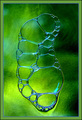
Bubbleby DeniseLComment: Greetings from the Critique Club!
Well, I don't know what I can say that the other commenters haven't already covered. First off, congrats on the top 20 finish! It's well deserved.
I love the flowy feel of the bubble shapes, the variety of sizes in the bubbles, the variety of tones in the background against the blue edges of the bubbles, and the textures. You've given the bubble just enough room around the edges without making it feel cramped or empty. I do have to agree with the one commenter though who said that they weren't fond of the border. I see where you were trying to pull in the color from the bubbles, but the blue line just puts it over the top for me. I would have gone with a simple black (or maybe b/w) border I think.
I love when such simple concepts turn out so beautifully, and this is a great example of that. Nicely done!
Hope this critique was helpful! :) |
| Photographer found comment helpful. |
| 05/03/2007 09:23:09 PM |
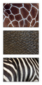
Skinby RissaComment: Oh, this is wonderful! Love how you kept to a theme, yet there are different colors, patterns and textures. Sometimes simple is better! :) |
| Photographer found comment helpful. |
| 05/03/2007 09:23:05 PM |
Embraceby SeanachaiComment: Absolutely love the story this one tells. Something that a mom would be proud to display on her wall. The dandelion stem she's holding onto is a nice touch too. You can just see the child bringing it to her as if it was the best thing in the world! Lovely! |
| Photographer found comment helpful. |
| 05/03/2007 09:23:00 PM |
Day Flows to Dusk, then Into the Nightby The_DentistComment: I love how the shots are seemlessly put together and the light flows. I also like how the trees to the left are fuller, and the ones to the right are more bare... almost as if it is a change in season as it goes across the shot too. My only little nitpick is that the shot feels tilted down to the right. Overall, great idea and well excecuted. |
| Photographer found comment helpful. |
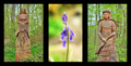
| 05/02/2007 06:10:04 AM |
Lord & Lady of Bluebell Woodsby alpharichComment: I like this idea.. very natural feel to it, and I like the variation in the dof with the middle shot. I think this might have been better for me if the two end shots had been more symmetrcal. Perhaps cropping closer on the left one to make the statue the same size as in the right shot. Nice! |
| Photographer found comment helpful. |
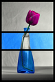
| 05/02/2007 06:05:24 AM |
Destainedby BugzeyeComment: I like this idea... the framing is nice, and I like that it wasn't cut in even thirds. It appears as though there are some desaturated spots on the flower and stem in the top two sections... perhaps from adjusting colors and not sections of the photo? Nicely done though! :) |
| Photographer found comment helpful. |
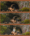
| 05/02/2007 06:01:20 AM |
Chipmuck's homeby ladpupmoeComment: Cute series of shots that work well together. The whole presentation could have been enhanced by a bit of editing... perhaps a contrast or levels adjustment. The top photo looks a bit crisper with more color compared to the other two. |
| Photographer found comment helpful. |
Home -
Challenges -
Community -
League -
Photos -
Cameras -
Lenses -
Learn -
Help -
Terms of Use -
Privacy -
Top ^
DPChallenge, and website content and design, Copyright © 2001-2025 Challenging Technologies, LLC.
All digital photo copyrights belong to the photographers and may not be used without permission.
Current Server Time: 08/17/2025 12:45:16 AM EDT.