| Image |
Comment |
| 05/07/2007 07:28:49 PM |
|
 Photographer found comment helpful. Photographer found comment helpful. |
| 05/07/2007 07:27:09 PM |
|
| Photographer found comment helpful. |
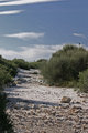
| 05/06/2007 08:46:53 AM |
path.jpgby dewdodesignComment: This shot isn't as exciting for me. The composition just doesn't draw me in as much. I like the line of the path, but something about the sky taking up that top half, and the bird sitting in an odd spot just makes this one feel more awkward. The colors aren't as vibrant as the other shot you posted either. Even a simple adjustment like duplicating the background layer and setting the mode to 'soft light', then adjusting the opacity to something you're happy with might help this one pop more. Hope that's helpful. |
| Photographer found comment helpful. |
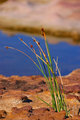
| 05/06/2007 08:40:33 AM |
flower2.jpgby dewdodesignComment: I agree.. nice color and dof, and too bad about the cut off flower at the bottom. I like the way the brown parts of the flower stems are placed in front of the blues so they don't blend in. Good job aligning the angle before shooting. |
| Photographer found comment helpful. |
| 05/06/2007 07:25:19 AM |
|
| Photographer found comment helpful. |
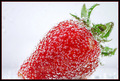
| 05/05/2007 05:34:34 PM |
Berry Bubbliciousby javamooseComment: Greetings from the Critique Club!
Well, 11th place, 35 comments, 2 favorites, and a score of 6.85. I don't know that I can be of much more help here!
Anyway, first impression was that I liked the slightly different take on the challenge. Not to photograph one of those big bubbles, but to focus in on the macro version. The shot is very... refreshing!
Composition is nice... grounded at the bottom, nothing cut off on the top or sides. Maybe just a bit too much empty space to the left? But I do like the few extra bubbles floating around in the background to keep it from being this stark whiteness, which you would have lost had you cropped the space on the left. The lighting is great, and allows the bubbles to be well defined. I love how they cover ever side of the leaves.
I think my biggest nitpick with this one is that red border. I'm just not a huge fan of colored borders. I think replacing that red with a simple white line would have worked better for me.
Congrats on a great image, and a new personal best! Looks like food is your thing to photograph! :)
Hope this has been helpful. Please feel free to PM me with any questions. |
| Photographer found comment helpful. |
| 05/05/2007 07:52:40 AM |
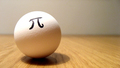
Irrational lottery numberby DjangoComment: Looks like the texture of an egg... Now I'm picturing a bunch of eggs being tossed around the inside of a lotto ball machine now. What a mess! Nice shot though :) |
| Photographer found comment helpful. |
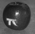
| 05/05/2007 07:44:25 AM |
Apple Piby SoulMan1978Comment: Nice pi... not sure about the b/w choice here... makes the apple look very unappealing to me. |
| Photographer found comment helpful. |
| 05/05/2007 07:38:40 AM |
Roman Piby DanniejeanComment: Nice simple setup and well done. It's hard to find the breaks in the numbers after the decimal... is it 3.1415 or 3.2549? I'm glad I don't have to write like this! |
| Photographer found comment helpful. |
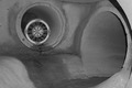
| 05/05/2007 07:33:56 AM |
III:XIVby Les_FeckComment: Ok, took me a while to make the connection to pi... the title was helpful, but I think the III:XIV is a bit too small and blends in too much to be easily seen. You'll probably get a few DNMC comments or votes from folks who don't take the time. I like the variety of circles and flow of the water line which moves your eye around, but the lighting seems a bit dull for this one. Good luck! |
| Photographer found comment helpful. |
Home -
Challenges -
Community -
League -
Photos -
Cameras -
Lenses -
Learn -
Help -
Terms of Use -
Privacy -
Top ^
DPChallenge, and website content and design, Copyright © 2001-2025 Challenging Technologies, LLC.
All digital photo copyrights belong to the photographers and may not be used without permission.
Current Server Time: 08/16/2025 03:50:40 PM EDT.