| Image |
Comment |
| 01/01/2009 10:47:43 AM |
arboreal flotsamby krnodilComment: Leaves, tree, sky? A reflection? Unique. Not sure it'll do great with the voters, but a lot to look at and wonder about within this abstract. |
 Photographer found comment helpful. Photographer found comment helpful. |
| 01/01/2009 10:42:30 AM |
The Fogby rob_smithComment: Love the fog and the shapes in the scene, but not sure if I like the peachy color. |
| Photographer found comment helpful. |
| 12/30/2008 04:03:47 PM |
Sad Clockby ferrygunComment: Greetings from the Critique Club!
First Impression: The face and feet on this one are very easy to spot though there are a few extra "parts" to the head. I do like though that the extras are a bit out of focus though (but there isn't a super sharp part of the shot that I can pick out). Oh, and his eyebrows look a little funny, and I can't tell if that bump should be a nose or a funny mustache! I kind of like the neon green since it adds a nice splash. I don't really get the ring in the front though. I wonder if "sad" is the right emotion for this little guy... confused or surprised at what's in his path perhaps?
After reading about the shot: Yes, I agree... this little guy needed some extra drama. I wonder if some creative lighting could have helped to make this more dramatic... a spotlight on the ring perhaps? Some interesting lighting on the face? Or perhaps giving this a different crop would have worked, allowing more space on the sides and top.
I hope this critique was helpful. If you have any questions about it, please feel free to PM me. I see from your profile that you have returned from a 2 year hiatus... so welcome back to DPC and good luck in your future challenges! |
| Photographer found comment helpful. |
| 12/28/2008 10:14:49 AM |
Botch.....eh?by PikkelComment: Greetings from the Critique Club!
First Impression: I remember this one from voting... the bokeh in the background didn't stand out at first because of the harsh lighting on the front of the candle. An interesting candle for the challenge since the glittery candle would compliment the spots in the background. I think giving the candle more space in the frame though and leaving more of the bokeh in the background would have not only helped the composition, but also the lighting may not have been as harsh if you were further away.
After reading your information: I think you captured the bokeh idea quite well. You placed the candle far enough away from the tree and used a shallow dof to get the nice round circles in the background (which is just one way to use bokeh). Unfortunately, I think one of the keys to bokeh is that it is a background used to enhance the subject (if I even understand it correctly), and you didn't leave enough background to really let it do that job. It also looks like you used a flash, which is a bit harsh on the front. Lighting your candle with a soft light and turning the flash off would have helped with that. You can also diffuse the flash with a sheet of paper to get rid of that harsh lighting.
Last thoughts: Overall, this was a good example of bokeh, but you may have been trying so hard to get the concept down, that you didn't focus enough on composition, lighting etc. Keep playing with those shallow dof's and see what kinds of interesting backgrounds you can get. You're off to a good start!
If you have any questions about this critique, please feel free to PM me! Good luck in your future challenges! |
| Photographer found comment helpful. |
| 12/24/2008 10:05:59 AM |
steaming hotby PixelstateComment: This was one of my favorites in the challenge. I like how the bokeh really becomes the main subject instead of just enhancing the photo. The brightest spots of light are closest to the mug and then dim as they drift away, just like steam would rise from a cup of hot cocoa.
Someone below mentioned the use of a darker table, which could work well, as could a different color mug, but something about the way all of the colors blend together is pleasing for me. Well done! :) |
| Photographer found comment helpful. |
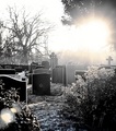
| 12/21/2008 02:44:42 PM |
Gothic Dawnby PaulComment: Greetings from the Critique Club!
First impression: The sun is clearly the first thing that grabs your attention here, and with the position in the sky it seems to fit the challenge. The lack of color is surprising for this challenge, but something different is also refreshing. I like the different tones of the headstones, it helps to set them apart and give depth to the photo. I don't know if it's processing or just the way the photo was shot, but the background trees are jagged, and the foreground has an odd texture about it. The photo isn't something I would hang on my wall, but I applaud the uniqueness of it within the context of this challenge.
Further reflections: After reading your comments, I'm glad that you went in to this with the understanding that it may not score well, but you were willing to take a chance with it anyway as an out of the box type of shot. It may not have scored high (though it did get over your 5.0!), but it garnered a favorite, and some very favorable comments from voters who appreciated its uniqueness!
To improve: I realize you didn't have a lot of flexibility to set up this shot considering where it was taken, but I might have played with the shutter speed a bit, choosing something just a bit faster to keep the sun from being so bright, but while keeping the headstones still nicely exposed. As far as processing, maybe the funny texture I mentioned above came from the neat image?
I hope you found this critique helpful. Please feel free to PM me if you have any questions. |
| Photographer found comment helpful. |
| 12/21/2008 01:15:55 PM |
- - - -by krnodilComment: It's always nice to find those little surprises in a photo when you open it up, just like the beautiful background here. The shot wouldn't be nearly as interesting without it! Great capture! |
| Photographer found comment helpful. |
| 12/21/2008 01:13:44 PM |
Sunrise Warmingby GregoryBComment: This is stunning! Such rich, warm colors, great lighting and perfectly focused. Looking at the snow piled up above my windowsill, this is a wonderful contrast! |
| Photographer found comment helpful. |
| 12/21/2008 12:39:20 PM |
Witheredby JeniYComment: Love the colors, and the shallow dof here... everything is nicely balanced. Great job! |
| Photographer found comment helpful. |
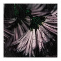
| 12/21/2008 12:34:25 PM |
Pink in grayby MelethiaComment: Looks like they're sweeping the ground beneath them. Beautiful muted tones and the overlay looks like rain running down the windowpane. |
| Photographer found comment helpful. |
Home -
Challenges -
Community -
League -
Photos -
Cameras -
Lenses -
Learn -
Help -
Terms of Use -
Privacy -
Top ^
DPChallenge, and website content and design, Copyright © 2001-2025 Challenging Technologies, LLC.
All digital photo copyrights belong to the photographers and may not be used without permission.
Current Server Time: 08/04/2025 06:57:57 PM EDT.