| Image |
Comment |
| 09/01/2006 01:13:41 PM |
No Fearby gliphixComment: Fantastic how the water and sky all blend together... very unique perspective! :) |
 Photographer found comment helpful. Photographer found comment helpful. |
| 08/29/2006 07:29:32 AM |
Tilesby russiComment: Love the shot with the shallow dof, but I find the border really awkward and distracting. I think it's a combination of the off-balance feel and the harsh black next to the soft pastel blues. |
| Photographer found comment helpful. |
| 08/29/2006 07:27:29 AM |
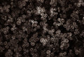
Trianglesby aznymComment: I can't help but search for any 4 leaf clovers in a patch, and this shot is no exception. Love how you brought out the triangles within the round clover edges. Fantastic idea! |
| Photographer found comment helpful. |
| 08/29/2006 07:23:43 AM |
|
| Photographer found comment helpful. |
| 08/25/2006 09:17:28 AM |
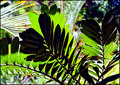
Natures Patternsby sherpetComment: The shadows and patterns here are great! Leaves so much to explore and look at within the photo! :) |
| Photographer found comment helpful. |
| 08/24/2006 07:43:25 AM |
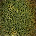
DPC mushrooms 3.jpgby Penny LaneComment: Great shot... love the details of the mossy ground and the simple color, dof and composition. The little bugs are a great addition too! |
| Photographer found comment helpful. |
| 08/24/2006 07:41:51 AM |
DPC orange salt lake.jpgby Penny LaneComment: I can't decide if I like the color or not. It's unique, which is a nice change, but I feel like the color overwhelms the shot, and it took me a bit to actually look at the details of the clouds and plants. Maybe a slightly different shade for a duotone? The details of the desert and the composition are nice here. |
| Photographer found comment helpful. |
| 08/07/2006 10:42:38 PM |
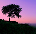
escarpment at twilightby hopperComment: Wow... I was right about the location! This is a beautiful shot, and not the typical angle I've seen shots taken from up there. Great job!! :)
Originally posted by kteach:
Lovely colors... I like the hint of green in the bottom that keeps the entire foreground from being a total silhouette. My first thought was that it looked like the escarpment in Thatcher Park in NY. I'll be back after voting to see where this was taken! :) |
|
| Photographer found comment helpful. |
| 08/04/2006 09:23:55 AM |
Frosty's rarely seen little brotherby cryingdragonComment: You posted in the forums asking for comments to help you improve, so here goes...
As most commenters noted, the shot is out of focus, which is it's biggest downfall. You did attempt to give it a background of some sort, which is a good start, but the poor lighting also didn't help your cause. Perhaps finding a white balance setting on the camera would help to get rid of the yellowish cast to the picture. And in reading your comments, you said that you did this last minute just to get it in. Usually, I'd say that is one of the things that dooms a photo in the challenges. Not giving yourself enough time to properly set up, shoot and process a shot and putting it in a contest with hundreds of other photos which people have taken the time to work through is setting it up for failure in most cases. Better to just sit out a challenge than to enter something that you're not happy with or proud of.
Hope something in this comment was helpful to you... and good luck in future challenges! |
| Photographer found comment helpful. |
| 08/04/2006 09:18:18 AM |
Gamesby cryingdragonComment: You posted in the forums that you were looking for comments on how to improve... so here goes.
When I look at this photo, it doesn't scream wow to me. It's a very contrived set up and for taking so much time to set it up, I'd think you'd have been a bit more careful about making it more precise. The spacings on the bottom row are uneven, and the dice are slanted at slightly different angles. With such a symmetrical type of shot, any deviation from an exact setup draws attention to itself I think.
The lighting was good for what you were trying to achieve, but as others commented, a bit more contrast might have helped. You also lost some light down in that lower corner, which also draws attention to itself.
Overall, it's just kind of a flat shot. Meets the challenge, was a creative idea as far as technique, but just not executed as well as it could have been.
Hope this was helpful. |
| Photographer found comment helpful. |
Home -
Challenges -
Community -
League -
Photos -
Cameras -
Lenses -
Learn -
Help -
Terms of Use -
Privacy -
Top ^
DPChallenge, and website content and design, Copyright © 2001-2025 Challenging Technologies, LLC.
All digital photo copyrights belong to the photographers and may not be used without permission.
Current Server Time: 08/09/2025 07:20:14 AM EDT.