| Image |
Comment |
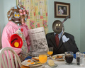
| 02/12/2007 06:31:52 AM |
Domestic Blissby AnnComment: Thanks for sharing the setup and story beind this one in the comments section... always fun to come back and find out how these creative shots are created! Great job!! |
 Photographer found comment helpful. Photographer found comment helpful. |
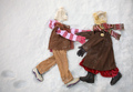
| 02/12/2007 06:28:36 AM |
Snow Fun!by JulieGComment: I would have loved to see how you set this one up in the Photographers comments... I'm amazed that the only footprints are from the child, and I also wondered how big these clothes were to see where you'd been shooting from to get a direct look down. It's an adorable shot, and was one of my top picks. |
| Photographer found comment helpful. |
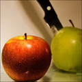
| 02/12/2007 06:25:13 AM |
Fearby SaraRComment: Hrm, I didn't get that the apple was sweating when I looked at it. It's interesting to come back and see how others viewed the photo. |
| Photographer found comment helpful. |
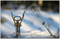
| 02/12/2007 06:24:08 AM |
Hey.. Get Back Here!by DeniseBernadetteComment: I liked this shot, but didn't really get the title when I voted. It looked more like the whisk was bullying the guy, or yelling at him. Perhaps Emerkaza's title of "Beat It" would have worked better? Either way, I still like this one. The little trail leading up to the corkscrew is a nice touch too... like he walked there on his own! :) |
| Photographer found comment helpful. |
| 02/12/2007 06:21:38 AM |
Ginger, the Cowgirlby TonyTComment: I love this one! Others do have a point that the background is pretty irrelevant to the shot, perhaps a nice desert brown would have been better? And a nice warm light, with a small reflector bouncing up under that dark hat? I still think it's a great idea! :) |
| Photographer found comment helpful. |
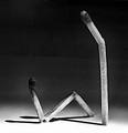
| 02/12/2007 06:15:51 AM |
If you only listened to meby zaflaboutComment: I came back to see who did this one, since it looked like my little guys from last week... and look who it is! :)
I like your lighting setup more than I liked mine... much more dramatic, and I don't know if it was intentional or not, but I like that you have the sitting match with his head bent over a bit (I broke mine off and had to glue it back on, so I know how difficult that is to do). You also handled the b/w conversion nicely, using a full range of tones.
I think the glue splotches, the grainy quality (though, it looks like you may have tried to soften it up a bit), and the uneven line in the background probably worked against you. Had those technicals been better, this would have done really well I think!
Looking at your EXIF, I'm confused about why you used a 70-300 lens, and a 10 second exposure. Maybe something to discuss in the D50 thread? |
| Photographer found comment helpful. |
| 02/12/2007 06:08:48 AM |
Bedtime Storyby vasilkovayaComment: I notice you don't have many comments here, so...
I think the composition is good, and I like the story that the shot tells, even if it is a bit dependent on the title. I think voters probably weren't very fond of any stuffed animals being personified though. I also found the shot a bit too bright for a bedtime story... it looks like you have a lot of light coming in through the window on the right. Maybe a darker room, with soft lights directed on the two main characters could work? |
| Photographer found comment helpful. |
| 02/12/2007 06:03:38 AM |
Lone Kingby whiterookComment: Originally posted by scalvert:
Um, yeah... is it just a coincidence that the central figures are white rooks? |
I hadn't even noticed that... very observant of scalvert, and very clever of whiterook! |
| Photographer found comment helpful. |
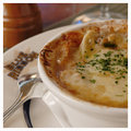
| 02/11/2007 09:30:29 PM |
HIL_0113OnionSN.jpgby pawdrixComment: I think this is my favorite of the bunch. Nice choice of simple items for the background, and I like the spoon resting on the plate with the full name of the restaurant (I guess that's what Blue Ribbon is anyway). I don't like french onion soup, but you've made it look appetizing here! |
| Photographer found comment helpful. |
| 02/11/2007 09:27:07 PM |
|
| Photographer found comment helpful. |
Home -
Challenges -
Community -
League -
Photos -
Cameras -
Lenses -
Learn -
Help -
Terms of Use -
Privacy -
Top ^
DPChallenge, and website content and design, Copyright © 2001-2025 Challenging Technologies, LLC.
All digital photo copyrights belong to the photographers and may not be used without permission.
Current Server Time: 08/16/2025 02:16:45 PM EDT.