| Image |
Comment |
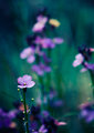
| 05/22/2011 12:06:58 PM |
Sweet Dreamsby KristinaGComment: I love the blue-greens in the background. Nice change from the normal yellow-greens. The blue-greens also seem more whimsical to me, more like the dream you refer to in your title : ) |
 Photographer found comment helpful. Photographer found comment helpful. |
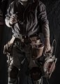
| 04/10/2011 11:56:23 AM |
Aftermath by Breeee123Comment: The little details from the hands give the viewer all the information they need, so they don't need to see the faces to understand the scene. That's exactly what you were supposed to do for this challenge. Well done. |
| Photographer found comment helpful. |
| 04/10/2011 11:54:55 AM |
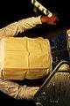
working blues by BrennanOBComment: The color and the processing fit the subject very well, though I wonder if the processing hast been pushed just a little too far because of the graininess/sharpening that borders on artifacting at this size. There is enough detail from the props between the shoulders and the knees that the viewer isn't wishing to see the face as a way of learning about the subject, which is exactly what you were supposed to do for this challenge. |
| Photographer found comment helpful. |
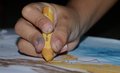
| 04/10/2011 11:51:54 AM |
Little Fingers Firing a Masterpiece ....by avermaaComment: When hands aren't spread out flat, it's hard to tell how old the hands are. The only real clues here are the title and the fish (which, I admit, I would have missed if I hadn't read the title). Having a brightly colored background, maybe made from the child's shirt, would have helped convey the age of the subject. |
| Photographer found comment helpful. |
| 04/10/2011 11:32:12 AM |
'til You Dieby neophyteComment: Man, I really wish the negative space in the upper right was filled by some giant motorcycle handlebars! Then his arm would have made a nice leading line back to the text too. |
| Photographer found comment helpful. |
| 04/10/2011 11:28:34 AM |
move your bodyby andreiplesaComment: Since the body is out of focus, you should have used more directional/contrasty light on her to help define her shape and to help her stand out amongst the rest of the blur. More "pretty" light on the bottle might also explain why the bottle is in focus instead of the person. |
| Photographer found comment helpful. |
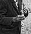
| 04/10/2011 11:26:32 AM |
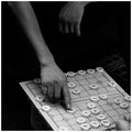
Market Piperby banmornComment: Since the image's focus is probably the hands, I would have liked to see sharper, clearer detail on them. That way the clarity of the hands (and the flute) would contrast the natural texture of the jacket. The grain does look beautiful on the stone wall in the background though. |
| Photographer found comment helpful. |
| 04/10/2011 11:23:13 AM |
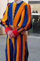
Fashion victim on dutyby cyparisComment: If you're at the Vatican, those were designed by someone *very* famous ; )
As for the image, I think the background is very distracting. I would have cropped off at least the bottom quarter, since it doesn't tell us anything we don't already know, then I would have used a much shallower depth of field to blur out the background. I don't even think it would be necessary to keep the whole subject in focus here; you could focus on just one aspect of the crazy fashion (the buttons and the belt buckle, for example) and blur the rest so you can make sure the image has a very prominent/specific focus (which would also give the image a more specific message--which specific part of the outfit would the fashion police arrest him for?). |
| Photographer found comment helpful. |
| 04/10/2011 11:16:51 AM |
Relax!by ferrissComment: It looks like you used Clarify or some similar technique. While that gives some great gritty detail that helps convey the horror or a dentist's chair, I still wish the image was a little brighter overall, particularly in some of the shadows. |
| Photographer found comment helpful. |
| 04/10/2011 11:14:47 AM |
the decisive momentby ubiqueComment: I wish there was a bit more detail in the shadows. As it is, the black seems to swallow the rest of the image. |
| Photographer found comment helpful. |
Home -
Challenges -
Community -
League -
Photos -
Cameras -
Lenses -
Learn -
Help -
Terms of Use -
Privacy -
Top ^
DPChallenge, and website content and design, Copyright © 2001-2025 Challenging Technologies, LLC.
All digital photo copyrights belong to the photographers and may not be used without permission.
Current Server Time: 08/05/2025 05:50:30 AM EDT.