| Image |
Comment |
| 06/08/2007 12:34:42 AM |
|
 Photographer found comment helpful. Photographer found comment helpful. |
| 06/07/2007 11:37:16 PM |
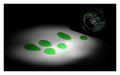
Glowby JackoComment: think this subject would have been better served with the light used on each drop to portray the glow. a drop coming out of the can would be a nice touch. I don't really like the tones of the background either, I dunno, seems really dull. |
| Photographer found comment helpful. |
| 06/07/2007 11:30:49 PM |
Blacklightby MarkComment: I like the reflection of the light in the bulb. I think you could have gone with less strokes as to see the bulb better, as I find the reflection most interesting though it is a small part of the image. The ligt and quality is good though. |
| Photographer found comment helpful. |
| 06/07/2007 11:29:12 PM |
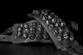
bells at restby friscaComment: This isn't striking me as interesting, think I'd rather see the bells doing what bells do! Could have taken this subject and showed of the life and melody that comes from bells and used the light to reflect that. Here this image is not making me care about bells. |
| Photographer found comment helpful. |
| 06/07/2007 10:21:30 PM |
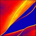
Fluro Agave Curves.by sherpetComment: I love the very strong diagnal line of this one. Very nice abstract. Seems pixelated in some parts but it could jsut be my screen. |
| Photographer found comment helpful. |
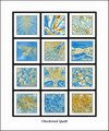
| 06/07/2007 10:20:20 PM |
Checkered Quiltby sherpetComment: I like this collection. It cohesevely puts your vision together. I think I'd like it better without text. |
| Photographer found comment helpful. |
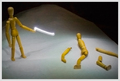
| 06/07/2007 08:33:45 PM |
Contactby inshaalaComment: pretty cool shot. love the small amount of light visible between the club and the ball. this would have had a major plus for me if you could see movement. Perhaps use the flash at the exact moment of actual contact and then still have the exposure going to do the light painting? not sure. |
| Photographer found comment helpful. |
| 06/07/2007 08:30:02 PM |
Peaceby muckpondComment: interesting shot. Not really aware of that symbol. I think if the person was a spot on b/w with no blown out spots and greater contrast and the sybol was smaller to bring the image in closer I think this would be a lot better. |
| Photographer found comment helpful. |
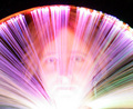
| 06/07/2007 08:26:10 PM |
Lights of a Goddessby KrystleComment: bottom area seems too blown out. I think you could have exposed this less and brought out the different colors nicely with post processing. could have positioned this lower, like right under the eyes and made it look almost like a woman holding some surreal fan, and greater visibility of the eyes would allow the viewer to be more engaged with the "goddess" |
| Photographer found comment helpful. |
| 06/07/2007 08:23:16 PM |
|
| Photographer found comment helpful. |
Home -
Challenges -
Community -
League -
Photos -
Cameras -
Lenses -
Learn -
Help -
Terms of Use -
Privacy -
Top ^
DPChallenge, and website content and design, Copyright © 2001-2025 Challenging Technologies, LLC.
All digital photo copyrights belong to the photographers and may not be used without permission.
Current Server Time: 06/20/2025 03:31:16 AM EDT.