| Image |
Comment |
| 01/26/2003 09:25:27 PM |
Duck Crossingby Wheeler1992Comment: The top of the photo is washed out til the sky is white and there appears to be a haze. Even the "sign" is washed out. As for the "duck" clearly in the crossing area, that's cute but not enough to make up for the washed out section.. Decent photo otherwise. |
 Photographer found comment helpful. Photographer found comment helpful. |
| 01/26/2003 09:18:56 PM |
Head Gamesby jitamsComment: Love it. Right on. Would have liked a little differentiaion between the background ant eh head since the sign with the head is your subject. But still a good shot. |
| Photographer found comment helpful. |
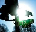
| 01/26/2003 09:16:09 PM |
Start Spreadin' the News by magnetic9999Comment: This is not exactly a black and white, more like light grey and dark grey, but I really like it. With the angle you shot the "road sign" I believe it speaks volumnes about New York: tall buildings and street light. All the techs are right in my opinion. This is a very well done composition with really good execution. Worhy of a 9. |
| Photographer found comment helpful. |
| 01/26/2003 09:06:50 PM |
Red Rock, Red Stopby YomiComment: There doesn't appear to be a sign post on this sign. I like the rock formation bery much and the coloring is fantastic. But something's not right here. Nice photo but can't figure it out. |
| Photographer found comment helpful. |
| 01/26/2003 09:00:04 PM |
the Madnessby moondoggieComment: Good shot. No arguments or nit picking here. Like the title. Photo says it without the title. I think the border works well here. |
| Photographer found comment helpful. |
| 01/26/2003 08:57:39 PM |
...Which Way?by catpixelComment: This is how a drunk driver sees the signs all the time. This is too cute. Don't particularly like the red tone to it, but that's personal. As it goes as a photo otherwise it's technically a good one: cropping, subject, meeting challenge, focus, etc. Deserves every bit of an 8 techinically, just not personally. So you get the score. |
| Photographer found comment helpful. |
| 01/26/2003 08:54:35 PM |
Blinded by the Lightby smellyfish1002Comment: Gotta know? Wat this photo and title after the fact of getting home and finding it was the best shot, so it was titled as a coverup of an error or was this intentional. Cause I'm blinded by it also, yet I like it, for some reason. Just hope the drivers weren't as blinded by the "sun" light and could see the "stop"light. Nice one worth a 7 to me. |
| Photographer found comment helpful. |
| 01/26/2003 08:48:16 PM |
One Wayby boyte1Comment: This one gets it for humor. They just said "road sign" and sure didn't say where they had to be did they. Looks like it's beginning to peel away from your thumb on the back end of it. Just a little dark, but not enough to really hurt the photo that much. Shadows are a bit distracting, under the thumb and on the side of the first finger Nice B & W. Nice composition with decent execution. Congrats on a 7. |
| Photographer found comment helpful. |
| 01/26/2003 08:43:45 PM |
"Honey, you missed the Stop-Sign!"..."No!"by Harz_JoergComment: From the thumbnail it was fantastic. The black tire looked like it was out in infinity with the road appearing to be the edge of the earth. And the sign like she had mowed right thru it. In the big photo it look like a white speckled tire sitting on a small play stop sign. I lost of of the illusion it had in the small shot. The thumbnail was a 10. This one is harder to score. The white spots on the black tire are very disturbing and the shadow of the tire cutting off part of the "stop sign" looks too fake. The focus is ok, the framing is nice, and the lighting is rather good. But I just can seem to score it fairly for what it is. This may all just be my personal problem, so I will give it a 5 in fairness to you. I hope you tell us exactly how you did this shot. |
| Photographer found comment helpful. |
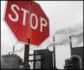
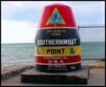
| 01/23/2003 10:09:00 PM |
"90 Miles to Cuba-(Southernmost Point)"by slamminComment: Looks more like an ocean sign rather than a "road sign". Otherwise the photo is a really good one. I especially like the different colors in the water. Is this in the water on on the tip of the land. I'll have to give you the benefit of the doubt and assume it's on the land, in which case it meets the challenge. Anyway it's a really nich photo, technically and appeal wise. Nice one. 7 |
| Photographer found comment helpful. |
Home -
Challenges -
Community -
League -
Photos -
Cameras -
Lenses -
Learn -
Help -
Terms of Use -
Privacy -
Top ^
DPChallenge, and website content and design, Copyright © 2001-2025 Challenging Technologies, LLC.
All digital photo copyrights belong to the photographers and may not be used without permission.
Current Server Time: 08/07/2025 09:53:13 PM EDT.