| Image |
Comment |
| 02/01/2003 01:54:29 PM |
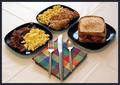
Three Square Meals a Dayby ClubJuggleComment: You did 3 times the work the others did. I personally like the fact that your background is folded to where the creases make squares also. Others will probable tell you should have been smooth. To me it is carrying the square theme further. Nice clear and colorful photo. Well done. |
 Photographer found comment helpful. Photographer found comment helpful. |
| 02/01/2003 01:51:26 PM |
|
| Photographer found comment helpful. |
| 02/01/2003 01:39:06 PM |
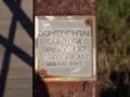
Square Signby joshComment: Well done! Like the DOF and the texture. Can almost feel the rust on the post. Good job. |
| Photographer found comment helpful. |
| 02/01/2003 01:27:42 PM |
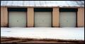
Garage Squaresby alanfreedComment: Only problem I can see is your photo is not perfectly level. My tripod has a level on it. Worth investing in. Still a good photo. |
| Photographer found comment helpful. |
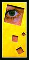
| 02/01/2003 01:17:46 PM |
Yellow & Greenby svitalComment: This plays with the mind and eyes. It appears to curve on the left edge, which we know it does not. It also appears to tilt to the left, because of the placement of the squares inside the yellow. I don't like modern art but this is good art. One nit pick - the eye should have been centered in the square. There's space on the nose side and almost cut off on the other side. Beautiful green eye. Well done. |
| Photographer found comment helpful. |
| 02/01/2003 01:06:12 PM |
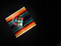
Vivid Symmetryby ChrisW123Comment: This is strange. It appears to be out of focus, but with closer looking it is not out of focus. The black bleeds into the orange. This plays tricks on my eyes and I'm not sure how I feel about that. First glance says 5, but further looking says 6 for the illusion. Going with further looking. |
| Photographer found comment helpful. |
| 02/01/2003 01:00:05 PM |
The Unheardby AntithesisComment: That looks like "Help" to me. I read lips. Neat idea. Sure is different and well done. I especially like your build in border. Good job. |
| Photographer found comment helpful. |
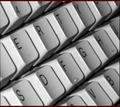
| 02/01/2003 12:56:11 PM |
Let Your Fingers Do The Walking...by dougmc1Comment: Wow, the angle really through me off for quite a while. It makes the letters look like they are on the side of the keys. I really like this illusion. You got me. The focus is a little soft, but what the heck I'm still intrigued by the angle. I still have to look for a minute to see the letters correctly. Worth a 10 all day long. Great one. |
| Photographer found comment helpful. |
| 01/30/2003 05:47:06 PM |
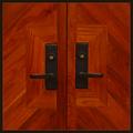
Adornmentby crabappl3Comment: This is the same door. I like the other one much better. Reminds me of the "Hell" road signs. I hope this is not the true color of the wood, becuase it is a very disappointing color. The photo has great focus and croping, but personally I dont like the color. |
| Photographer found comment helpful. |
| 01/30/2003 05:28:35 PM |
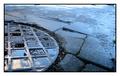
Circle of squaresby vjozComment: I love the photo but I don't like the cropping. I don't see any reasoning for cutting your subject in half and leaving the pavement. Rule of thirds here works against you in my opinion. Other wise it's a really nice photo with good focus and all. |
| Photographer found comment helpful. |
Home -
Challenges -
Community -
League -
Photos -
Cameras -
Lenses -
Learn -
Help -
Terms of Use -
Privacy -
Top ^
DPChallenge, and website content and design, Copyright © 2001-2025 Challenging Technologies, LLC.
All digital photo copyrights belong to the photographers and may not be used without permission.
Current Server Time: 08/07/2025 05:08:10 PM EDT.