| Image |
Comment |
| 01/10/2007 08:42:11 AM |
CRAZYby EssAreDubyaComment: Needed lighting on the background to separate the subject from the background. As it is, the details of her hair get lost in the dark background. |
 Photographer found comment helpful. Photographer found comment helpful. |
| 01/10/2007 08:40:36 AM |
Girl Next Doorby BlackboxComment: You had a very shallow DOF selected, and you missed the focus. The photo is sharpest on the woman's dark, back elbow, whereas the face and the rose are soft. Wasn't a bad composition, but needed to be executed better. |
| Photographer found comment helpful. |
| 01/10/2007 08:39:00 AM |
Nickelback - Photographby quindeComment: Low light = slight camera shake. If you'd gone with a slighter faster shutter speed, that would have been avoided, and also you wouldn't have blown out the highlights. Nice idea though. |
| Photographer found comment helpful. |
| 01/10/2007 08:34:39 AM |
Sugar, were going downby bmartuchComment: Yeah, I was sure there would be a literal representation of this one. It's funny. Nice capture of the action, but I think the composition could have been worked out better. Maybe a tighter crop to get more impact out of the sugar hitting the liquid. Or maybe just cropping off the top third, to establish the centre of attention away from the middle of the pic where it is now to a better focal point. |
| Photographer found comment helpful. |
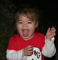
| 01/10/2007 08:28:39 AM |
|
| Photographer found comment helpful. |
| 01/10/2007 08:26:01 AM |
Buttonsby scarbrdComment: Nice idea. Even nicer subject... Maybe a slightly smaller aperture would have allowed for sharpness throughout the depth of the image, which I think I would have preferred (my eyes keep getting drawn to the slightly soft fingers - that despite the fact that I keep trying to draw them back to the cleavage...). Oh, and the red really works. |
| Photographer found comment helpful. |
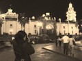
| 01/10/2007 08:15:09 AM |
Dirty Little Secretby 99PercentComment: Nice idea. Has an almost Cartier-Bresson feeling to it, but seems to be lacking a bit of interest - maybe more blurred people in the foreground would have served to add life into the photo, whilst the clever angle you chose would have shown the isolation of the subject even more. Also, some more contrast might have added more emotion to the pic. |
| Photographer found comment helpful. |
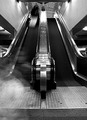
| 01/10/2007 08:10:45 AM |
|
| Photographer found comment helpful. |
| 01/10/2007 08:06:54 AM |
Over my Head (contrast)by FedericoComment: There is too much contrast in this photo. The sky is completely blown out, which would be okay if it served to highlight the detail in the trees, but the detail in the trees is completely lost because they are too black. I liked the idea though - it was great for the title. |
| Photographer found comment helpful. |
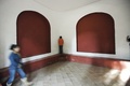
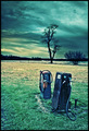
| 01/10/2007 08:03:09 AM |
|
| Photographer found comment helpful. |
Home -
Challenges -
Community -
League -
Photos -
Cameras -
Lenses -
Learn -
Help -
Terms of Use -
Privacy -
Top ^
DPChallenge, and website content and design, Copyright © 2001-2025 Challenging Technologies, LLC.
All digital photo copyrights belong to the photographers and may not be used without permission.
Current Server Time: 06/20/2025 08:06:40 AM EDT.