| Image |
Comment |
| 01/27/2007 04:58:51 AM |
Lost in the Shadowsby UbersteinyComment: I love the minimalism in this one. The lighting control was excellent, and the composition is perfect. Very well done. |
 Photographer found comment helpful. Photographer found comment helpful. |
| 01/27/2007 04:58:08 AM |
red hotby boodComment: Nice shot. I like the way the bright red chilli jumps out at you from that dark backround. The highlights on the chilli are perhaps a bit harsh, but overall the lighting is good. Composition is not quite perfect - the smoke seems to be bunched up in the corner (but I can imagine how hard it must have been to capture it perfectly). Good work. |
| Photographer found comment helpful. |
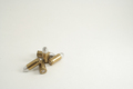
| 01/27/2007 04:56:06 AM |
...and they all fall down.by chimericvisionsComment: A very neat shot. But I think it could have been made more interesting by making the lighting on the bullets a bit more dramatic (maybe more highlights, or more shadow - to add a bit of depth). Also, I wonder if correcting the white balance so that the background was pure white rather than cream might have made the subject jump out a bit more? |
| Photographer found comment helpful. |
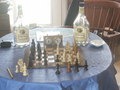
| 01/27/2007 04:52:36 AM |
Chess Match with timingby whiterookComment: I'm not quite sure about the minimalism aspect, but regardless of that, the composition is poor and the lighting is quite bad. |
| Photographer found comment helpful. |
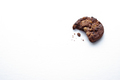
| 01/27/2007 04:51:06 AM |
Mmmm Good!by Marc923Comment: Nice control of your lighting. And the subject is composed very well. And unlike most of the 'small object on a white background shots', I think the bite out of the cookie and the little scattered crumbs add interest to the subject, and make it a more enjoyable photo. Well done. |
| Photographer found comment helpful. |
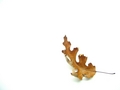
| 01/27/2007 04:47:55 AM |
Studyby pacpintoComment: Nice control of your lighting. Would make a good desktop background. |
| Photographer found comment helpful. |
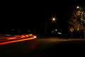
| 01/27/2007 04:47:28 AM |
Taillightsby jackal9Comment: Too many distracting elements here. Composition could have been simplified dramatically. |
| Photographer found comment helpful. |
| 01/27/2007 04:46:30 AM |
Lilac Heavenby J-MeComment: The scene could have been composed better. Maybe brought the subject down to the bottom third of the image, where it would have been placed stronger. Also, although the lighting makes an interesting backdrop, it does nothing for enhancing the subject. And the focus could have been sharper. |
| Photographer found comment helpful. |
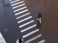
| 01/27/2007 04:39:08 AM |
Crossingby taterbugComment: The lamppost and white line in the lower left are a bit distracting, but overall I like the mood here - feels like a deserted street, lonely man, head down. Quite unassuming and minimalist. |
| Photographer found comment helpful. |
| 01/27/2007 04:37:43 AM |
steelby kdkaboomComment: Might have enhanced he feeling of minimalism if you'd arranged it so that only the lower third was steel table, and the top two thirds were the white wall background. These type of minimalist shots are usually good practice for the rule-of-thirds law. |
| Photographer found comment helpful. |
Home -
Challenges -
Community -
League -
Photos -
Cameras -
Lenses -
Learn -
Help -
Terms of Use -
Privacy -
Top ^
DPChallenge, and website content and design, Copyright © 2001-2025 Challenging Technologies, LLC.
All digital photo copyrights belong to the photographers and may not be used without permission.
Current Server Time: 06/22/2025 04:20:06 PM EDT.