| Image |
Comment |
| 12/07/2005 02:17:38 AM |
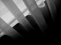
The Glare From the Windowby sacsComment: I had to give this one a 4. A very plain shot. The black and white works well, but there is no real subject. I read the title to give me a bit more understanding to the picture, but it doesn't make real sense to me. But maybe this picture was taken at dawn, so I thought it would fit the challenge. I gave that score because it probably fits the challenge. |
 Photographer found comment helpful. Photographer found comment helpful. |
| 12/07/2005 02:13:35 AM |
Waiting Time.......by BrentRyanGreenComment: You've got the challenge right on, but the focal point isn't so great. The picture itself is boring to me. I don't mean to offend you or anything, I'm just attracted to pictures with a lot of contrast. This doesn't have much. I like the way you've shown the whole place seems to be empty though. I have a 4. |
| Photographer found comment helpful. |
| 12/07/2005 02:12:01 AM |
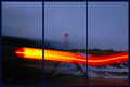
Truck Before the Tracksby JaguarComment: Unique framing you've done. Very much like the triptych strategy. I just don't understand the picture very well. The contrast works fairly well with the break of dawn. I'm thinking a railroad crossing and a truck went past. So I gave a 5 for this. |
| Photographer found comment helpful. |
| 12/07/2005 02:03:24 AM |
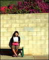
Too Early for the Busby chaliceComment: The shot is quite out of focus and there's too much sharpening going on. Maybe the wall was too high? I'm not sure, but the composition isn't great. I gave it a 4. It's a good shot though. Oh and the contrast works quite well. |
| Photographer found comment helpful. |
| 12/07/2005 02:01:40 AM |
Too early to tellby DirtypainterComment: Oh dear it's very grainy. I like the concept. I gave it a 4 for having the concept link to the theme. Perhaps if you could do a clearer shot without including the entire line up. I personally think by having so many people in this particular shot, it distracts the attention from the main focal point. |
| Photographer found comment helpful. |
| 12/07/2005 01:57:56 AM |
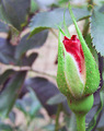
An Early Bloomerby olddjComment: I think you've over saturated the red. I gave a 4 on this because it fits the theme. It's a good picture, but there is too much noise. I think it's also over sharpened as well. It might have worked a bit better if placed in a better looking background. |
| Photographer found comment helpful. |
| 12/07/2005 01:55:49 AM |
Evolution.by WessyComment: This show isn't working for me at all. I'm could be really dumb not understanding the whole picture to fit the challenge. Evolution it may be, but I don't see transformation. So I gave a 3 on this. It's a bit grainy, but I do like the surreal effect done on it. |
| Photographer found comment helpful. |
| 11/28/2005 08:07:27 PM |
Formby sigrun_thComment: I gave this a 4 because I'm not sure how it's odd. The top view angle is great, but towards the side of the shot it starts becoming rather blurry. I'd probably give a 5 if it was better focused and still.
Thank you very much for the explanation, so I just bumped this up to a 6 instead of 7 just because of the focus. It is odd indeed. I guess I just forgot about the odd numbers and was looking for strange. Looks like graffiti in the thumbnail. |
| Photographer found comment helpful. |
| 11/27/2005 06:53:56 PM |
...this odd dream I had...by GiorgioComment: Interesting technique you've used here. I'm sure a lot of others have said the same. This shot contains a lot of originality and I thought it was a rather well thought out shot. Especially not forgetting the shadow details. An odd picture indeed. If this were placed in the Illusions challenge, this is almost guaranteed the top 20 spot, at least in my head. Hopefully you'll also get a top 20 spot, if you wish on this Odd challenge.
I think it's cut out, none the less, job well done, but I gave a 7 on this because I personally feel like the picture lacks another sort of emotion, it's a bit plain. It just could be I'm attracted to bright colours though. |
| Photographer found comment helpful. |
| 11/25/2005 07:38:00 AM |
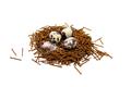
ODD: adj. unusual or unexpected; strangeby manic35Comment: I thought this shot was very well thought out. If you hadn't separated some of the nail bits from the nest look-a-like, it would take a lot more time to come up with what it was. A very odd nest it is. The white background works very well with the rusted nails, giving it a good contrast. The feather added for effect is very innovative as well. I gave an 8 for this shot. Not because it's not an awesome shot, but compared to a very few others it's lacking a few more eye catching element. The background, like I've said works well, but looking at it for a while, makes me think it's too much white. |
| Photographer found comment helpful. |
Home -
Challenges -
Community -
League -
Photos -
Cameras -
Lenses -
Learn -
Help -
Terms of Use -
Privacy -
Top ^
DPChallenge, and website content and design, Copyright © 2001-2025 Challenging Technologies, LLC.
All digital photo copyrights belong to the photographers and may not be used without permission.
Current Server Time: 08/17/2025 02:10:32 AM EDT.