| Image |
Comment |
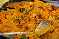
| 01/11/2006 12:26:46 AM |
Gigantic Paëllaby charieComment: Looks like it's all in a huge frying wok, since those peas are unbelievably small on this shot. It's not a bad thing of course. The composition is quite good. A variety of contrasting colours makes it even more appealing. Great focus as well, draws you to the shrimp. I giving this a 7. |
 Photographer found comment helpful. Photographer found comment helpful. |
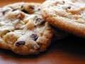
| 01/11/2006 12:24:18 AM |
Chocolate Chip Cookiesby stare_at_the_sunComment: You make my mouth water already. Great composition, but I think I would have liked to see better focusing on one of the cookies. Either that or my tummy is growling like a maniac. Personally if you have used a different surface to put these cookies on, it might has been better. This is a 7 for me. |
| Photographer found comment helpful. |
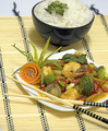
| 01/11/2006 12:21:48 AM |
Gung Gaeng Panang Kao Sueyby michael_pComment: Thai food. The food looks great and so is the presentation. Thai food is known for it's freshness, well at least in my family. I think the presentation is innovative in the sense that is has a fusion Chinese set up to it. Usually these dishes are not eaten with chopsticks, but with a fork and spoon. I won't judge on that. I think your focal point was the panang, but it somehow went out of focus around the huge broccoli.
The colour is very faded as well. Shaped carrots are very pale and look unappetising, so I'll throw a 7 your way for this. None the less the composition works very well. |
| Photographer found comment helpful. |
| 01/04/2006 12:58:04 AM |
Domino Sugar Cubes Ad Gone Wrongby literaryradicalComment: I'm honestly surprised this didn't even break a 5 at least as well as the amount of people that gave you a 1. I'm guessing they're quite close minded or just one of those people who gives everyone a 1 in hopes for their picture to score better. |
| Photographer found comment helpful. |
| 01/03/2006 07:25:42 AM |
Domino Sugar Cubes Ad Gone Wrongby literaryradicalComment: Great shot! Provoking in some sense, but I cetainly love it. I personally think if you could have made it look like she popped out from the fridge, boy that would be awesome. None the less, I give this shot a 7. Great composition. |
| Photographer found comment helpful. |
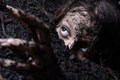
| 12/21/2005 09:48:09 PM |
Taphephobia by fadedbeautyComment: I have been constantly been changing this shot's score between a 7 and an 8. I definitely love the concept, and whole you've got an awesome model, whether it was you (the photographer) or someone else. Immaculate really, but the biggest flaw was within the eyes. Fear is not written all over the eyes, instead curiousity is the message I got in the eyes. It's also great you thought of the hand language. It helped out a lot in the composition and atmosphere of the shot. There's a softness in the hand gesture. Personally, I would have thought it would be better if the hands were stretched out a but more. So I think I'll give this a 7. Sorry though. I really this it's a fantastic shot none the less. |
| Photographer found comment helpful. |
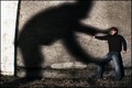
| 12/21/2005 09:40:43 PM |
Fear Of Shadowsby TUBORGComment: The effect made works well for this shot, instead of degrading the shot, I believe it enhanced its integrity. The phobia is shown very well. Body language is great. Although, I think I see the dark bit of the eye,iris, it would have probably been better if the eyes were looking at the shadows rather than away. I could be wrong though. Very good use on the shadow, well choreographed in my opinion. I know it's hard, but I took a point off for the excessive whiteness on the shadow's bum. Another for not entirely portraying the fear through the eyes. I gave an 8. |
| Photographer found comment helpful. |
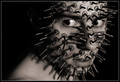
| 12/21/2005 09:36:07 PM |
Aphenphosmphobia - Fear of Being Touched by glodaComment: Definitely very creative. One of my personal favourites out of all the 100+ pictures for this challenge. I gave you an 8 though. It's not easy to bring fear out through the eyes. To me the look gives more of a surprised vibe rather than fear. So I took half a point off there. Another half off for seeing the cellar tape sticking out of the pins/nails. The one point was taken off because of not entirely showing the fear. As in if you did the same for the body, sticking more pins/nails on the neck and shoulder, I'd certainly given it a 9 or more. Great job though. The composition itself is spot on. I'm hoping you get a ribbon, when I say that I hope I didn't just jinx you. |
| Photographer found comment helpful. |
| 12/21/2005 12:09:06 PM |
Got Cheese?by fotomann_foreverComment: Oh so you're the one! I remember browsing, not voting for the challenge. I saw this, and I don't mean to be rude or anything, I thought it was rather hilarious! Very daring, I admire that in a person. The cheese-tache tops it all off, so my hat comes off to you for that. Hold on, you got a low 4 for this? Man, voters here are seriously crazy. I would thought this would break a 5. It's a really cute picture. I would have thrown you a definite 6. Such a slutty pose, yet so innocent looking. I meant that as a joke by the way. |
| Photographer found comment helpful. |
| 12/21/2005 01:41:42 AM |
math!by charlievComment: I gave this shot a 4. It's a very snap shot like photo. Maybe it's because I'm fine with math. Honestly though, the atmosphere and composition of the shot doesn't provoke phobias really well. The lighting isn't terrific. Although, if you could have removed the other sationary, and gave a darker shade, I personally would have given it a 6 at least. |
| Photographer found comment helpful. |
Home -
Challenges -
Community -
League -
Photos -
Cameras -
Lenses -
Learn -
Help -
Terms of Use -
Privacy -
Top ^
DPChallenge, and website content and design, Copyright © 2001-2025 Challenging Technologies, LLC.
All digital photo copyrights belong to the photographers and may not be used without permission.
Current Server Time: 08/17/2025 02:10:40 AM EDT.