| Image |
Comment |
| 03/19/2006 09:24:29 AM |
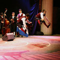
University traditionsby DocendoDiscimusComment: Cool shot! It is so difficult to get motion shots in focus and to avoid the evident motion blur that is here. My suggestion is that if you are going to have motion - use a larger fstop - smaller number - and go ahead and get the sharper details so that the motion blur becomes part of your art. You could also crop the bottom portion of this shot - it is just dead space that is not adding, but detracting from the focal point of your photograph. |
 Photographer found comment helpful. Photographer found comment helpful. |
| 03/19/2006 09:21:28 AM |
|
| Photographer found comment helpful. |
| 03/19/2006 09:16:04 AM |
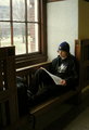
Dreams of NASAby rebs138Comment: Really good composition idea! The shirt actually detracts from the picture though - the "blast off" is so bright that it takes your focus from the subject matter. The hat is appropriate due to the awful weather outside, and the use of ambient lighing was a great idea. I like the pose and use of the backpack as a prop. The wood is beautiful and the window view is appropriate. You could have cropped out the top of the picture - since it is just dead space to keep the focal point on your subject. |
| Photographer found comment helpful. |
| 03/19/2006 09:12:24 AM |
Old schoolby ClayaComment: too much grain (underexposed), and too little focus (the wood is in focus instead of the subjects) - a good composition idea and a nice attempt at use of angles. I think adding some light from somewhere off to the side would have realy added to this picture. even a flashlight would have worked. |
| Photographer found comment helpful. |
| 03/19/2006 09:09:58 AM |
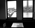
An empty lesson in the full heart of Londonby lucienawComment: This compsition gives such an empty feeling. The black and white, coupled with one window teeming with life and one window filled with a factory - fits with your title. A melancholy person gazing out the window would have added a kick in the pants to this picture. I like the lighting and lines.. and the paper on the table becomes the subject... makes me wonder what it says... |
| Photographer found comment helpful. |
| 03/19/2006 09:06:11 AM |
School Days' Bits & Bytesby AlexutaComment: Great use of color and angles - nice cropping - the focus leaves me thinking I have one contact out though - maybe a little more angle to really give it depth? |
| Photographer found comment helpful. |
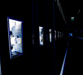
| 03/19/2006 09:04:41 AM |
Keepers of the Secretsby NeuferlandComment: AWESOME depth - I pulled my face right up to the screen to try to see what was at the end of the hall! Great lines and really neat lighting effects! Probably a little cropped off the top would help kill that dead space up there, but a really great composition! |
| Photographer found comment helpful. |
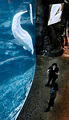
| 03/19/2006 09:02:53 AM |
Aquatic Edutainmentby RyShuComment: A little underexposed makes this shot a little too grainy. Cool composition though - love the color difference from water to stone and the curve of the glass is really artsy! Either a longer exposure or a smaller f-stop number would make this shot a winner! |
| Photographer found comment helpful. |
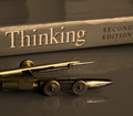
| 03/19/2006 08:58:46 AM |
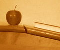
Scholastic educationby MontagueComment: Great composition idea - love the colors - it looks cool! Most would have been tempted to black and white it - but keeping the gold tone makes it really enticing. I think that you could have improved this shot by cropping out the glare on the top of the book - it is distracting. Either a crop of a higher angle would have accomplished the same thing. Good job! |
| Photographer found comment helpful. |
| 03/19/2006 08:55:53 AM |
Shelf of knowledgeby paulb_17Comment: You may want to crop in more on your subject - fill your frame and try a different angle. Just books all in a line, with flash washing out some of the titles, doesn't do it. The idea is good, just the artwork is missing. Try different focal lengths and/or different angles and/or cropping. |
| Photographer found comment helpful. |
Home -
Challenges -
Community -
League -
Photos -
Cameras -
Lenses -
Learn -
Help -
Terms of Use -
Privacy -
Top ^
DPChallenge, and website content and design, Copyright © 2001-2025 Challenging Technologies, LLC.
All digital photo copyrights belong to the photographers and may not be used without permission.
Current Server Time: 06/17/2025 02:14:17 AM EDT.