| Image |
Comment |
| 08/15/2006 06:11:06 PM |
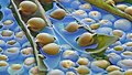
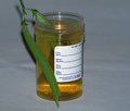
Good Ole' Peas!by Candi20Comment: The set up would have been much better had you straightened out the backdrop and perhaps used the same material under your props as well. Not sure about the colour overlay, it definitely washes out any good tonality that may otherwise have scored you extra points here. |
 Photographer found comment helpful. Photographer found comment helpful. |
| 08/15/2006 06:06:15 PM |
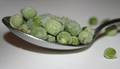
A spoonful a day...by jdnzComment: Nice shallow dof but I'm not sure about the flash fill(?) or whatever light that was used. I feel the image is lifeless, dull. Yes, different lighting would have seen this score much better. |
| Photographer found comment helpful. |
| 08/15/2006 05:57:04 PM |
|
| Photographer found comment helpful. |
| 08/15/2006 05:56:16 PM |
|
| Photographer found comment helpful. |
| 08/15/2006 05:47:40 PM |
Pea Time !by meowComment: Eeeewwww! :D Subject matter aside, technically, I feel the flash is too intrusive here. Perhaps diffused or window light may have been the better option? |
| Photographer found comment helpful. |
| 08/15/2006 05:44:58 PM |
Peas Necklaceby pamelasueComment: I bet that was real fiddly to make! :D Ok, the issues I see in this image are two-fold: 1. The focus seems to be on the top left of your model's neck but and a bit soft on the necklace - would be better the other way round; 2. The fingers(?) are distracting. Not sure they're there to hold it together, but I feel it's an enormous let down in the composition.
Good effort and creativity though, keep trying! :) |
| Photographer found comment helpful. |
| 08/15/2006 12:11:44 AM |
Pea Cuisineby BebeComment: Oh wow! What an elaborate set-up! An amazing amount of work must have gone into this. Outstanding creativity and vision! However, there's some funky pixelisation going on throughout the image. Did you try enlarging this from a smaller file, or perhaps over sharpened...? It's a terrible pity, the distortion takes away from what I'm certain would have been a ribbon contender! Best wishes for the challenge :) 5 |
| Photographer found comment helpful. |
| 08/15/2006 12:06:00 AM |
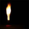
Blue Fireby charliebakerComment: Wow, gorgeous gradient. The only problem I have with it is the texture to the bottom right - at first glance, it looks more like noise or pixel distortion due to compression, rather than what I'm sure must be the surface under the flame. Original take on the challenge, I likey, but suspect many others may feel differently.
edit to add: HAHA! Very funny. You got me :D |
| Photographer found comment helpful. |
| 08/15/2006 12:03:22 AM |
Blue Peasby charliebakerComment: Ummmm..... hang on a sec..... ummmmm, didn't I just see you somewhere...? Sweet cheese and crackers, now I have to go change my embarrassing comment! :D That's it. You're getting a 10 for being so cheeky. |
| Photographer found comment helpful. |
| 08/14/2006 11:40:18 PM |
hippieby hopperComment: Nice and simple composition. Good use of props and light, just enough to reveal the colours on the sticks and holder, but not too dark that we can't make out surrounding surface texture. Well done :) |
| Photographer found comment helpful. |
Home -
Challenges -
Community -
League -
Photos -
Cameras -
Lenses -
Learn -
Help -
Terms of Use -
Privacy -
Top ^
DPChallenge, and website content and design, Copyright © 2001-2025 Challenging Technologies, LLC.
All digital photo copyrights belong to the photographers and may not be used without permission.
Current Server Time: 06/20/2025 08:17:05 AM EDT.