| Image |
Comment |
| 03/08/2004 11:38:05 PM |
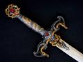
Cutting Edge Designby BAMartinComment: Nice one... I'm thinking that maybe you should have flipped this horizontally so that the blade is facing up, like when someone is hold a sword (it's facing up usually). Maybe a little more USM also. |
 Photographer found comment helpful. Photographer found comment helpful. |
| 03/08/2004 11:31:11 PM |
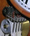
The Bulova Watch Coby RtwoComment: Cool subject but the background is hosed. You shouldn't have tried to mess with it because it ruined the outline of the watch. And the blue is very extreme. |
| Photographer found comment helpful. |
| 03/08/2004 11:28:34 PM |
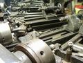
Old School Clockby PoobaComment: This one may not do well because it doesn't have that "Wow" factor, but fits the topic perfectly and for me is very interesting. I'd love to have this clock! Looks very rare to me. |
| Photographer found comment helpful. |
| 03/08/2004 11:24:56 PM |
|
| Photographer found comment helpful. |
| 03/08/2004 11:24:01 PM |
A Design Classicby andywightmanComment: "Negative space" is supposed to enhance the subject, but I don't it does in this case for some reason. I'm not sure why, but my brain is telling me this. :D |
| Photographer found comment helpful. |
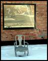
| 03/08/2004 11:22:46 PM |
Design & Sunbeamsby MonaComment: Ohhh very nice. Love this one. The window on the that awesome brick wall is fantastic, with the beam coming off of it. The snow is a little blue, but kinda works with the blue tone of the chair. Best one so far. 8. |
| Photographer found comment helpful. |
| 03/08/2004 11:18:27 PM |
Glass Block Windowby willtataComment: It's a little too abstract. Although interesting, it doesn't really convey Design/Archetecture. :(
|
| Photographer found comment helpful. |
| 03/08/2004 11:17:18 PM |
Rotating Poleby pitsamanComment: Too much dead space on the right. Should have shot more of the words on the window on the left, leaving the barber pole more on the right. Although then you'd have had the big reflection on the left! :) Tought one, you would have to try to Clone it out but that might be tough. |
| Photographer found comment helpful. |
| 03/08/2004 11:14:47 PM |
Apartmentsby flip89Comment: Hmm, don't know if I like the building on the left. You should have switched to Portrait orientation and shot just the subject. This would also give more of a sense of height to the subject. |
| Photographer found comment helpful. |
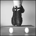
| 03/08/2004 11:13:01 PM |
Balance and Strength - Basic Engineering Principlesby ColeyComment: This can't be real. :) Although eggs are very strong (relatively speaking) when positioned like that. Very good idea and nicely done. Could be a tad bit lighter so the eggs are a little whiter. Maybe not, the socks are good. |
| Photographer found comment helpful. |
Home -
Challenges -
Community -
League -
Photos -
Cameras -
Lenses -
Learn -
Help -
Terms of Use -
Privacy -
Top ^
DPChallenge, and website content and design, Copyright © 2001-2025 Challenging Technologies, LLC.
All digital photo copyrights belong to the photographers and may not be used without permission.
Current Server Time: 08/27/2025 08:06:30 PM EDT.