| Image |
Comment |
| 06/19/2003 12:03:03 AM |
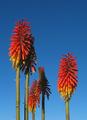
Reach for the skyby brentg3Comment: Cool perspective on the shot.... it looks like giant, tall, trees from another planet. |
 Photographer found comment helpful. Photographer found comment helpful. |
| 06/19/2003 12:00:41 AM |
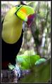
Hello from Belizeby RLSComment: Awesome shot I love the lighting and colorful subject. The border takes away from the pic however I think. I really like the texture of the background also. |
| Photographer found comment helpful. |
| 06/18/2003 11:57:11 PM |
Solitary Treeby PedroComment: The border takes away from the picture in my opinion. Good shot otherwise. |
| Photographer found comment helpful. |
| 06/14/2003 08:07:14 PM |
Runner's Worldby ToddhComment: Excellent. So far, I predict this one will WIN baby :) You get my only 10 (so far). |
| Photographer found comment helpful. |
| 06/13/2003 01:38:23 PM |
|
| Photographer found comment helpful. |
| 06/13/2003 01:37:50 PM |
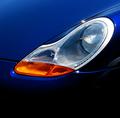
Car and Driver....by Dallas_TXComment: Don't know if a like tight close ups for magazine covers. Seems like more of the car should be showing. And the landscape shape of the headlight isn't good for a portrait magazine cover. |
| Photographer found comment helpful. |
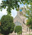
| 06/13/2003 01:35:35 PM |
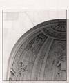
Architectural Digestby TarbiniComment: Maybe use a little more Unsharp Mask on this. I don't know if I like the border for a magazine cover. Nice contrast between the light wall on the outside and the inner part. |
| Photographer found comment helpful. |
| 06/13/2003 01:32:29 PM |
Cigar Aficionadoby crabappl3Comment: Pretty good shot. But maybe instead of the black background you should have used an abstract, soft background to give the mag cover more interest. |
| Photographer found comment helpful. |
| 06/13/2003 01:22:54 PM |
Guidepostby OneSweetSinComment: Thanks for explanation of the photo! The dark clouds and bright Sun have a nice strong contrast. |
| Photographer found comment helpful. |
| 06/13/2003 02:27:41 AM |
|
| Photographer found comment helpful. |
Home -
Challenges -
Community -
League -
Photos -
Cameras -
Lenses -
Learn -
Help -
Terms of Use -
Privacy -
Top ^
DPChallenge, and website content and design, Copyright © 2001-2025 Challenging Technologies, LLC.
All digital photo copyrights belong to the photographers and may not be used without permission.
Current Server Time: 06/25/2025 04:43:47 PM EDT.