| Image |
Comment |
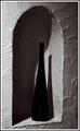
| 05/26/2003 02:19:27 AM |
Alcoveby AleciaComment: Not enough contrast. Needs more white tones I think (and less grey). |
 Photographer found comment helpful. Photographer found comment helpful. |
| 05/26/2003 02:18:01 AM |
Death on the Beachby kretsComment: Very nice, and great contrast! This is a very good photograph, with perfect black to white balance in my opinion. 9. |
| Photographer found comment helpful. |
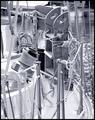
| 05/26/2003 02:16:11 AM |
|
| Photographer found comment helpful. |
| 05/26/2003 02:13:23 AM |
Oldtimer by kiwinessComment: Darker! Wow this could have been a great shot with the white beard. The hat/shirts need to be much darker. Midtones darker also. |
| Photographer found comment helpful. |
| 05/26/2003 02:09:54 AM |
Winner!by buck4freeComment: Too much saturation. This shot might be better in just black and white instead of adding the extreme tone color to it. |
| Photographer found comment helpful. |
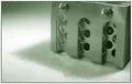
| 05/26/2003 02:07:27 AM |
Cold Steelby MitonskiComment: LOL, "cold steel" should have a blue tint, not green. :) You should have renamed it "moldy steel" instead. :^D |
| Photographer found comment helpful. |
| 05/26/2003 02:02:37 AM |
Mooringby crabappl3Comment: Love it. My eyes jump all over this pic because every part of it is interesting and perfect contrast everywhere. 8! |
| Photographer found comment helpful. |
| 05/26/2003 02:01:27 AM |
Booh !by ewebComment: LOL, are you trying to get a low score on purpose? :p
|
| Photographer found comment helpful. |
| 05/26/2003 01:59:39 AM |
Russian Standardby GalinaComment: I would have backed off on the blue saturation a tiny bit. Nice job however! |
| Photographer found comment helpful. |
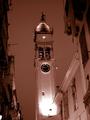
| 05/26/2003 01:58:47 AM |
St Spyridon glowsby hughletherenComment: Seems like there's way to much red in it. Plus the tower looks a little tilted to the left. The contrast of this is good, but the toning ruined it I think. :( |
| Photographer found comment helpful. |
Home -
Challenges -
Community -
League -
Photos -
Cameras -
Lenses -
Learn -
Help -
Terms of Use -
Privacy -
Top ^
DPChallenge, and website content and design, Copyright © 2001-2025 Challenging Technologies, LLC.
All digital photo copyrights belong to the photographers and may not be used without permission.
Current Server Time: 06/25/2025 11:29:13 AM EDT.