| Image |
Comment |
| 02/03/2003 07:43:13 AM |
|
 Photographer found comment helpful. Photographer found comment helpful. |
| 01/31/2003 09:09:23 AM |
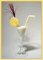
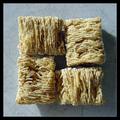
Cheers!by elgominComment: Critique Club Comment:
Excellent composition! I like the added cheese wedge on the rim of the glass. Reading the comments below, seems people either liked or disliked the shadow, those who disliked it probably don't realize the difficulty of lighting this shot. You have done well with your one diffused light. Your glare on the glass is nonexistent, and you have no areas in the background that stand out as too bright. I really like how you've centered the shot and added the festive color.
The only thing that really stands out for me is your choice to use F/2.8 with such a close shot. Would a smaller aperature of F/8 have worked better so the whole straw would be in focus? Some shots work well with a large aperature, but when being in this close, and with so much detail, in my opinion, it's best to capture as much as you can within your camera's limit.
All in all, I like this shot. Your studio work is done well!
Now, where are my cookies to dunk into this?
-danny |
| Photographer found comment helpful. |
| 01/30/2003 10:11:48 PM |
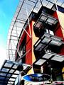
The High Streetby GinaRothfelsComment: Critique Club Comment:
The contrast of sharp angles with the curves of the overhang and street sign have a powerful impact with me. When a photographer can capture different textures and elements with in his shot, it shows me that they have an artful eye and are looking at the world from a different perspective. Your shot here shows just that. The bold oranges with the cool blue contrast beautifully to the eye as a perfect marriage of warmth and cold. The cold is further carried into the metal of the structure while the warmth is seen in the highkey of the sky and reflections off of the building.
Techinically I think that you have a very sharp picture. There is some edgies on the white curved part that are probably do in part to your compression of the image. I also am a little distracted by the noise in the sky. Both of those do not however take away from a strong composition.
This is a good shot! Keep them coming! |
| Photographer found comment helpful. |
| 01/27/2003 04:01:14 PM |
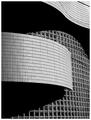
Wall of Windowsby NatashaComment: Nice abstract shot. The tones and lighting are perfect. I love the flow of the curved shadows against the square of the windows. Well done, in my top 10 this week! |
| Photographer found comment helpful. |
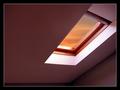
| 01/27/2003 03:56:33 PM |
Skylightby KonadorComment: Great composition and clearity. The colors in the sky really make the shot. I like your use of shadows. 10 all the way! |
| Photographer found comment helpful. |
| 01/27/2003 09:44:43 AM |
The Adult Sideby jimmythefishComment: Nice shot, just for whimsy, I would have had one on the frosting side. That would show that even us adults like to have fun! |
| Photographer found comment helpful. |
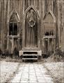
| 01/27/2003 12:34:06 AM |
Garden Churchby ShiiizzzamComment: I took me a minute to see that this is not crooked. Your step and path are level, it's the church that is crooked. You're color work is excellent and by leaving a long path to it, we are left to wonder who else has walked down this path in the years past. Great shot. |
| Photographer found comment helpful. |
| 01/25/2003 11:02:28 PM |
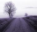
Road to Fogginessby kiwinessComment: Critique Club Comment:
For your first entry, you have chosen a very nice shot! This is a great find, and I glad you happened upon it so you could share it with us.
I like the balance of the shot. From the tree on the left that brings me into the frame, from the road with it's great texture that takes my eyes back to the top to the little tree on the right, and then back out of the frame. You might have tried moving the entry of the road to the lower left leading to the middle of the frame, but that's a personal choice.
The fog rolling across the road had a very calm feel to it. It makes me wonder what is on the other side? Make me feel curious, not anxious. Very nice. The amount of the white at the top is not over powering, as it has a softness to it.
Your conversion to black and white is well done. You have great detail in the branches and the pebbles in the road.
I like this shot, glad you shared it with us, I hope to see more of your work.
-danny |
| Photographer found comment helpful. |
| 01/23/2003 09:50:04 PM |
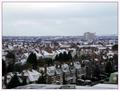
Suburbia in the Snowby DezComment: Critique Club Comment:
Less is more... I really like the clarity of the houses in the shot. I really like the row right in front, and the shadows on them. I wonder if a cropt that excludes all the sky except enough for the tall building and a crop of your roof top so that this is a 16 x 9 format, would add a more dynamic feel to this shot? I see that you adjusted levels, but have you concidered doing curves, contrast and hues? You might be surpised what these tools can do to help an over cast shot. I have several that I almost tossed until I learned what PS can do for me. I'm not saying every picture needs it, and this may not, but with the tighter crop and some more contrast you could really make the view wonder what is happening in the houses with the cars in from of them.
Your sharpening is good and save for web. This is a nice photo that with maybe another camera angle to remove some of the foreground, could be a great shot.
-danny |
| Photographer found comment helpful. |
| 01/23/2003 02:28:08 PM |
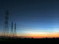
Sunset on the horizonby xertionComment: Critique Club Comment:
I must say that you have captured a beautiful sunset. The gradient from the warm hue of the deep orange to the dark coolness of the sky above, is soft enough to not be harsh on the viewers eyes, but strong enough to make us stand in wonderment of the beauty all around us. You have manage to take the strength of the powerline towers and make them bring strength to the sunset. The wires in parallel with the ground and gradient changes have a natural affect of pulling my eyes to the righ to enjoy the background of trees that dot the horizon.
Your use of a long shutter speed has allowed you to capture the balance of light and dark in the scene. It has also given the camera a chance to get nice sharp edges to the towers. Your horizon is level and post processing work is good. You may want to run it through an unsharp mask to really make your edges super crisp.
This is a good shot making me realize that we are just pawns placed here to enjoy sunsets like this.
-danny |
| Photographer found comment helpful. |
Home -
Challenges -
Community -
League -
Photos -
Cameras -
Lenses -
Learn -
Help -
Terms of Use -
Privacy -
Top ^
DPChallenge, and website content and design, Copyright © 2001-2025 Challenging Technologies, LLC.
All digital photo copyrights belong to the photographers and may not be used without permission.
Current Server Time: 06/17/2025 02:16:43 AM EDT.