| Image |
Comment |
| 10/02/2004 11:52:58 AM |
A Flying DESSERTby kiwinickComment: Cute. You may want to try a crop with the fruit in upper right giving it more negative space to fly into. Lighting is good and the overall effect of it flying is believable. - 6 |
 Photographer found comment helpful. Photographer found comment helpful. |
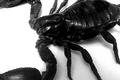
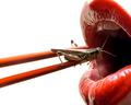
| 10/02/2004 11:51:30 AM |
Scopion desertby siggiComment: Yes this is a closeup of a scorpion, but the setting does not imply 'dessert'. Overall focus is soft and the lighting a little harsh. - 6 |
| Photographer found comment helpful. |
| 10/02/2004 11:48:50 AM |
Tropical Starsby kyeboshComment: Triangulation of composition is always strong. Yours works nicely. I do however feel the overall shot is soft in focus. This is perhaps due to a wide aperture. I would think if you're wanting to include items farther back in the shot, you'd want to close down the aperture, lengthen your shutter time and use a tripod to get the image as sharp as possible. - 6 |
| Photographer found comment helpful. |
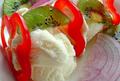
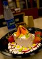
| 10/02/2004 11:45:43 AM |
Ice cream-kiwi fruit-peppers &onion sundaeby trainComment: Interesting combination.
Technically, good colors, but you have blown some of the highlights on the ice cream. I also feel that too much sharpening has been done in post processing. Overall composition is fine. - 6 |
| Photographer found comment helpful. |
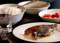
| 10/02/2004 11:39:44 AM |
food from the tropicsby asneemComment: Nice natural light shot. Unfortunately I can't make out what the food is on the plate. Composition isn't too bad, maybe too many items in the shot. Sometimes less is more. - 6 |
| Photographer found comment helpful. |
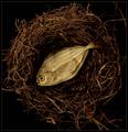
| 10/02/2004 11:34:28 AM |
Kitty Gourmetby instepsComment: Unique concept. The placement of the fish in the nest is a whacky location, but fish in itself, not so whacky. You have exposed this shot perfectly and the centered composition works nicely. Bump to an 8. |
| Photographer found comment helpful. |
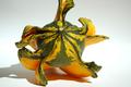
| 10/02/2004 11:32:37 AM |
Do a little dance... by dogzComment: Nice studio shot. Nothing overwhelming here. I don't think the centered composition works for this shot, especially with the shadow falling to the left. I think more space on the left for the shadow would make a more balanced composition. I also think your exclusion of the top of the gord weakens the composition. - 7 |
| Photographer found comment helpful. |
| 10/02/2004 11:30:07 AM |
|
| Photographer found comment helpful. |
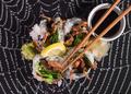
| 10/02/2004 11:26:00 AM |
Spider Rollby scalvertComment: I like the overall idea of this shot. I feel you should crop so the food isn't dead center of the image. The photo underneath of the spider web would be more dramatic with it being black and not grey in between the webs. - 7 |
| Photographer found comment helpful. |
| 09/29/2004 03:14:18 PM |
Spam and Cabanon Fromage Délicesby bruskiComment: Greetings!
I think you have a good idea here, but your presentation, more so your background, seem to not have been taken into concideration when you composed this shot. With the DOF being as shallow as it is, your background object, with their OOF appearance make for more of a distraction then addistion to the scene. I like the use of a shallow DOF when composing a food product shot. It's widely used in cookbooks to isolate the main subject. In your shot, however, the water bottle, salt and pepper shakers, and what appears to be counter top in the background draw my eye away from your presentation.
Technically the image also seems a little soft. Not OOF soft, but just not sharp. When resizing for web, you will need to do a light sharpen afterwards to bring back the crisp edges you had at 100%. You may need to also convert the image to sRGB before uploading to the web. The color gamut for a web browser is less than PS, so if you shot in RGB mode and worked the image up in RGB mode, you may get flat colors uploading an image in RGB mode for the web. This image also may be about half a stop under exposed and lacking in some more contrast. Perhaps look at your levels and ensure that your histogram is withing range, and bump the contrast just a touch. This will give your food more appeal and make it jump off the page more.
All in all, your presentation on the plate is good. Just work on backgrounds, and your PS skills to make the image have more pop!
-danny |
| Photographer found comment helpful. |
Home -
Challenges -
Community -
League -
Photos -
Cameras -
Lenses -
Learn -
Help -
Terms of Use -
Privacy -
Top ^
DPChallenge, and website content and design, Copyright © 2001-2025 Challenging Technologies, LLC.
All digital photo copyrights belong to the photographers and may not be used without permission.
Current Server Time: 06/18/2025 02:42:05 PM EDT.