| Image |
Comment |
| 01/08/2003 09:42:34 PM |
|
 Photographer found comment helpful. Photographer found comment helpful. |
| 01/08/2003 09:29:31 PM |
|
| Photographer found comment helpful. |
| 01/08/2003 09:04:27 PM |
|
| Photographer found comment helpful. |
| 12/23/2002 11:47:51 PM |
Attachmentby kandyjComment: very well done! good color and i like the gentleness expressed in the image. 9 goodtempo |
| Photographer found comment helpful. |
| 12/23/2002 11:34:10 PM |
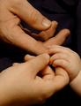
Feetby SonifoComment: great composition. the little feet are animated the most, then the middle feet, and the big feet are not animated. i would have chosen a different border, maybe a small white or gray or no border. 9 goodtempo |
| Photographer found comment helpful. |
| 12/23/2002 11:10:00 PM |
|
| Photographer found comment helpful. |
| 12/23/2002 10:52:36 PM |
Four of a Kindby kandyjComment: very well done! great composition and subject. nice tonal balance. 9 goodtempo |
| Photographer found comment helpful. |
| 12/23/2002 10:47:16 PM |
Two by two.by mykolearyComment: took a while to figure this one out. love it. great composition. very creative. good exposure and color. 10 goodtempo |
| Photographer found comment helpful. |
| 12/16/2002 10:06:31 PM |
Music Box Ballerinaby SquiffyeitherjagComment: Critique Club critique:
Composition/Content: Great subject and colors. Great idea too. The eye wants to go to the ballerina's face but goes to the two bright spots on top of her head and to the right of her. I would like to have seen the ballerina's arm fully in the picture.
Lighting: The lighter spots in the picture take the eye away from the ballerina. Otherwise, the lighting is right on.
Background: The background colors give the picture life.
Camera Work/Technical: It looks like you either started with the ballerina on the right and moved it left, or the camera on the left and moved it right. In either case it produced the same thing, part of the blur on top of the ballerina. If you started with the ballerina on the right and moved it to the left to end up in the position it is in, you might have avoided the blur being on top of the ballerina. Or, you might have done what indigo997 suggested below. Exposure is good.
Digital Processing: Colors, saturation and contrast look good.
My Opinion: You have all the makings of a great picture, just needed to change the center of interest. Nice job. |
| Photographer found comment helpful. |
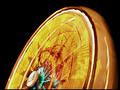
| 12/16/2002 08:04:46 PM |
Ferris Wheelby FrooberComment: Critique Club critique:
Composition/Content: The bright colors and shape against the black background give this photo "Wow". The center of focus appears to be in the center of the photo where the yellow lines have more contrast with their background. I woulk like to have seen the center of the wheel or the structure holding the wheel more in focus to give the eye an anchor to latch on to and wander from.
Background: The black background gives the bright colors great contrast.
Camera Work/Technical: Exposure is very good. Focus appears to be center weighted and might be better either towards the center of the wheel or widened.
Digital Processing: Color is balanced and nice and bright.
My Opinion: I usually don't like titles having to explain a photograph. I would like to have seen more of the structure or something in the picture that told me this was a ferris wheel. When I first looked at it, I thought it was a toy or a fan. Anyway, this is a great photo and a great idea.
|
| Photographer found comment helpful. |
Home -
Challenges -
Community -
League -
Photos -
Cameras -
Lenses -
Learn -
Help -
Terms of Use -
Privacy -
Top ^
DPChallenge, and website content and design, Copyright © 2001-2025 Challenging Technologies, LLC.
All digital photo copyrights belong to the photographers and may not be used without permission.
Current Server Time: 08/04/2025 05:58:14 PM EDT.