| Image |
Comment |
| 10/31/2014 08:42:06 PM |
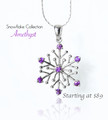
Winter Sparklesby giantmikeComment: I personally would like this better without the reflection. However, the simplicity and colors work well for an ad. 9 |
 Photographer found comment helpful. Photographer found comment helpful. |
| 10/31/2014 08:40:34 PM |
|
| Photographer found comment helpful. |
| 10/31/2014 08:39:37 PM |
|
| Photographer found comment helpful. |
| 10/31/2014 12:12:39 PM |
|
| Photographer found comment helpful. |
| 10/31/2014 12:11:04 PM |
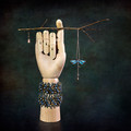
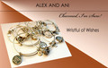
Alex and Aniby mluComment: Having so many bracelets gives a busy feel, and the focus seems a bit off. |
| Photographer found comment helpful. |
| 10/31/2014 12:09:24 PM |
|
| Photographer found comment helpful. |
| 10/31/2014 12:07:32 PM |
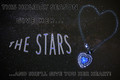
The Starsby MadMan2kComment: In my opinion: Nice idea and the wording is good. However, the font does not add to a romantic feeling. Adding a shape to "The Stars" is distracting. The dots (stars) are distracting - I think it might work if you lowered the opacity on them. Overall, I tend to look at everything but the necklace. |
| Photographer found comment helpful. |
| 10/31/2014 12:02:48 PM |
|
| Photographer found comment helpful. |
| 10/31/2014 12:01:24 PM |
|
| Photographer found comment helpful. |
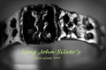
| 10/31/2014 12:00:10 PM |
silverby mrbig65Comment: While this shows the detail in the ring, to me it loses impact as an advertisement. Maybe more detail in the shadows would help. |
| Photographer found comment helpful. |
Home -
Challenges -
Community -
League -
Photos -
Cameras -
Lenses -
Learn -
Help -
Terms of Use -
Privacy -
Top ^
DPChallenge, and website content and design, Copyright © 2001-2025 Challenging Technologies, LLC.
All digital photo copyrights belong to the photographers and may not be used without permission.
Current Server Time: 06/17/2025 05:48:08 PM EDT.