| Image |
Comment |
| 10/10/2005 08:31:47 AM |
Red and blue, just for youby LalliSigComment: Fine splash shot, but to show a the complementary colour for the strawberry, your background would have been a pale green tone. Or else, keep the blue toned background and splash something yellow/orange into the glass! |
 Photographer found comment helpful. Photographer found comment helpful. |
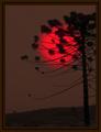
| 10/10/2005 08:22:39 AM |
Flareby fotodudeComment: Fine abstract arrangement of leaves, but you needed to show more red and not yellow to demonstrate complementary colour contrast. |
| Photographer found comment helpful. |
| 10/10/2005 08:20:17 AM |
Mighty Armby indy79Comment: Very nice shot of the crane, but you could have shot at a different angle and/or cropped a bit tighter to emphasize the orange-yellow complementary colour contrast on the equipment. |
| Photographer found comment helpful. |
| 10/10/2005 08:12:12 AM |
Unreal Sunsetby rodrigoComment: The red of the sun is brilliant, but the rest of the image appears brown rather than a green that would demonstrate a complementary contrast in this picture. |
| Photographer found comment helpful. |
| 10/10/2005 08:10:43 AM |
My Favorite Colorsby CalliopeKelComment: Complementary colours are pairs of colours that contrast strongly when compared to each other.
The colours in this photo are so desaturated that the effect of complementary colours is lost. Your image demonstrates a duotone effect rather than the effect of complementary colours.
Check some of the forum discussions on complementary colours for suggestions on using colour for contrast.
|
| Photographer found comment helpful. |
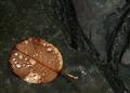
| 10/10/2005 08:06:38 AM |
Brown & Blueby GoldBerryComment: Complementary colours are pairs of colours that contrast strongly when compared to each other.
The colours in this photo are desaturated so much that the visual effect of complementary colours is almost lost. Your image demonstrates a duotone effect rather than the effect of complementary colours. Perhaps shooting from a different angle to include more of the orange leaves and/or tighter cropping to the figures would give more colour contrast?
|
| Photographer found comment helpful. |
| 10/10/2005 08:04:37 AM |
Complmentary House ... color !by LionsitalyComment: Complementary colours are pairs of colours that contrast strongly when compared to each other.
The colours in this photo are so desaturated that the effect of complementary colours is lost. Your image demonstrates a duotone effect rather than the effect of complementary colours.
Check some of the forum discussions on complementary colours for suggestions on using colour for contrast.
|
| Photographer found comment helpful. |
| 10/10/2005 08:03:18 AM |
Confluenceby riotComment: Complementary colours are pairs of colours that contrast strongly when compared to each other.
The colours in this photo are so desaturated that the effect of complementary colours is lost. Your image demonstrates a duotone effect rather than the effect of complementary colours.
Check some of the forum discussions on complementary colours for suggestions on using colour for contrast.
|
| Photographer found comment helpful. |
| 10/10/2005 08:01:48 AM |
Black & Tanby ScreamingToadComment: Complementary colours are pairs of colours that contrast strongly when compared to each other.
Black and white are neutrals and not colours at all, and therefore they cannot be complementary colours... white shows the presence of light, and black shows the absence of light. Black and white areas next to each other do demonstrate high contrast, but high contrast gives a different visual effect than complementary colours do in a picture.
Your image demonstrates a duotone effect rather than the effect of complementary colours.
Check some of the forum discussions on complementary colours for suggestions on using colour for contrast.
|
| Photographer found comment helpful. |
| 10/10/2005 08:01:09 AM |
Nothing to hideby davinciComment: Complementary colours are pairs of colours that contrast strongly when compared to each other.
Black and white are neutrals and not colours at all, and therefore they cannot be complementary colours... white shows the presence of light, and black shows the absence of light. Black and white areas next to each other do demonstrate high contrast, but high contrast gives a different visual effect than complementary colours do in a picture.
Your image demonstrates a duotone effect rather than the effect of complementary colours.
Check some of the forum discussions on complementary colours for suggestions on using colour for contrast.
|
| Photographer found comment helpful. |
Home -
Challenges -
Community -
League -
Photos -
Cameras -
Lenses -
Learn -
Help -
Terms of Use -
Privacy -
Top ^
DPChallenge, and website content and design, Copyright © 2001-2025 Challenging Technologies, LLC.
All digital photo copyrights belong to the photographers and may not be used without permission.
Current Server Time: 07/31/2025 04:34:40 PM EDT.