| Author | Thread |
Comments Made During the Challenge  |
|
|
10/10/2005 08:04:37 AM |
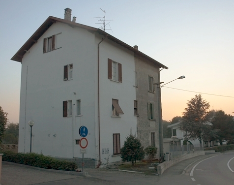
Complementary colours are pairs of colours that contrast strongly when compared to each other.
The colours in this photo are so desaturated that the effect of complementary colours is lost. Your image demonstrates a duotone effect rather than the effect of complementary colours.
Check some of the forum discussions on complementary colours for suggestions on using colour for contrast.
|
|
 Photographer found comment helpful. Photographer found comment helpful. |
|
|
10/08/2005 10:00:25 PM |
|
Not sure how this meets the challenge. |
|
|
|
10/06/2005 08:55:51 PM |
|
Is it a duplex with inhabitants of different tastes? Very funny. |
|
|
|
10/06/2005 02:16:48 PM |
|
This one seems to be missing that "oomph" in the color. Too much pastel, and not enough of any defining colors. |
|
| Photographer found comment helpful. |
|
|
10/06/2005 12:06:39 PM |
|
|
|
10/06/2005 09:28:37 AM |
|
No, it's not. Interesting anyway. |
|
|
|
10/05/2005 01:09:48 PM |
|
I don't see any complementary colors. |
|
|
|
10/05/2005 11:39:13 AM |
|
Interesting picture. Hard for me to see these as complementary colors but its a nice picture. |
|
|
|
10/05/2005 07:15:26 AM |
|
Home -
Challenges -
Community -
League -
Photos -
Cameras -
Lenses -
Learn -
Help -
Terms of Use -
Privacy -
Top ^
DPChallenge, and website content and design, Copyright © 2001-2026 Challenging Technologies, LLC.
All digital photo copyrights belong to the photographers and may not be used without permission.
Current Server Time: 06/29/2026 07:28:16 AM EDT.