| Image |
Comment |
| 10/10/2005 08:04:37 AM |
Complmentary House ... color !by LionsitalyComment: Complementary colours are pairs of colours that contrast strongly when compared to each other.
The colours in this photo are so desaturated that the effect of complementary colours is lost. Your image demonstrates a duotone effect rather than the effect of complementary colours.
Check some of the forum discussions on complementary colours for suggestions on using colour for contrast.
|
 Photographer found comment helpful. Photographer found comment helpful. |
| 10/10/2005 08:03:18 AM |
Confluenceby riotComment: Complementary colours are pairs of colours that contrast strongly when compared to each other.
The colours in this photo are so desaturated that the effect of complementary colours is lost. Your image demonstrates a duotone effect rather than the effect of complementary colours.
Check some of the forum discussions on complementary colours for suggestions on using colour for contrast.
|
| Photographer found comment helpful. |
| 10/10/2005 08:01:48 AM |
Black & Tanby ScreamingToadComment: Complementary colours are pairs of colours that contrast strongly when compared to each other.
Black and white are neutrals and not colours at all, and therefore they cannot be complementary colours... white shows the presence of light, and black shows the absence of light. Black and white areas next to each other do demonstrate high contrast, but high contrast gives a different visual effect than complementary colours do in a picture.
Your image demonstrates a duotone effect rather than the effect of complementary colours.
Check some of the forum discussions on complementary colours for suggestions on using colour for contrast.
|
| Photographer found comment helpful. |
| 10/10/2005 08:01:09 AM |
Nothing to hideby davinciComment: Complementary colours are pairs of colours that contrast strongly when compared to each other.
Black and white are neutrals and not colours at all, and therefore they cannot be complementary colours... white shows the presence of light, and black shows the absence of light. Black and white areas next to each other do demonstrate high contrast, but high contrast gives a different visual effect than complementary colours do in a picture.
Your image demonstrates a duotone effect rather than the effect of complementary colours.
Check some of the forum discussions on complementary colours for suggestions on using colour for contrast.
|
| Photographer found comment helpful. |
| 10/10/2005 07:59:46 AM |
Shades of Brown to Black with a Biteby PhilXT350Comment: Complementary colours are pairs of colours that contrast strongly when compared to each other.
Black and white are neutrals and not colours at all, and therefore they cannot be complementary colours... white shows the presence of light, and black shows the absence of light. Black and white areas next to each other do demonstrate high contrast, but high contrast gives a different visual effect than complementary colours do in a picture.
Your image demonstrates a duotone effect rather than the effect of complementary colours.
Check some of the forum discussions on complementary colours for suggestions on using colour for contrast.
|
| Photographer found comment helpful. |
| 10/10/2005 07:53:42 AM |
Blue/Orange, Blue/Yellowby dahvedComment: What a comment on the controversy of different complementary colour systems!
This is a very striking composition, and I like the energy of the diagonal lines. Too bad that the block that's supposed to be orange is actually too red to get the complementary effect. What's demonstrated is more of a primary colour scheme, which pumps its own energy into the composition.
Regardless of the score, I think this is a fine photo, just doesn't say what the title suggests! |
| Photographer found comment helpful. |
| 10/10/2005 07:40:39 AM |
Reflecting Floraby sfaliceComment: Great close-up shot, but your flower should have had more orangey tones and less green tones to achieve a complementary contrast with the blues surrounding it.
Nevertheless, my complements on a great close-up shot, and a wonderful study in reflections. |
| Photographer found comment helpful. |
| 10/10/2005 07:34:10 AM |
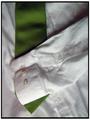
Black on Whiteby KelliComment: Complementary colours are pairs of colours that contrast strongly when compared to each other. The main colour effect here is from the green of the grass in the background.
Black and white are neutrals and not colours at all, and therefore they cannot be complementary colours... white shows the presence of light, and black shows the absence of light. Black and white areas next to each other do demonstrate high contrast, but high contrast gives a different visual effect than complementary colours do in a picture.
Check some of the forum discussions on complementary colours for suggestions on using colour for contrast.
|
| Photographer found comment helpful. |
| 10/10/2005 07:32:02 AM |
Night Outby bigfishComment: Complementary colours are pairs of colours that contrast strongly when compared to each other. In this photo, the predominant colour is the green of the tie, but there is no complementary red to set it off.
Black and white are neutrals and not colours at all, and therefore they cannot be complementary colours... white shows the presence of light, and black shows the absence of light.
Black and white areas next to each other do demonstrate high contrast, but high contrast gives a different visual effect than complementary colours do in a picture.
Your image demonstrates a duotone effect rather than the effect of complementary colours.
Check some of the forum discussions on complementary colours for suggestions on using colour for contrast.
|
| Photographer found comment helpful. |
| 10/10/2005 07:27:42 AM |
if the shoe fits...by trumpetwalrusComment: Complementary colours are pairs of colours that contrast strongly when compared to each other.
Black and white are neutrals and not colours at all, and therefore they cannot be complementary colours... white shows the presence of light, and black shows the absence of light. Black and white areas next to each other do demonstrate high contrast, but high contrast gives a different visual effect than complementary colours do in a picture.
Check some of the forum discussions on complementary colours for suggestions on using colour for contrast.
|
| Photographer found comment helpful. |
Home -
Challenges -
Community -
League -
Photos -
Cameras -
Lenses -
Learn -
Help -
Terms of Use -
Privacy -
Top ^
DPChallenge, and website content and design, Copyright © 2001-2025 Challenging Technologies, LLC.
All digital photo copyrights belong to the photographers and may not be used without permission.
Current Server Time: 08/02/2025 05:15:22 AM EDT.