| Image |
Comment |
| 10/07/2005 02:39:37 PM |
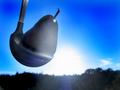
Pourable Breakfast with a Side of Sunshineby CoralComment: I totally miss the connection with "coffee shop" on this image... in fact I don't even know what I'm looking at here.
On technical merit the edges of the pear/spoon thing suffer some jagged edges (probably from JPEG). Perhaps Neat Image could get rid of those. Also, the halo in the top of the pear thing is distracting. In fact, the entire giant white blob in the lower center of the picture distracts from the main focal point, though I can also see why you framed this the way you did, it adds a lot of impact. |
 Photographer found comment helpful. Photographer found comment helpful. |
| 10/06/2005 02:08:44 PM |
de-sat not de-cafby tenfrozentoesComment: In my opinion the de-sat doesn't add anything to this picture. There's no action or emotion in this photo, it doesn't try to tell any story. Technically it's well composed and focused, and the DOF is right on for the desired effect. There's just no "wow factor" to me on this photo. |
| Photographer found comment helpful. |
| 10/04/2005 12:08:46 PM |
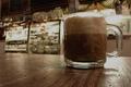
High-Quality H2Oby Commando303Comment: Not very exicting, this shot...
The contrast between the edge of the glass and the black background is so strong that the camera couldn't reproduce it well, leading to the jagged edge along the left side. Not so good. You did do a good job with focus and sharpness, and I imagine exposure was tricky for this as well. The subject is very well lit.
An interesting macro study, but just not very "Wow!". Sorry. |
| Photographer found comment helpful. |
| 10/04/2005 12:06:39 PM |
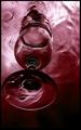
Wine Redby RobotBanjoComment: An interesting shot... and I think I know how you did it... :)
Technically well done, composition is spot on, focus, depth of field, tone and color are all good. Technically a very well done photo.
But... There are a lot of distractions in this photo. Bubbles where they don't belong, ripples, splashes, all things that take away from the main point of the image. Understandably hard to avoid, but essential to correct in order for this to be a really remarkable picture. A good overall effort though. |
| Photographer found comment helpful. |
| 10/04/2005 07:49:10 AM |
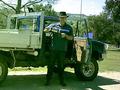
Looking in for Partsby neophyteComment: Saw this in one of the forums...
I like this photo on an expressive level. It documents something that most people don't see. The conversion to B&W was a good choice, because it adds to the 'grit' of the scene.
There's something slightly off about the composition, though I can't say I know right off the bat how to fix it. I'd have to play around with the original. My best idea just looking it is to do a tighter crop so that only the three guys with their backs to the camera are in the shot. I think there's a conflict for focal point, between the guys in the foreground and the guys looking into the front of the tent.
There's something to be done with the bike parts on the ground too, but I just can't put my finger on what it is. Were these guys willing participants? I've found that if I'm working with a subject that allows me to take pictures from several different angles, the one that works best is usually not the one I tried first.
Overall I'm not suprised that it didn't get a ribbon, but I am suprised it didn't place higher than it did. |
| Photographer found comment helpful. |
| 09/29/2005 01:41:02 PM |
Coffee breakby dzone1Comment: The greenish color cast makes this photo very hard to look at. It's awfuly busy and doesn't really tell a story. The countryside looks very pretty, perhaps if you had posed the guy in the bed of the truck with the mountains behind him, or something like that... |
| Photographer found comment helpful. |
| 09/29/2005 01:25:29 PM |
Looking up into the gills of a fungiby tonygComment: Wow. The color is really good here. The lighting is perfectly done to get that "glow" through the edges. However, I wish the DOF had been tweaked to get the whole thing in focus. At least for me, in abstract shots like this where my eye is wandering all over the place, I want the whole thing to be in focus. To me, this just isn't as sharp as it could be. Nice job, though. |
| Photographer found comment helpful. |
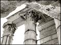
| 09/29/2005 01:21:13 PM |
Roman columnsby pmottaComment: Meets the challenge well. Good use of black and white, something that is generally overused here, but it adds to the feeling of age of this photo. The exposure and DOF are good too.
However, the composition seems a little off for me... It looks like a cave wall or something at the top of the photo's foreground. It leaves me asking "what is that". |
| Photographer found comment helpful. |
| 09/27/2005 03:59:36 PM |
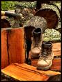
Hard Workingby glad2badadComment: A response to your response...
I finally was able to put my finger on what bothered me about this picture.
The boots are positioned in a manner such that they _should_ have feet and legs in them. Like you caught the lumberjack mid-stride. But there is no lumberjack, making me wonder if the lumberjack is a ghost or something.
Instead, what you seem to be going for here is a "tools of the trade" type shot. You've got the axe in a position of rest. Why not mess the boots up a little, like they've just been taken off the lumberjack's feet? Muss the laces, pull out one of the tounges, maybe even knock one over on its side...
The feeling of unrest that I just couldn't put my finger on until now is that this shot looks TOO perfect... like the lumberjack was just vaporized by aliens or something. |
| Photographer found comment helpful. |
| 09/26/2005 01:32:46 PM |
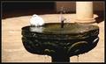
sunbathingby stekComment: A nice scene.
The title and composition suggest that the bird should be the focal point, but the bird is lacking detail due to overexposure, lack of focus, or both. I'll bet that you framed the picture and took it, which resulted in the camera metering for the darker fountain, instead of the light bird. If your camera can be made to lock the exposure and focus then you should meter for the bird and then compose the photo. Else, you could increase Depth of Field to get the bird AND the fountain in focus, but don't go too far or else you'll bring in the column or the ground, which would be a problem, in my mind. I do like the border. |
| Photographer found comment helpful. |
Home -
Challenges -
Community -
League -
Photos -
Cameras -
Lenses -
Learn -
Help -
Terms of Use -
Privacy -
Top ^
DPChallenge, and website content and design, Copyright © 2001-2025 Challenging Technologies, LLC.
All digital photo copyrights belong to the photographers and may not be used without permission.
Current Server Time: 08/04/2025 03:56:38 PM EDT.