| Image |
Comment |
| 03/15/2007 05:27:56 PM |
DAY 6. minimal edit. katee ...by rozComment: This is a great capture -- well composed, great lighting, wonderful color (especially the apple). I'm still waiting for your terrible "from the camera" shots, Roz, 'cause I ain't seen one here yet! |
 Photographer found comment helpful. Photographer found comment helpful. |
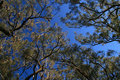
| 03/15/2007 05:24:54 PM |
DAY 6. minimal edit. canopy .by rozComment: I would play with levels, shadows, and saturation here. The sky is perfect, so maybe color selector for the greens in the trees (to bring out a bit more color for contrast against the sky). Another (though labor intensive, I think) option might be selective desat; keep the blue sky and make everything else B&W . . . that might be a really bad idea, by the way :) |
| Photographer found comment helpful. |
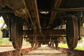
| 03/15/2007 05:22:02 PM |
DAY 5. minimal edit. train .by rozComment: There is so much going on here; the lines (both in the tracks and on the bottom of the train), the circles on the wheels, great stuff. Can't wait to see the edited version! |
| Photographer found comment helpful. |
| 03/15/2007 05:15:59 PM |
Juan Castroby colorcarnivalComment: I see possibilities here; you've got the stuff you can't process in (expression on the face, tilt of the head, that sort of thing). I'd bring the exposure up, maybe crop it a bit (off the right, I think, but I'd have to see it to be sure), and brighten the reds. This might also be a chance to do a selective desat, keeping the color in (maybe) Juan Carlo's shirt, but making the rest b&w or toned in some way. Just a thought :) |
| Photographer found comment helpful. |
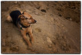
| 03/14/2007 01:08:09 PM |
Day 4.1 - Black and Tan Fantasyby xianartComment: I like what you've done to bring this good looking guy out, but I wonder if a bit more vignette might have worked here; to my eyes, both the dog and the area to his left (our right as we look at him) seem highlighted, and it seems a bit a bit unnatural (that's not the right word, it's too harsh to really describe what I'm seeing, but I can't think of the right word just now, sorry). |
| Photographer found comment helpful. |
| 03/14/2007 01:02:39 PM |
Day 3.1 - Black and tanby xianartComment: Excellent composition, with good use of textures and lines in the lightness of the dirt; that he looked to his left just adds flow. Nicely shot (I hope he got a biscuit for behaving so well). |
| Photographer found comment helpful. |
| 03/14/2007 12:58:52 PM |
Day 2 Garden Fenceby ElaineComment: What everyone below has said (nice use of depth of field, excellent exposure, nice textures); not sure what you'll do in editing, but I'm looking forward to seeing it. |
| Photographer found comment helpful. |
| 03/14/2007 07:19:04 AM |
Spool of Redby ElaineComment: Hi Elaine, I was looking through your profile when I saw you had entered the red II challenge, so I popped over to see this entry and noticed there was only one comment on it. I hate that (when I enter and get few comments). I voted this challenge, so here are my thoughts on your shot: I gave this a 6.0. It's nicely lit and the use of DoF really adds to it (I started it at a 5 and bumped it up during my review). The red is a really nice choice, too (not a comment I would outside of a challenge focused on color), and the lines in the thread give some movement (top to bottom) to the image (at least to my eyes). The one problem you ran into here with me as a voter is that string is just not very interesting to me as a subject. Some people don't like kids, others don't like cats. Me, I don't like thread. Nothing you can do about that, but the technique shown on this with subject matter that interested me would have scored at least a 7, and probably higher. |
| Photographer found comment helpful. |
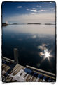
| 03/12/2007 04:02:17 PM |
Flareby xianartComment: Nice processing; I like how the convergence I felt in the last image is maintained. Did you consider cloning out the buoys? I find them a tad distracting (but I'm easily distracted tonight). |
| Photographer found comment helpful. |
| 03/12/2007 03:51:20 PM |
Day 3by xianartComment: Great image to play with; does the dust show so much because of the brightness of the scene? I like the composition here. The tilted horizon doesn't bother me, but I'm pretty alone in my tolerance for tilted lines in images (here I think it's balanced some by the lines of the dock, with a nice right to left motion driven by the slight convergence). |
| Photographer found comment helpful. |
Home -
Challenges -
Community -
League -
Photos -
Cameras -
Lenses -
Learn -
Help -
Terms of Use -
Privacy -
Top ^
DPChallenge, and website content and design, Copyright © 2001-2025 Challenging Technologies, LLC.
All digital photo copyrights belong to the photographers and may not be used without permission.
Current Server Time: 06/19/2025 06:40:22 AM EDT.