DPChallenge: A Digital Photography Contest You are not logged in. (log in or register
 
Browse Settings
Currently viewing:
Registered UserKiwiShotz

Show comments:

Per page:

Order:

Comments:


Comments Made by KiwiShotz
Pages:   ... [86] [87] [88] [89] [90] [91] [92] ... [216]
Showing 881 - 890 of ~2151
Image Comment
Christmas windows
01/10/2006 08:50:40 PM
Christmas windows
by burtct

Comment:
Doesn't she just have the most delightfully whistful look :) I was looking at yoiur composition and wondering if you could get tighter and end up with more impact or less. I had a play [url= //www.dpchallenge.com/image.php?IMAGE_ID=273066279452]here[/url]
hope you don't mind.
Photographer found comment helpful.
Big City Nights
01/10/2006 07:57:10 PM
Big City Nights
by muypoetico

Comment:
You nailed the long exposure. Take the time to tidy up, it's worth at least 1 extra point. You need to rotate so that the vertical poles are vertical and could probably crop to the two outside poles. That would give us a better look at the street detail. As it is, the black foreground almost dominates the shot
Photographer found comment helpful.
Sgt C. Gull - Traffic Control
01/10/2006 07:53:53 PM
Sgt C. Gull - Traffic Control
by digidori

Comment:
And you managed to dodge a ticket for stopping on the freeway as well ... nice work :)
Photographer found comment helpful.
Revenge- The tables have Turned
01/10/2006 05:16:30 PM
Revenge- The tables have Turned
by Sunshine86

Comment:
::: Critique Club :::
How can I not bless any image from a photographer who chose my nickname for the UserName challenge :)

Very happy to do the detailed critique you requested on your image but it is difficult without some detailed information in your photographer's comments. When we do a critique, we go further than just assessing the photographic result. That's what the voting process does. The critique process goes deeper to look at what you were trying to achieve, how you wanted it to look and what issues you had in getting the image captured and ready for voting.

First Impression - the most important one:
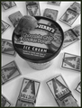
I was a little confused at first and it took me a second to find the mouse. I didn't like the look of the image and would have passed it over fairly quickly if I hadn't been critiquing it. When I found the mouse and 'got' the story I couldn't stop giggling.

Composition:
Once I found all the elements, I could see how the composition works. Because I initially didnt see the mouse though, it's probably not yet at optimum. I wonder if de-centralising the ice cream, perhaps by retaining image to the left of the crop which would put the ice cream container on thirds, that there would be a more natural eye-flow to the image as a whole.

Subject:
This is one cute and funny story being told here and it touched the voters too as 5.6 is a great score for this pic. This is a tough school and the voters weren't slow in noticing the unset traps. Just shows how careful it is necessary to be.

I wonder about the ice cream container. The detail on the lid bothers me but I'm not sure if it is supposed to be a part of the story or if it's just a vehicle for the mouse to be on. The text and illustration on the lid just detracts so much from the Point of Interest, the mouse. If the cookie dough ice cream is not supposed to be a feature, then a drinks coaster or piece of card obscuring that graphic would really help.

Technical (Colour, focus, and light):
I just love your depth of field. It doesn't get more perfect than that. The main Point of Interest is of course the mouse (or is it a gerbil?). That area, as evidenced by the ice cream lid, is crystal sharp whilst the traps are just mildly OOF. The sense of height above the traps is communicated but they are not so OOF that they cease to be an importand part of the focus. Had they been sharp, the eye would have been drawn to the wrong place entirely. Yep the mouse does look OOF but I suspect that is motion blur and as such I'm not sure it's hugely significant. Certainly its not as important as your main point of interest being so hard to see.

The conversion to B&W has caused the elements to blend here and doesn't appear to add anything to the image. You've had mixed feedback about the mono but I do believe colour (lid obscured) would have done so much more to identify the respective layers and elements.

I know you love desaturation and monotones. Only two out of 12 images on your profile page have strong colour. That's perfectly fine as many people don't identify a speciality and stick with it. You do. I would just be careful how and when it's used.

To grow its vote?:
I hope this is the point of the critique. This has more potential than most to be a hit picture and whilst we're talking about the things that may help it, please don't believe that this is a bad picture. It's not, I would just love to see it knock their sox off.

I'm surprised it scored as high as it did but am very happy for you that it did. I think it scored on its humour rather than its photographic values so given an adjustment to those, you had a huge potential hit here.

Summary:
This is not a bad image, it's a very good story-telling one and one that has even more potential than it already displays. Have you got a coloured original that you can post in your Portfolio?

It's been fun, thanks for the opportunity

Brett
Photographer found comment helpful.
Rodeo Clown in Training
01/10/2006 08:01:41 AM
Rodeo Clown in Training
by Artyste

Comment:
Great burst of colour! Not only that but it enhances the subject. Dang I hate it when submissions Do Meet Challenge, there's nothing to grumble about ... LOL
Photographer found comment helpful.
Country Lane
01/10/2006 07:59:23 AM
Country Lane
by BaldurT

Comment:
Now this is the first image I've come across where colour shift has been used so dramatically. What an interesting pattern it makes
Photographer found comment helpful.
Adrift
01/09/2006 04:34:42 PM
Adrift
by elsapo

Comment:
Very simple, very good. The lighting balance is great, you've got all the detail of the leaf, held its colour and maintained a presense in the blue background. The eye travels bottom-lef to top-right so the angle of the leaf is right on that leading line. The composition may have cost you a point overall. Get the leaf onto a thirds line, or even better, a thrids intersection and you'd have a point back I believe.
Photographer found comment helpful.
Paper Waves
01/09/2006 02:36:50 PM
Paper Waves
by shudderbug

Comment:
Great treatment and impressive post-processing
Photographer found comment helpful.
A festive welcome
01/09/2006 02:35:38 PM
A festive welcome
by p2jvr

Comment:
Very cute and clever. One of those images that makes you smile which is really good stuff. If it suffers anywhere it is because you've had to crop the birds so close to the left hand edge which has messed up your best composition options. From this angle, I can see that if you'd added any more left margin, you'd have ended up with the house next door as a horrid distraction. The solution I think would have been to take 5 steps to the left which would have made the ivy as the background to the birds, the foreground tree would have nestled between the door and window and you would have had more cropping options. Easy to be wise after the fact huh :)
Photographer found comment helpful.
"Red"
01/09/2006 02:29:33 PM
"Red"
by tfarrell23

Comment:
Technically brilliant. You've held the papers texture while still giving it a gradient - I'm impressed. The composition is so sophisticated, it takes my breath away. This could hang as a 6ftx4ft mural in any corporate boardroom!
Photographer found comment helpful.
Pages:   ... [86] [87] [88] [89] [90] [91] [92] ... [216]
Showing 881 - 890 of ~2151


Home - Challenges - Community - League - Photos - Cameras - Lenses - Learn - Help - Terms of Use - Privacy - Top ^
DPChallenge, and website content and design, Copyright © 2001-2025 Challenging Technologies, LLC.
All digital photo copyrights belong to the photographers and may not be used without permission.
Current Server Time: 06/22/2025 10:36:38 PM EDT.